20世纪30年代,物流的概念渐渐出现在人们的视野认知里,通过运输、保管、配送等方式,以最低的成本高效率的完成物品的流通输送。传统的物流行业办公空间,大多较为粗糙、简陋,但作为强功能的场所,办公空间的设计一直随着科技进步和人员协作方式的改变而不停演变。
In 1930s, the concept of logistics gradually came into public’s attention. Through transportation, storage, and distribution, the circulation and delivery of goods was completed efficiently at the lowest cost. Traditional office space of logistics industry was mostly rough and simple, yet as a place that requires strong functionality, the design of such office space has been constantly evolving with technological progress and changes in personnel collaboration methods.
如今,千禧一代已成为职场主力军,他们常被定义为追求自由、更年轻有活力,自由开放炫酷的办公空间,更将得到他们的青睐。WED中熙设计在义乌物流园区办公大堂空间规划设计尝试打破传统物流行业的刻板印象。
Today, millennials have become the main force in the workplace. They are often defined as free, young, and energetic, so that they will favor open office spaces. The planning design of office lobby space in Yiwu Logistics Park by WE Design attempts to break the stereotypes of the traditional logistics industry.
条形码的漫游Roaming of Barcode
“在一个传统行业里做新式的变化,如何能体现到物流行业的特性,符合当下自由、开放的工作理念,让设计为传统行业赋能,就是我们一直追求的‘WE design future(设计未来)’,”WED创始人Simon如是说,“设计师一直在思考和寻找,这个行业中的人们最熟悉的东西是什么,以此做出有‘共情力’的设计”。
“Making changes in a traditional industry, how to reflect the characteristics of the industry based on the current free and open working philosophy and let design empower the traditional industry is ‘WE design future’ that we have been pursuing, " said Simon, the founder of WED. "Designers have been thinking and looking for what is the most familiar element of this industry to the public in order to complete the design with 'empathy'.”
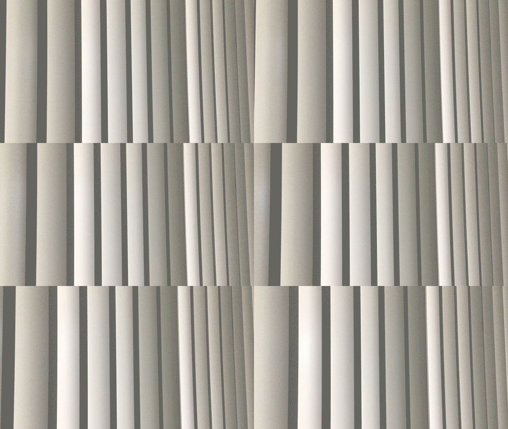
在设计语言上,设计师将对物流行业的元素洞察加入到设计中,提取物流的特性,链接、输送的关系,把源于条形码和集装箱的设计灵感,用材质和光影进行了深化融合,呈现出令人惊喜的效果。
In terms of design language, the designer added the understanding towards elements of logistics industry into the design, extracted the characteristics of logistics as well as the relationship between links and transportation, and deepened the design inspiration derived from barcodes and containers. By integrating materials with light and shadow, the entire design presents a surprising outcome.
“我们看到使用者在这个空间中的两种状态:一种是在干净利索的背景下疾行来往的繁忙场景,另一种是阳光照到室内,立面隔断在楼道地面投射出条形的光影效果,大家在开放区域轻松交谈的场景,这就是建筑的力量。”
"We see two conditions of users in this space: one is a busy scene with a clean background, the other is people talking easily in an open area with sunlight pouring into the room, and the facade partition projects a strip on the corridor floor. This is the power of architecture."
空间重启与构筑 Space Restart and Construction
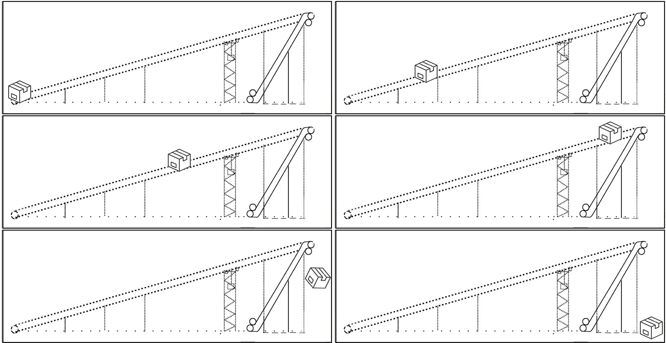
在空间布局上,WED中熙设计对原来上下两层的大堂建筑空间的结构进行重新设计,对人流动线也重新规划。原有空间中大堂中四根立柱孤立存在,连接横梁阻碍视线破坏空间整体感,与外立面也毫无联系,设计师重新调整了几者的关系,把四根柱子链接做成整体的构筑物,也创造出人员行走和等待的不同动线。
In terms of space layout, WED redesigned the structure of the original lobby building space on the upper and lower floors, and re-planned the circulation of people. In the original space, the four pillars in the lobby exist in isolation. The connecting beams obstruct vision and destroy the overall sense of the space. They have no connection with the exterior façade neither. The designer re-adjusted the relationship between four pillars and made them as a whole structure. It also created different circulations of people walking and waiting.
平面分析
草图表现
WED中熙设计也一直热衷于探索各种新式材料在室内空间的表现,采用应用在高科技产品的氧化铝板材质,让柱子整体的视觉感变轻,也带来了更强的质感和科技感。大理石材、铝金属不同质感拼接、重叠、碰撞,让空间产生微妙的细节变化又相互融合,让空间变得更有冲突感和层次感。
WED is also keen on exploring the performance of various new materials in the interior space. The use of alumina board material, which is applied in high-tech products, made the overall visual of the columns lighter, bring a strong sense of texture and technology. The different textures of marble and aluminum spliced, overlapped, and collided, producing the space with subtle details, yet they merged with each other after all, enriching the space with conflicts and layers.
色彩的应用无疑也是空间内的特点之一,洗手间设计师通过对品牌基色的搭配组合,强烈颜色蓝红色调的对比来区分男女使用区域,这样的处理方式带来更丰富的视觉冲击变化,也给注重效率的灰白空间带来一抹艺术感。
The application of colors is undoubtedly another outstanding feature of the space. The designer of bathroom distinguished the male and female areas through strong color contrast of blue and red by combining the basic colors of the brand. Such method enriched visual impact and offered a touch of art to the gray space focusing on efficiency.
这是一个设计无处不在的时代,设计的“界”限,正在不断被跨越和延展,当跨界探索、创新越来越被热议,设计的表达方式也会因探索思考而焕发个性魅力。
This is an era in which design exists everywhere. The "boundary" of design is constantly being crossed and extended. When cross-boundary innovation obtains more and more attention, the expression of design will also be radiant with individual charm due to exploration.
▼项目概况
Project Overview
项目名称 | 东宇物流办公大堂空间设计
项目地点 | 义乌
项目面积 | 475㎡
空间设计 | WED中熙设计事务所
设计团队 | 郑健阳、郑安迪、莫伟伦、郑熙
完成时间 | 2020年5月
摄 影 师 | bm Studio+彦铭
Project Name | The lobby space design of Dongyu logistics office building
Project Location | Yiwu
Project Size| 475㎡
Interior Design | WE Design
Design Team | Zheng Jianyang, Zheng Andi, Mo Weilun, Zheng Xi
Completed time | May 2020
Photographer | bm Studio+ Yan Ming
▼关于中熙设计
About WE Design
WE Design中熙设计事务所于2010年创立,WE意为“东与西”,以现代设计的思想,融合亚洲文明的精美,WE亦意为”我们“,展现年轻一代设计人改变社会与环境的决心与抱负。以“WE Design Future(我们设计未来)”为宗旨,广泛与不同行业进行合作,创作出品质卓越、概念新颖的项目,包括房地产、住宅、办公楼、商业及医疗等类别。通过近十年的不断成长,已发展成为提供室内设计、软装设计与工程、艺术顾问与工程、品牌设计等服务的全案设计事务所,透过跨领域、跨板块的合作,配以崭新的室内设计和建造科技,为客户设计及实现最佳方案。
WE Design was founded in 2010. WE means “East and West”; with the idea of modern design, it integrates the exquisiteness of Asian culture. WE also means “we”, showing the determination and ambition of younger generation designers to change society and environment. With the aim of "WE Design Future", the company works extensively with different industries to create projects of superior quality and innovative concepts, including real estate, residential, office, commercial and medical space. Through the continuous growth of nearly ten years, it has developed into a design office that provides services including interior design, furnishing and commission work, art consultancy, brand design, etc., through cross-domain and cross-platform cooperation, with new interior design concept and construction technology, WE Design provides the best service to the customer.


