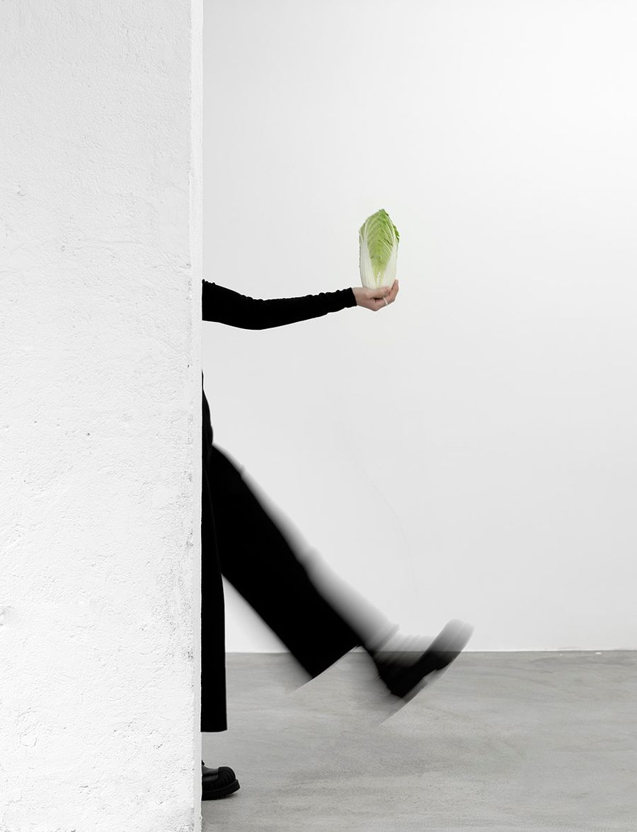
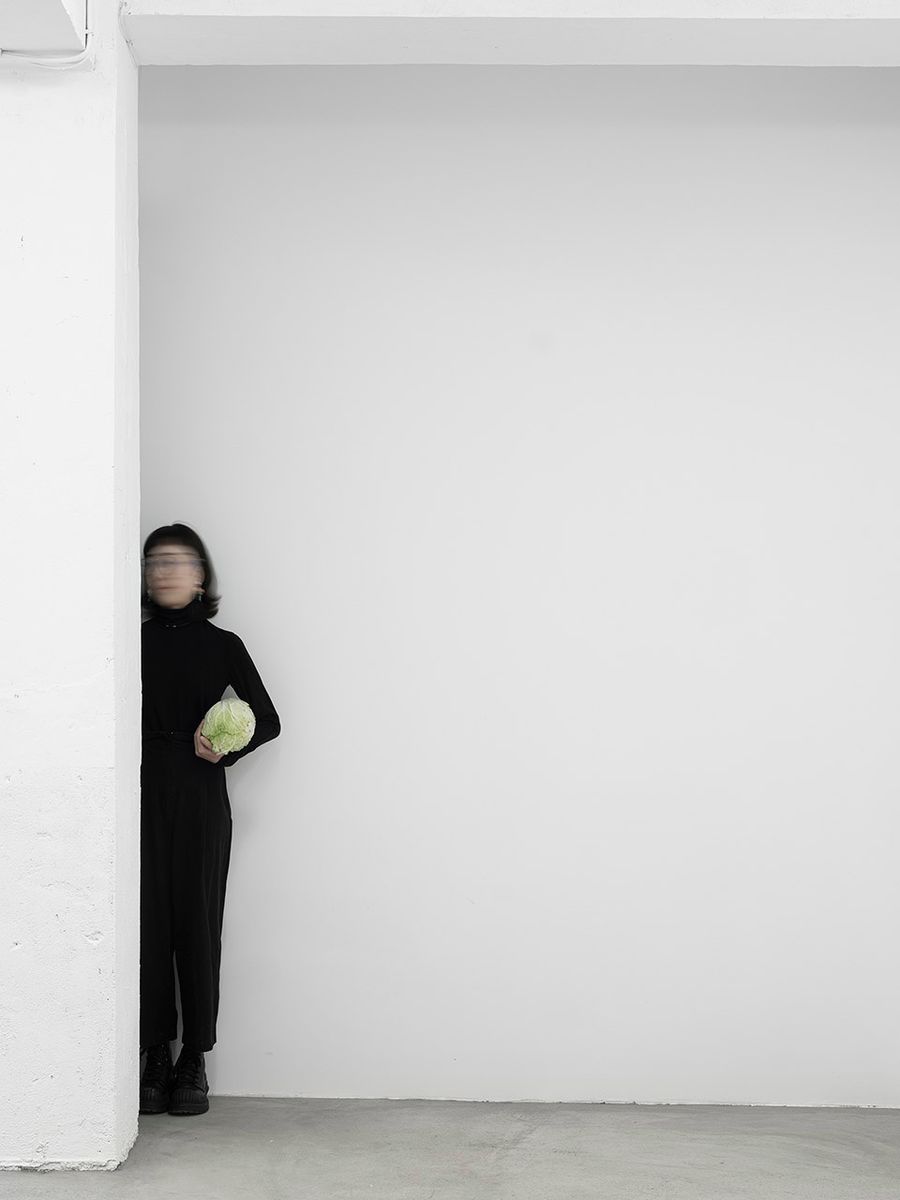
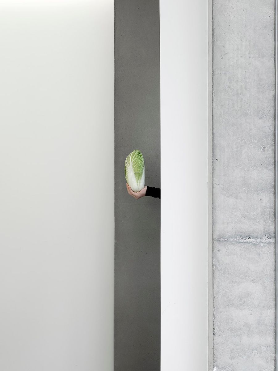
“我希望白菜做的事,像灰度里的白光。”
————-白菜帮子
“We hope what we do at BaiCai resembles the white light from grey shade.”
– BaiCai team
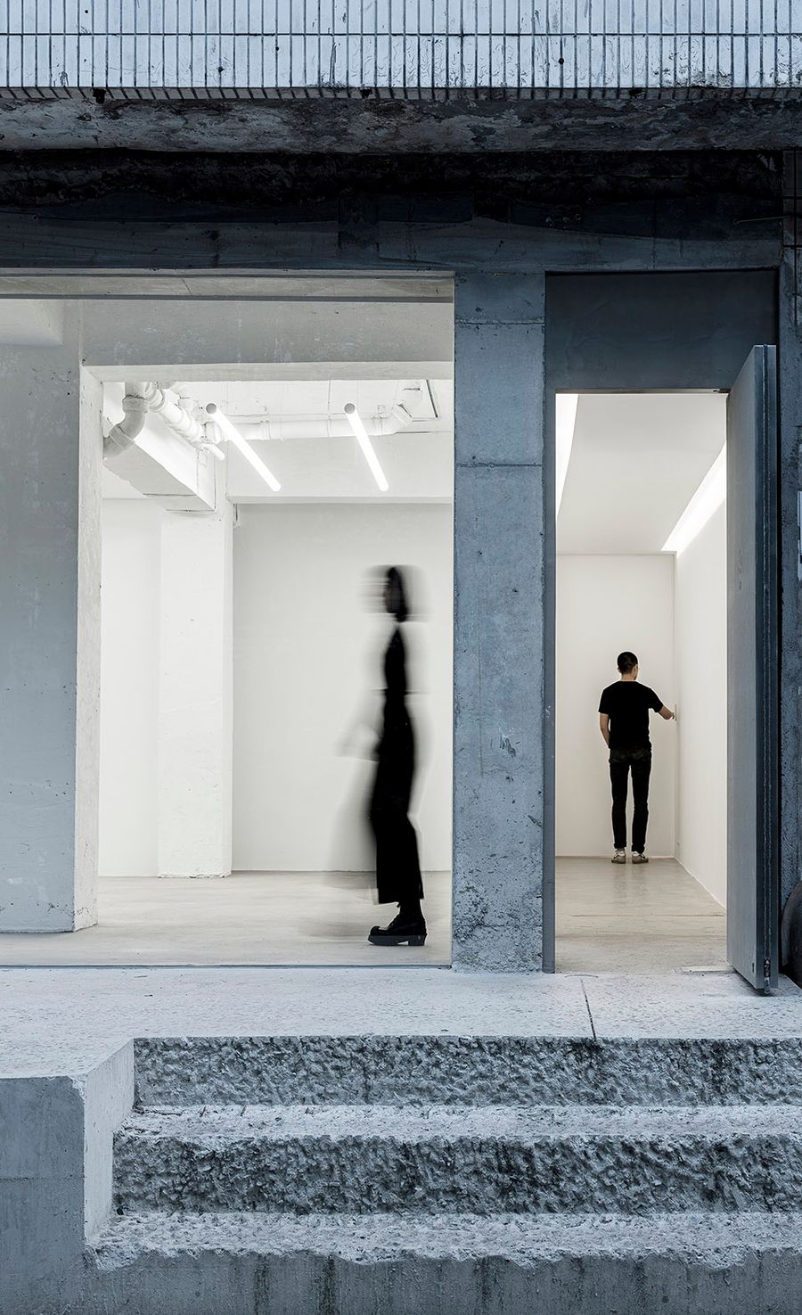
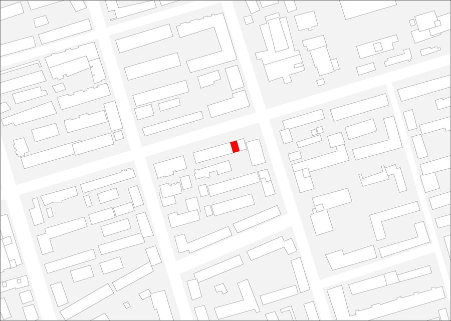
白菜设计工作室选址位于沈阳的中心繁华城区,在紧邻六国领事馆、万象城、鲁迅美术学院的一条绿荫饱满的街道上。同一条街上聚集着多家老牌美食神店,到了晚上会有夜市、菜场市集,步行距离有三家老四季面馆充分说明了场地烟火气的浓厚程度。我们认为这里是沈阳这个城市的情绪交汇处,也是我们选择这里的原因。
BaiCai Design Studio nests in the bustling city center of Shenyang, along a lush road that is adjacent to the consulates of six countries, MixCity and Luxun Academy of Fine Arts. The road is also famous for its classic restaurants of local food, where you can find bazaars and markets every night. We believe it is the emotional intersection of Shenyang, which is why we settle ourselves here
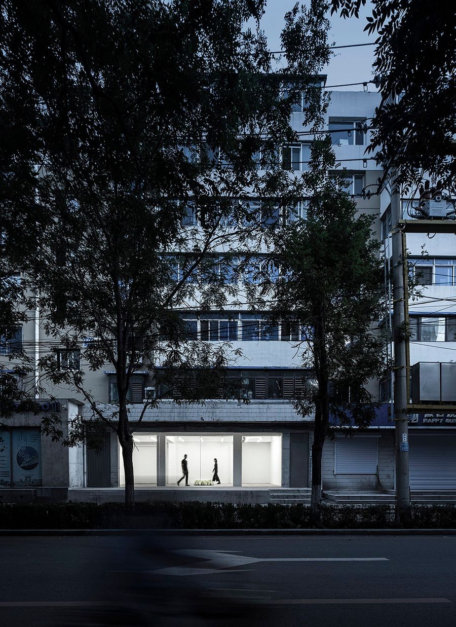
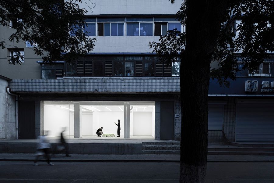
▼工作室外观
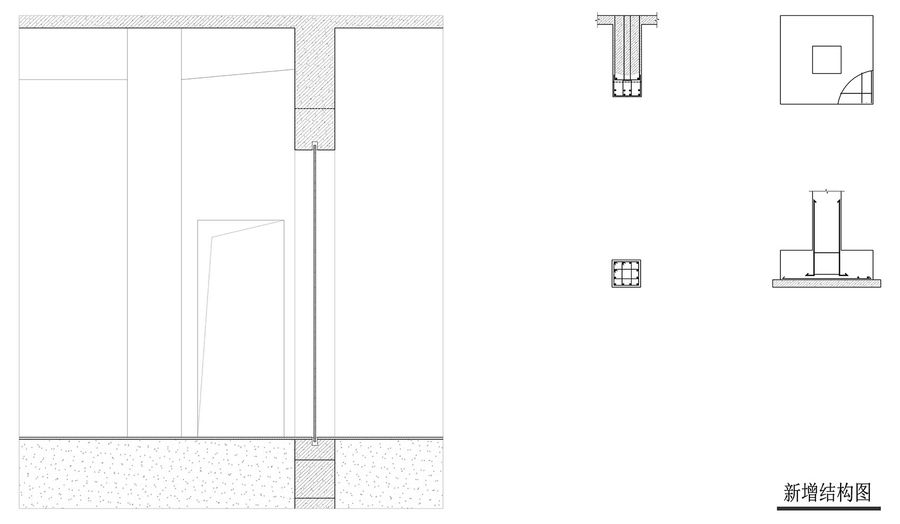
项目位置位于一栋二十多年的居民楼的一楼,建筑为砖混结构。在设计过程中,为了实现25平米全玻璃的展示面,我们对外立面做了很大的结构改动。我们取消了原有的两个结构柱,地基挖到原土层后在两侧重设了柱子,并且浇筑加固了上下梁形成一个稳定的井字结构,形成干净外立面的同时避免了由于大玻璃自身重量产生下沉带来的风险。空间入口与设备隔扇在立面上被推到柱子外侧,做到隐藏,使窗成为视觉唯一中心点。
The project is located on the first floor of a 20-year-old residential building of brick-concrete structure. We took a tremendous change to the façade to create a full class wall of 25sqm. We removed two existing structure columns and reset the columns after extending the base to the original layer of soil. By pouring concrete, we reinforced the upper and lower beams to create a stable square structure, which helped to simplify the façade while to avoid the risk of glass sinking due to overweight. From section view, the entrance and the partitions for equipment were hidden outside of the columns, emphasizing the window as a key feature to the space.
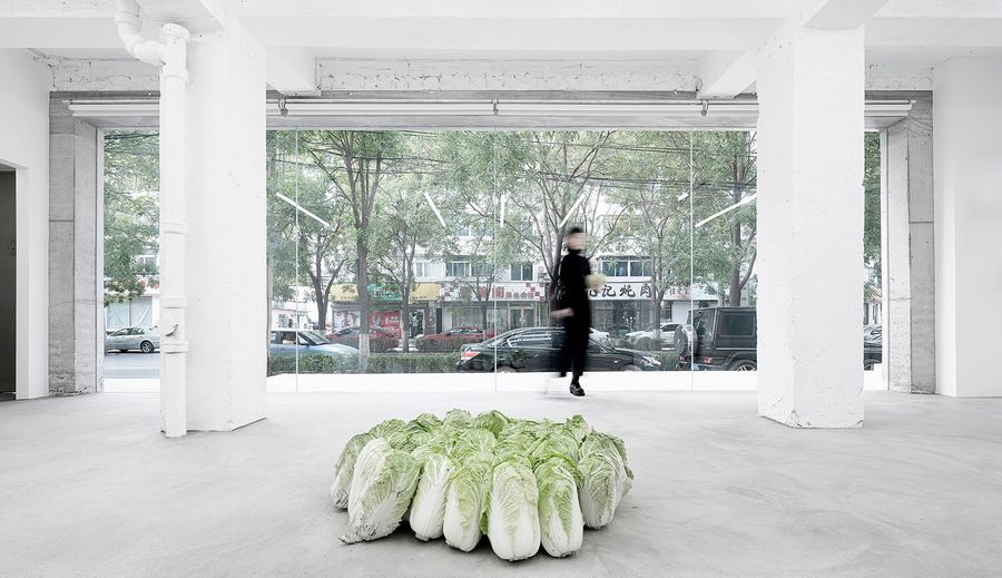
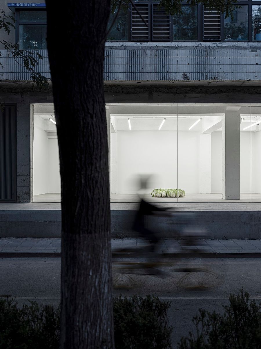
白菜的门脸儿都给了窗,WINDOW SPACE是一个不设限,输出思想的空间。会定期策展,分享好玩儿的事儿,有趣的思想。突破灰度的白光,无修饰的外观,让内容成为立面。
The window is all you can see when you arrive at BaiCai Design Studio, then we call it the WINDOW space. It is a space for free thinkings and exchanges, and where periodically we will host exhibitions and workshops with our friends. The white lights that penetrate the grey and plain space leave nothing but the content itself as the identity.
▼工作区:灵活自由的空间
▼走廊尽头的隐藏门
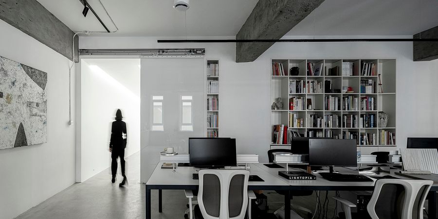
▼从工作区看走廊
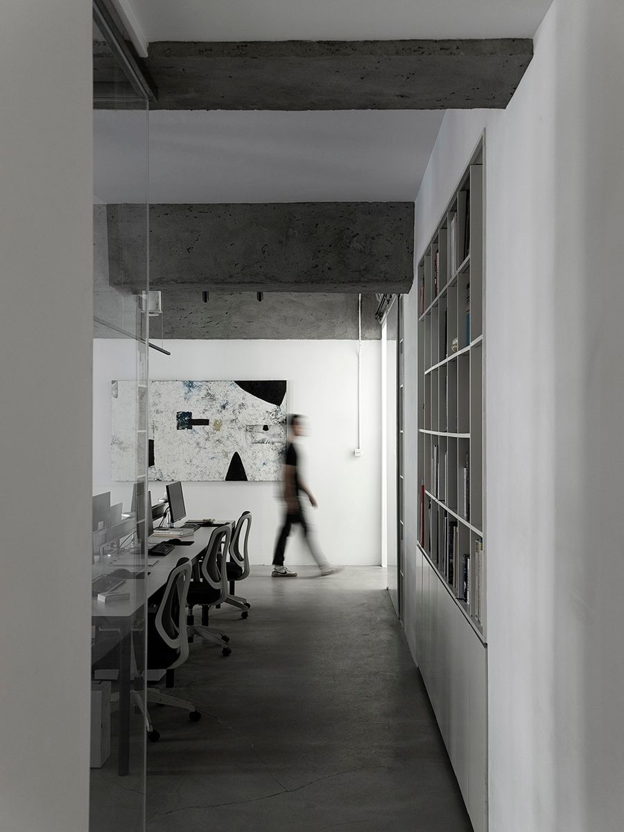
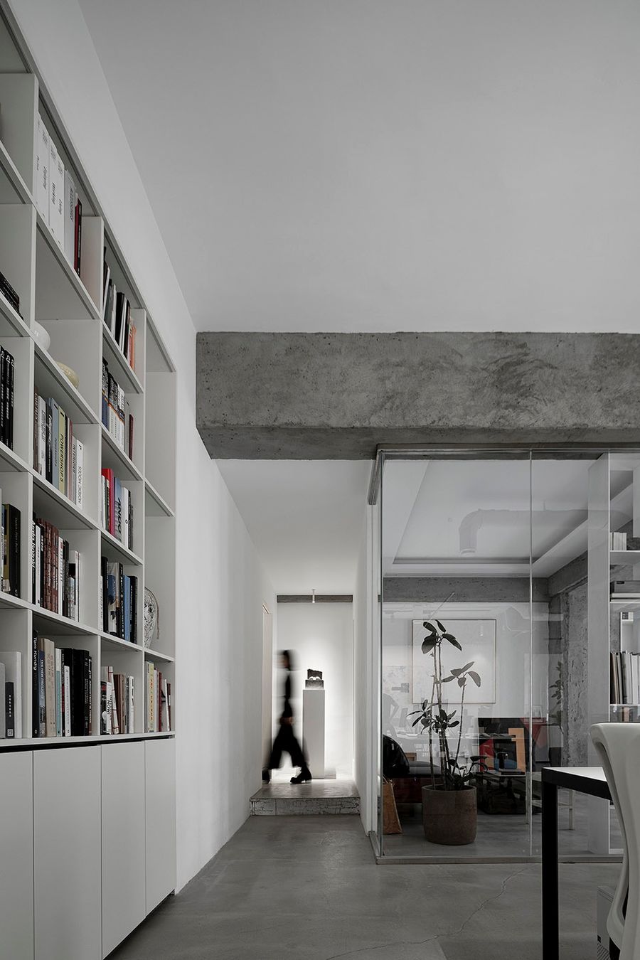
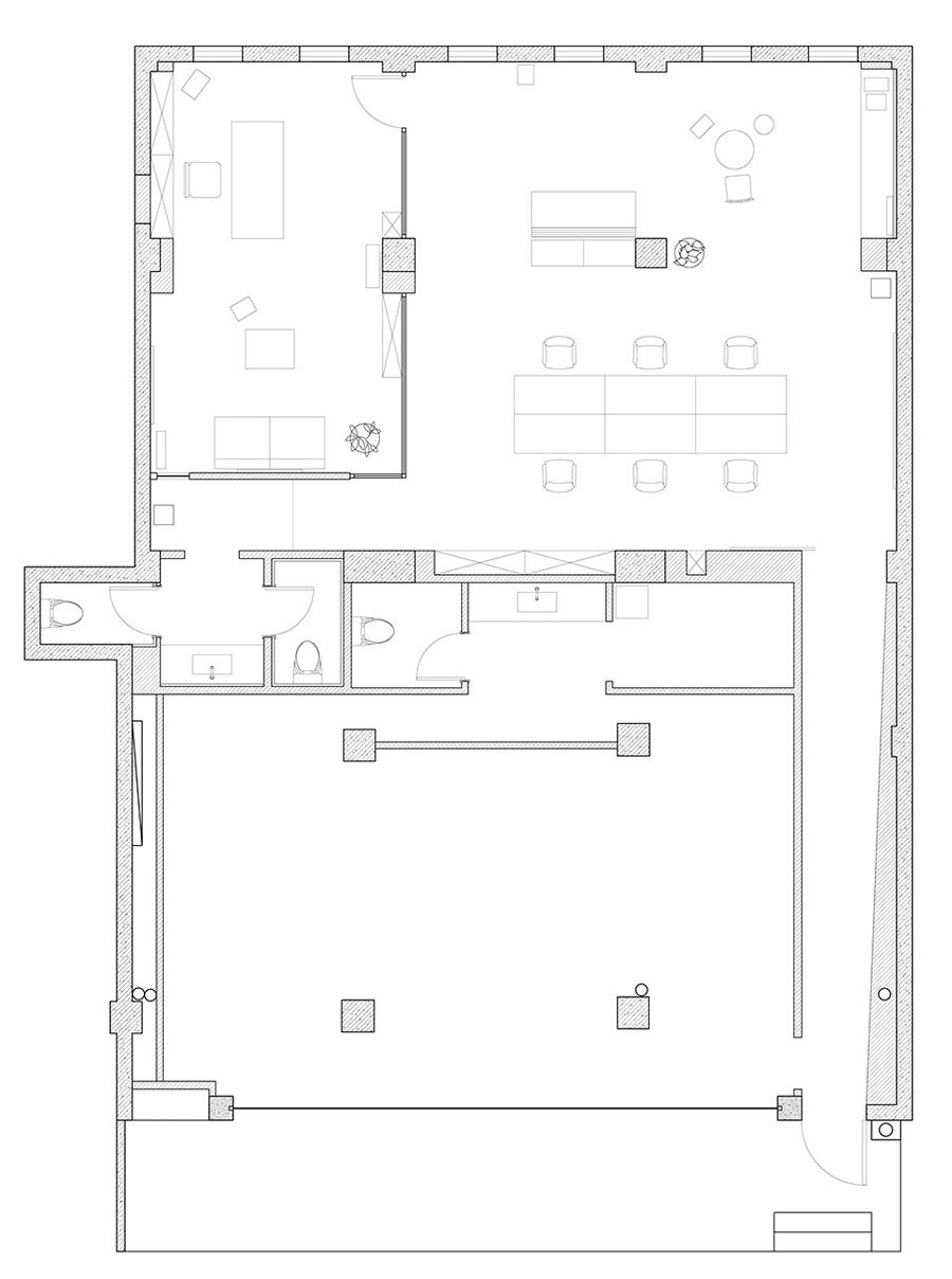
WINDOW边上8米深的狭长走廊尽头有一个隐藏门,打开后就是白菜的办公空间。长走廊和隐藏门使艺术空间和工作室独立存在,却以一种更紧密的形式连接在了一起。
There is a hidden door at the end of the long and narrow corridor with a depth of 8 meters next to the WINDOW. After opening the door, you will meet our office space. The long corridor and hidden door physically separate the art space from the studio, but somehow connected both in a more intimate way.
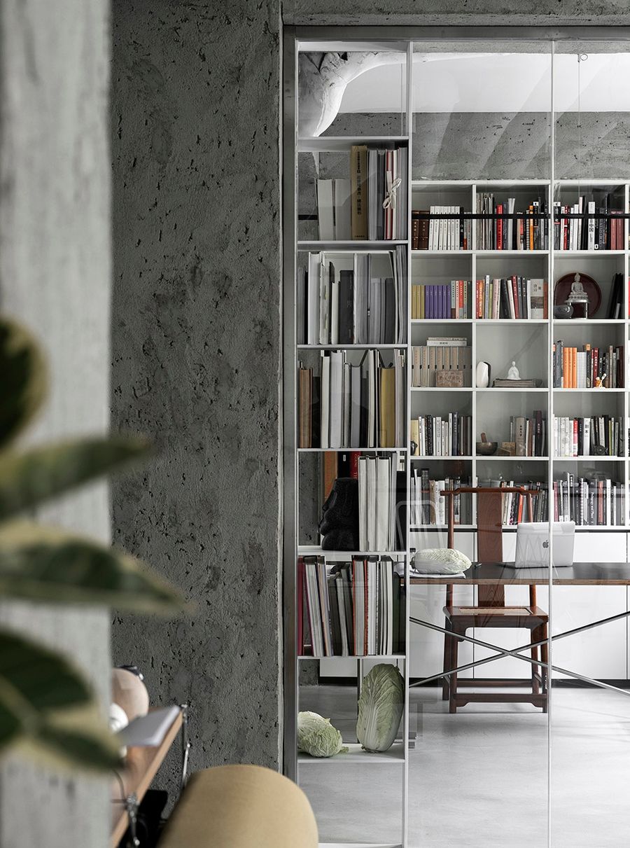
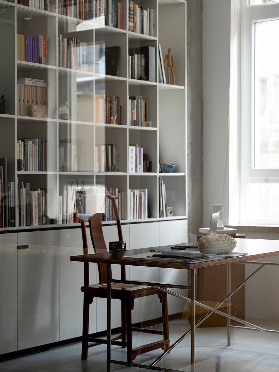
▼透明玻璃分隔空间
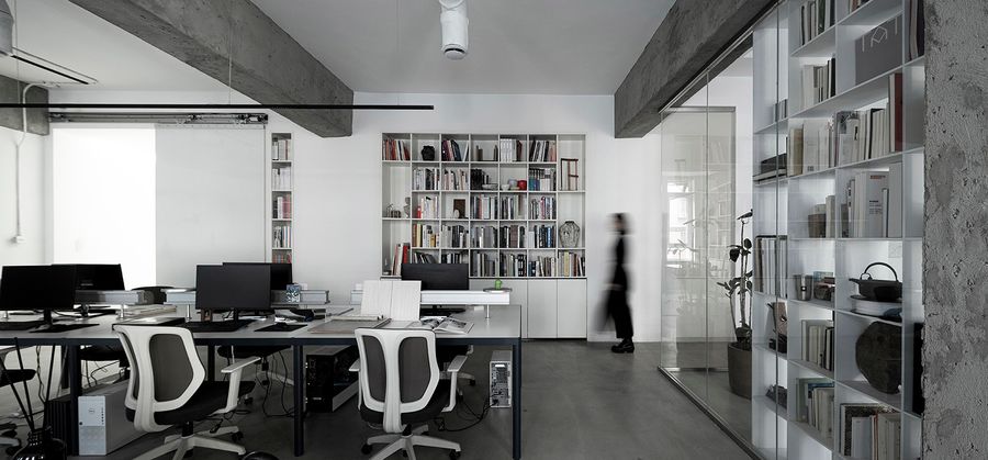
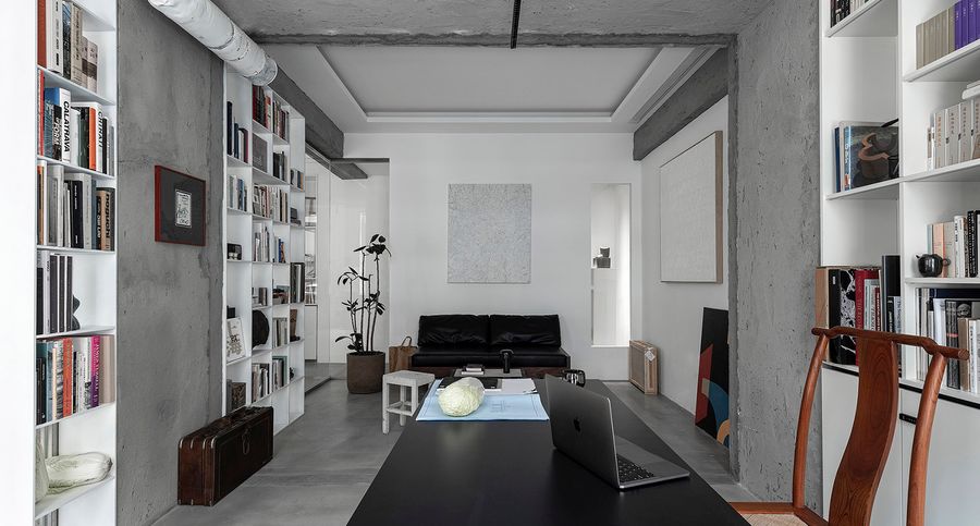
▼内部办公区
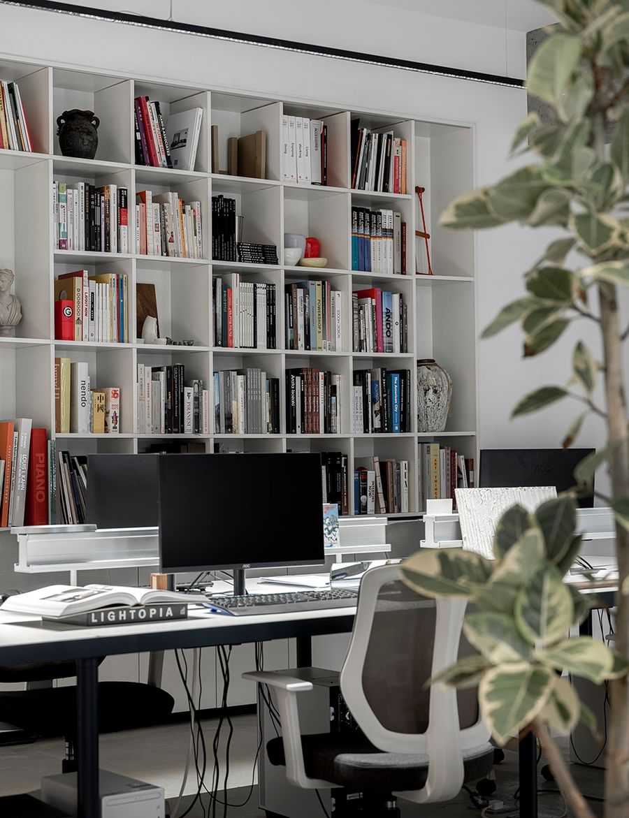
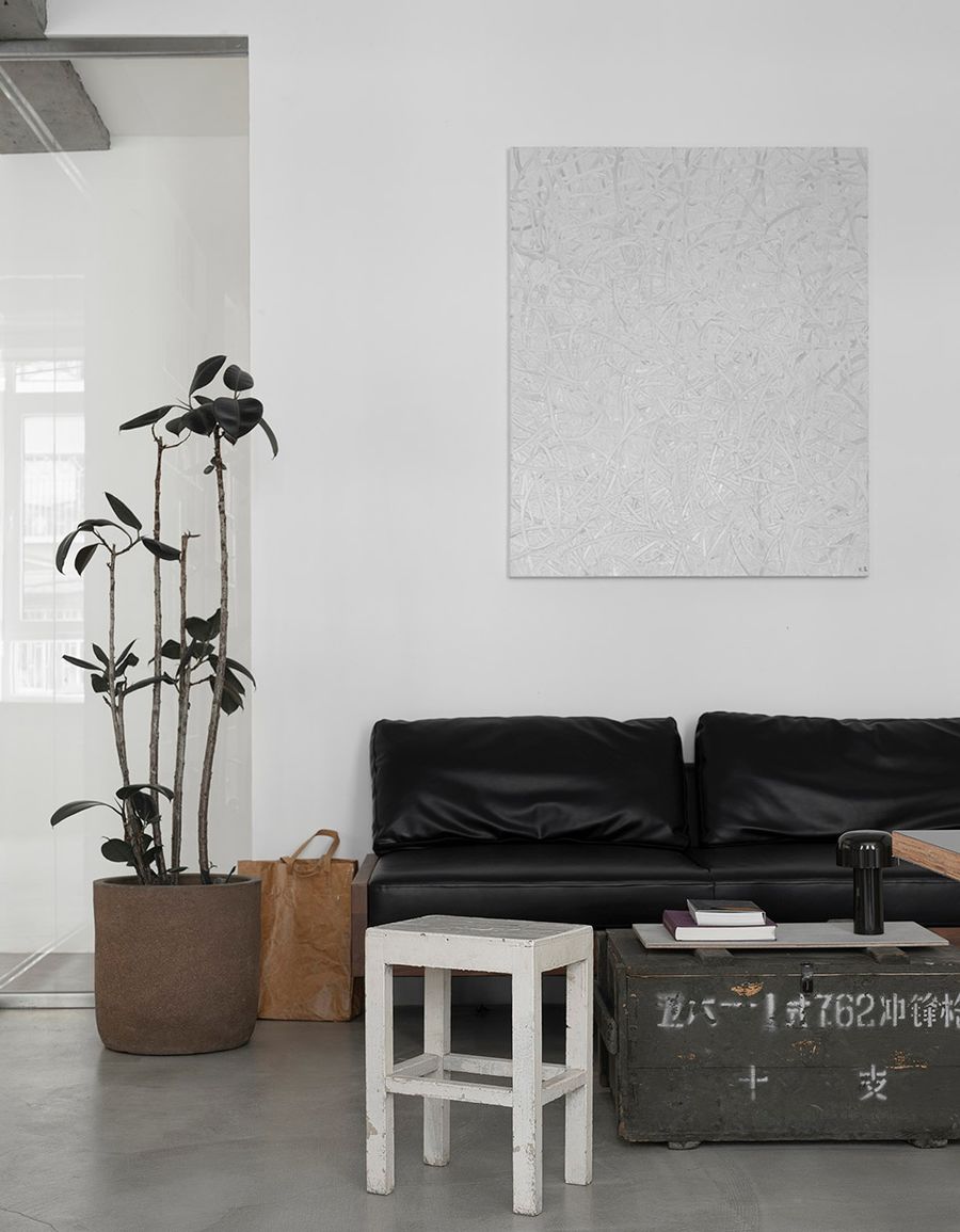
▼新老物件的碰撞
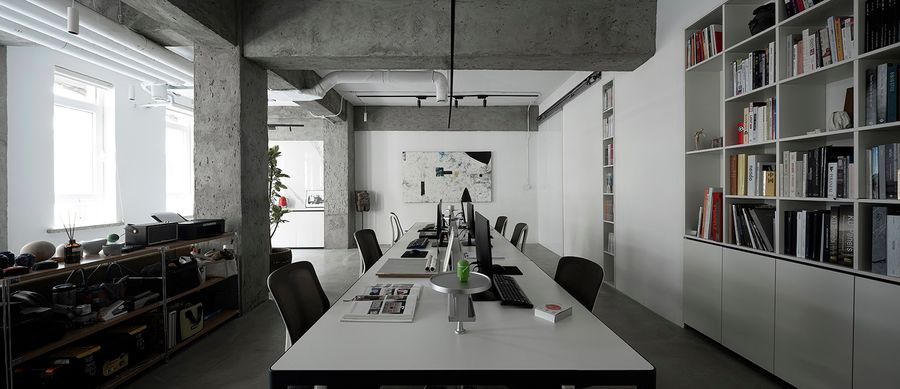
▼保留原始的梁和柱
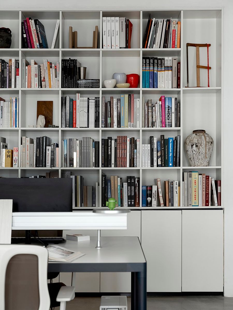
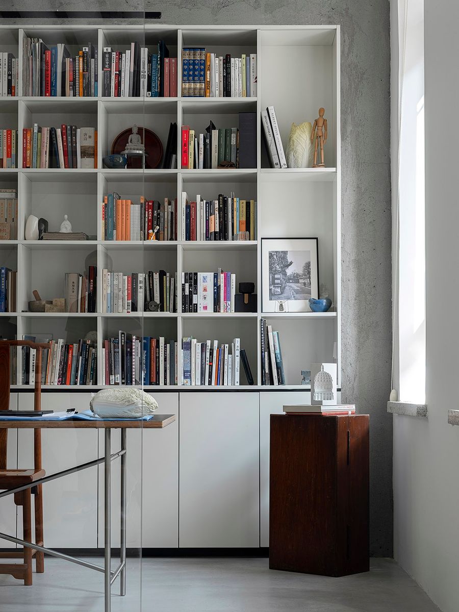
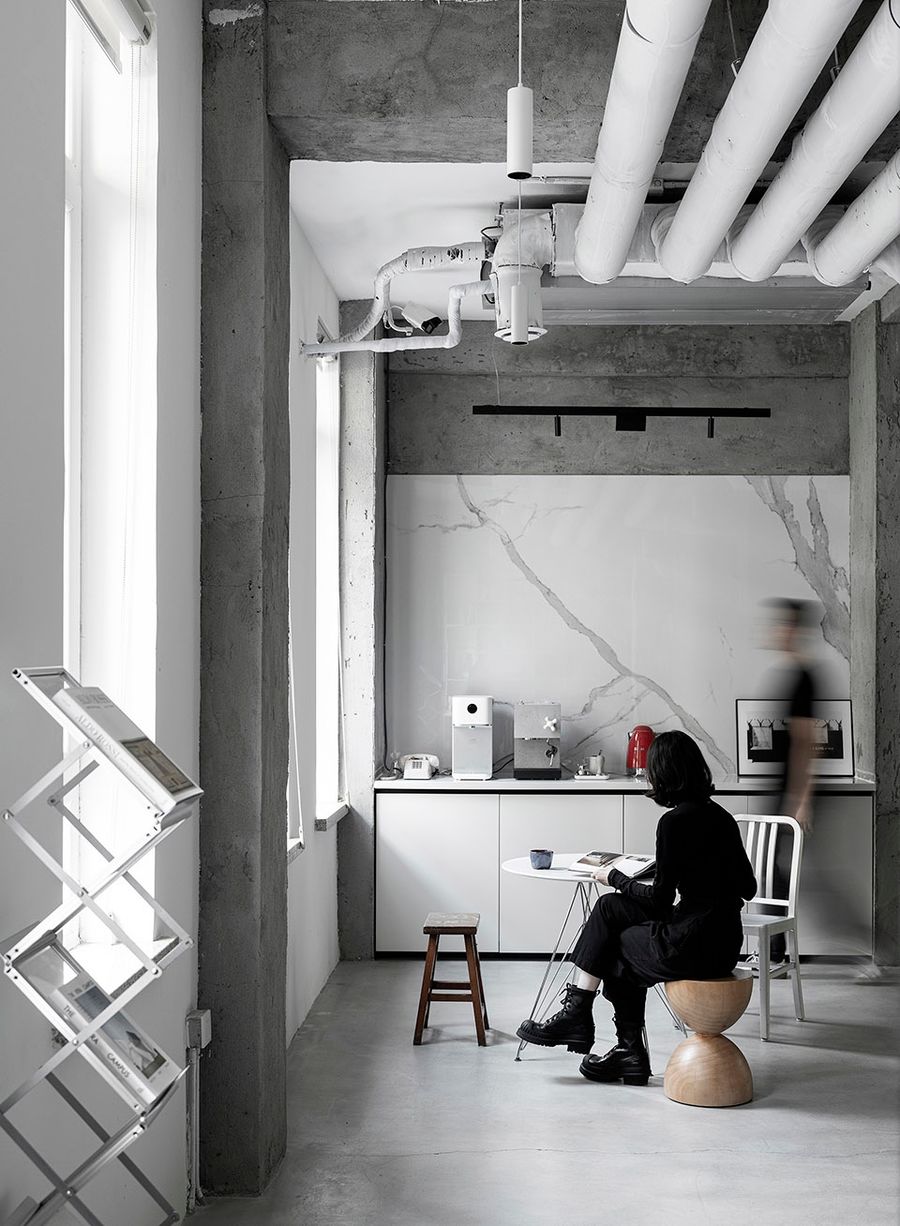
空间整体氛围是白菜的底色:雪白和雪灰。工作室保留了原始的梁和柱,此外的一切墙面或柜体皆为白色,通过内容的陈列营造空间的暖度和舒适性。
The overall color tone of the space is snow white and grey. We kept the original beams and column of the interior, giving everything else the same white color, including the walls and cabinets. The sense of warmth and comfort are created by curated display of contents.
▼水吧区
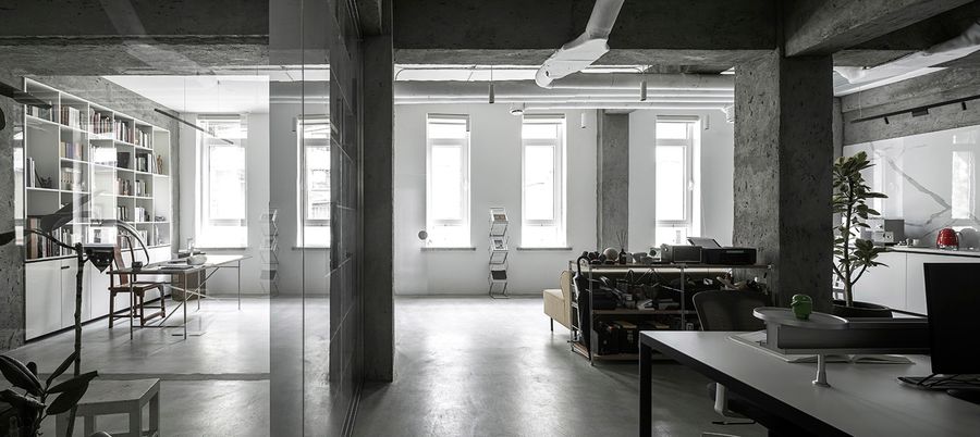
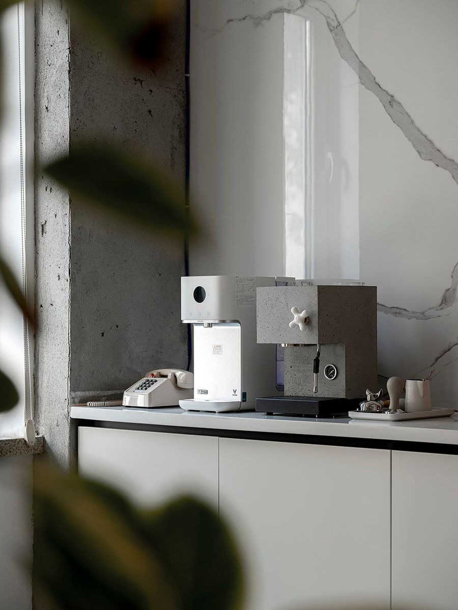
为了保障空间的视觉通透性和层次,运用了书架与玻璃划分出区域和动线,自然地规划出了工作区、活动区、水吧区和办公室。我们希望白菜是一个有光的空间,是有内容的、创造的,也是逻辑的、自由的。
To ensure the visual permeability and rich layers of the space, we use bookshelves and glass panels to define the zoning and circulation, where people can naturally walk between working area, event area, kitchen and offices. We want to make our studio a luminous space, with rich content, creativity, logic and freedom.
▼场地图
▼平面图
▼结构加固
空间名称:白菜设计工作室
空间地址:沈阳市和平区十四纬路15-2
设计公司:白菜设计
施工公司:沈阳大辽天境建筑装饰工程
结构设计:辽宁北方建筑设计院
照明设计:智境空间设计
建筑面积:206平方米
空间摄影:图派视觉


