好的发型设计能够“改变你的视角,甚至改变你的人生”。
With hair design, you can “change your perspective, change your life”
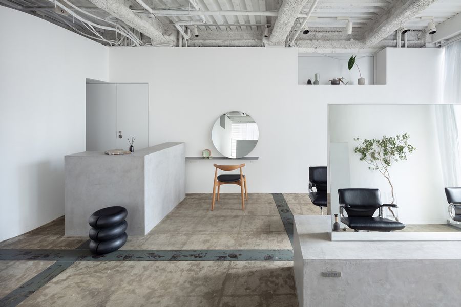
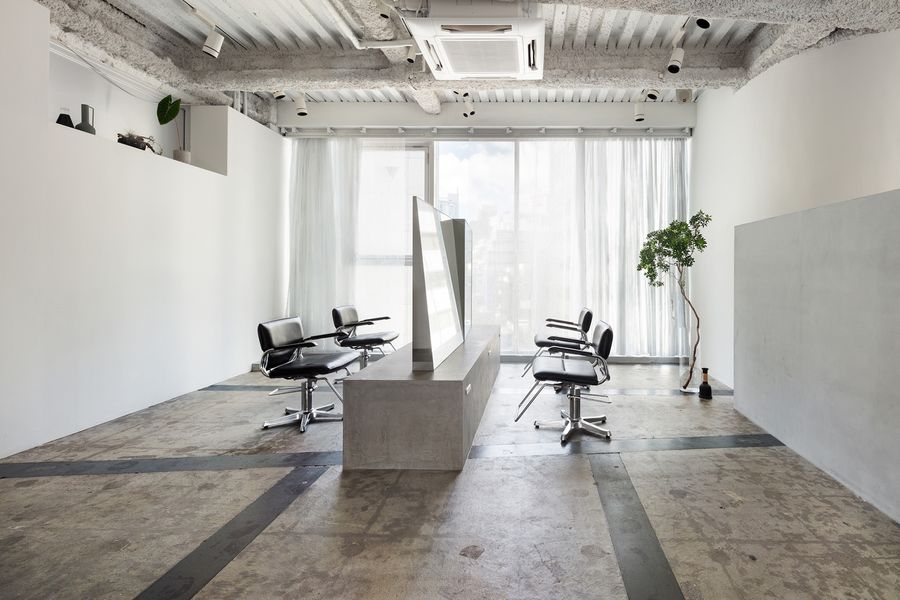
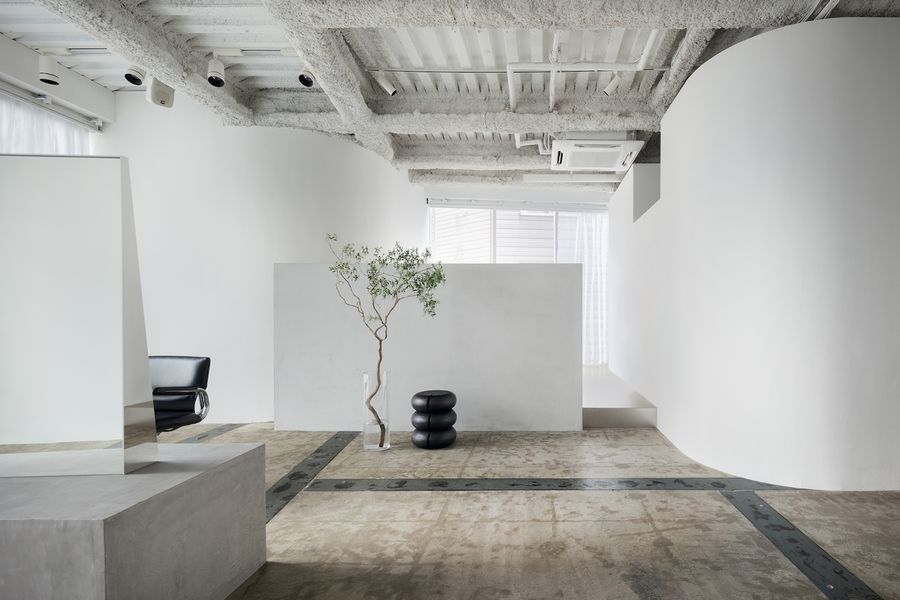
▼项目概览,overall of the project ©Takumi Ota
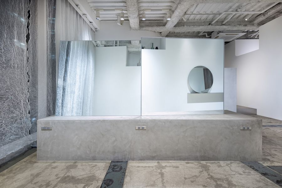
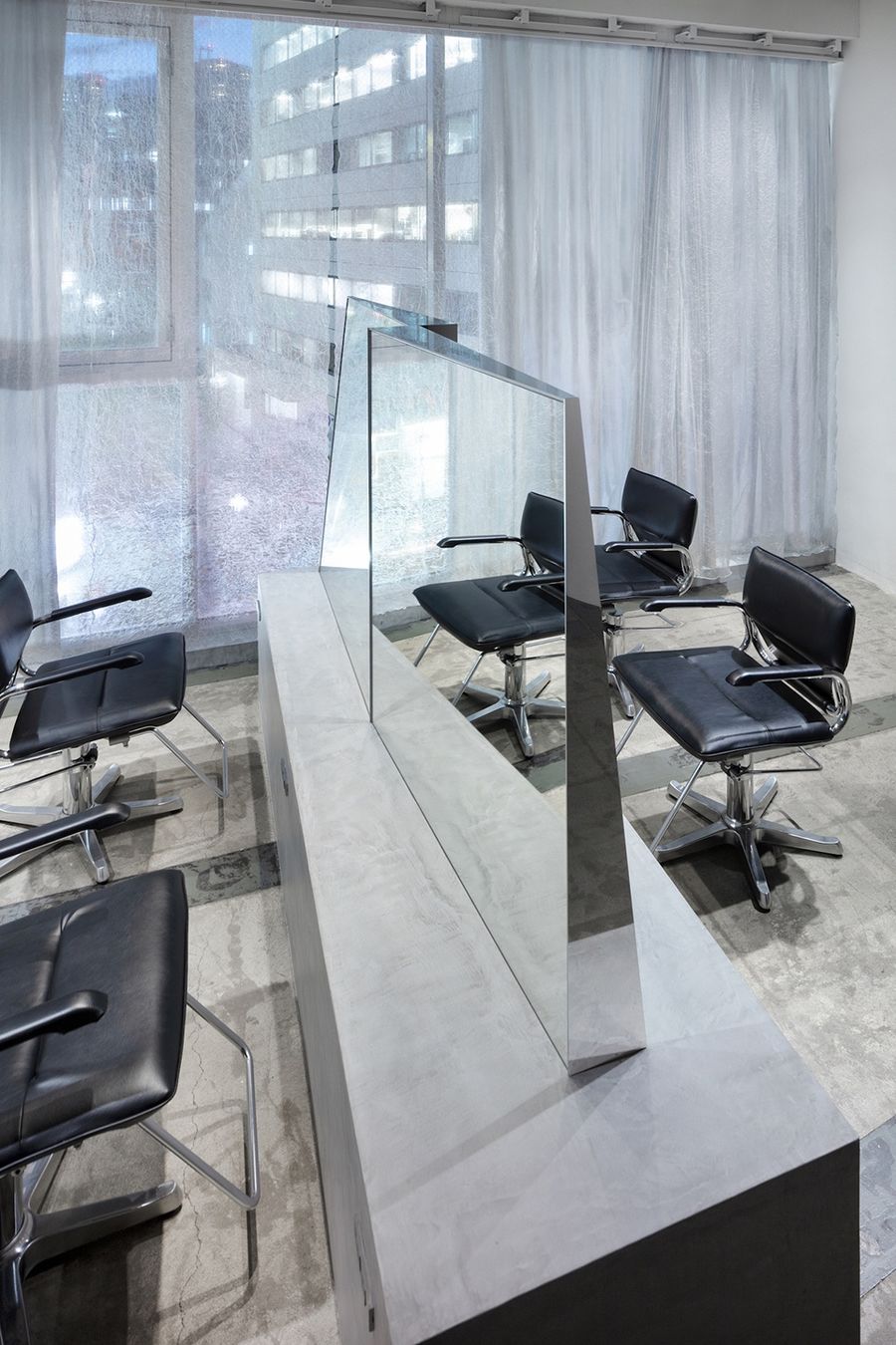
为了传达出这一理念,设计团队利用了多面镜子的组合,来创造出一种通过改变视角而改变人们对于空间认知的体验。
To symbolize that concept, I designed this multi-faceted mirror set to create a spatial experience that changes perceptions by shifting perspectives.
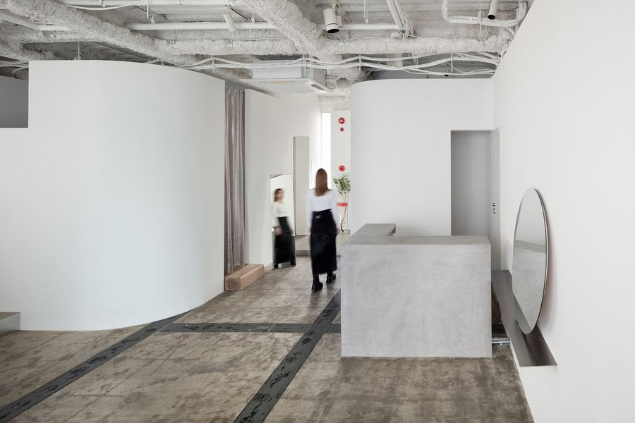
▼接待区,reception area ©Takumi Ota
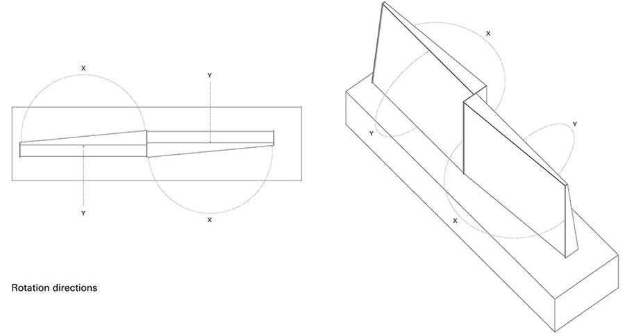
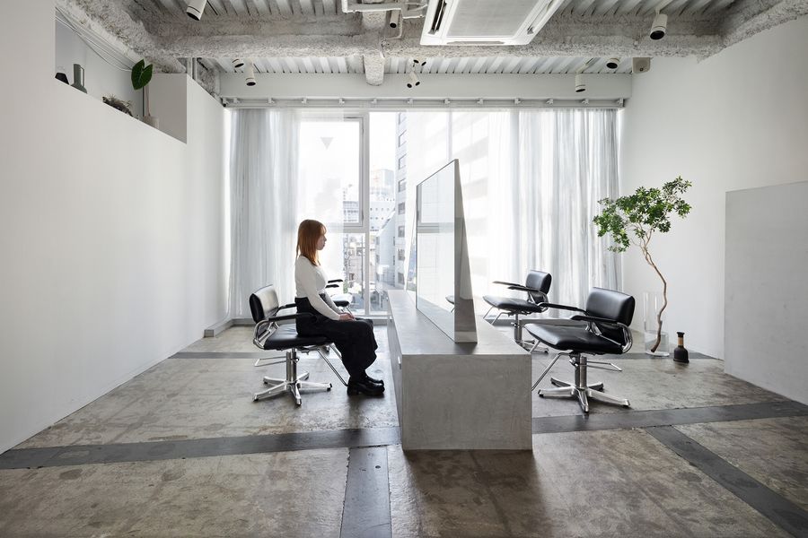
倾斜角度不同、相互错落的镜面为四组座位区提供了隐私,巧妙地避开了邻座的视线。
▼分析图,analysis diagram ©SIDES CORE
Mirrors given mutually contradictory tilts provide privacy for four seats by making it harder for lines of sight to cross, even between adjacent seats.
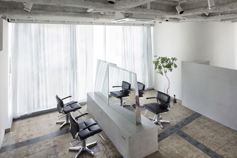
▼俯视理发空间,overlooking the salon ©Takumi Ota
▼理发区,haircut area ©Takumi Ota
▼相互倾斜的镜面保护了每个座位的隐私,angled mirrors protect the privacy of each seat ©Takumi Ota
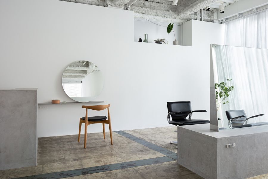
▼设计区,design area ©Takumi Ota
▼镜面细部,details of the mirror ©Takumi Ota
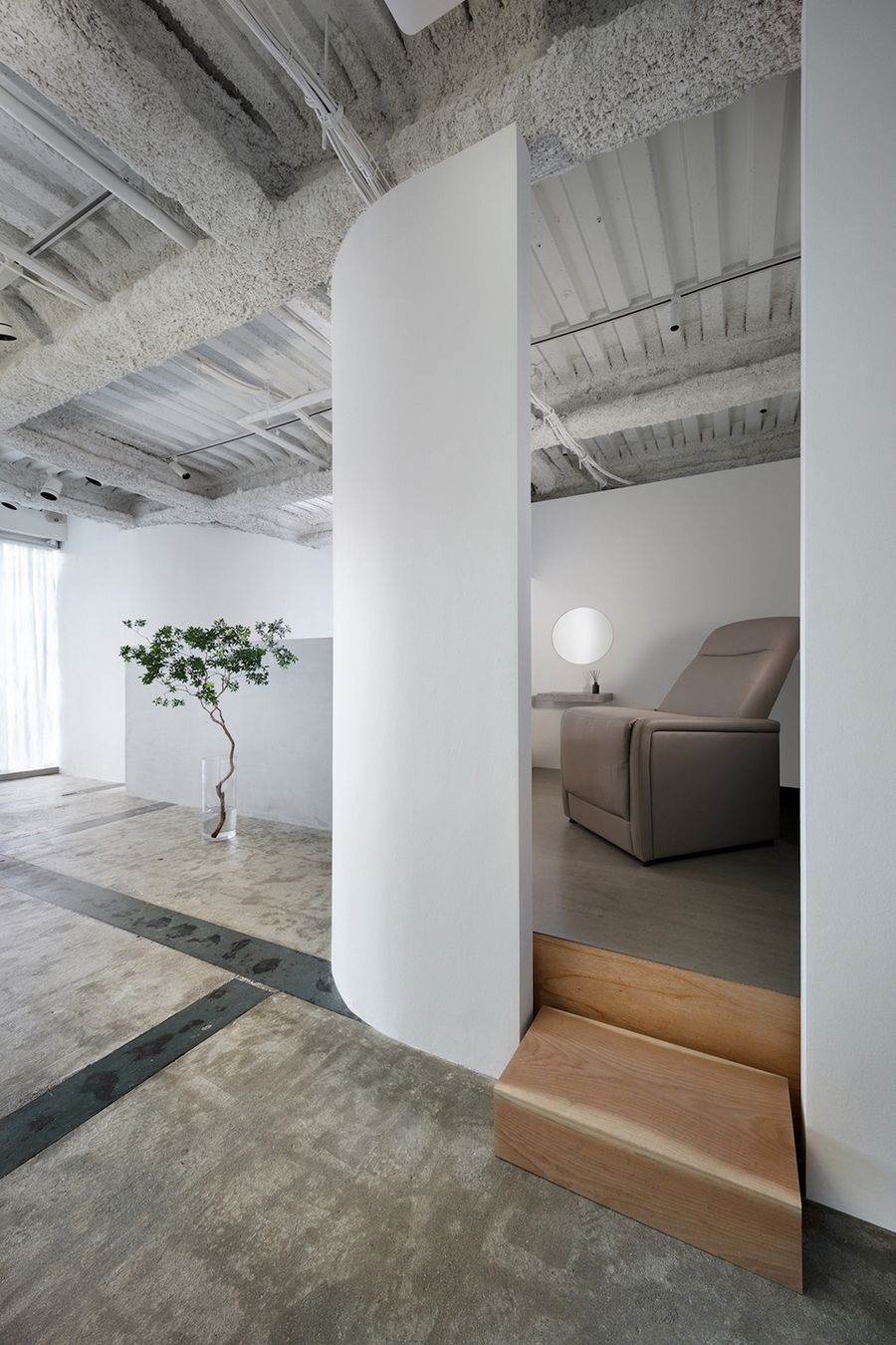
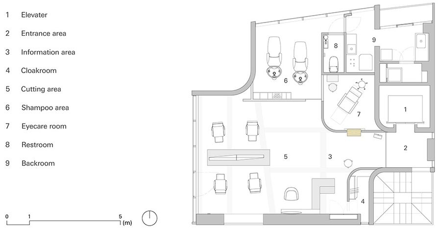
与镜子的线性设计相反,现有建筑的墙面以柔和的曲线塑造了空间的特点。全新的分区隔墙延续了这一空间语言,与原有空间融为一体。令人放松的个人护眼室隐藏在由曲面墙围合出的体量中,墙体断开的地方形成入口。通高的大型落地窗为室内引入充足的自然光线,曲面墙体再加上经过蒸汽银箔处理的窗帘,则进一步让进入室内的自然光线产生柔和、丰富的表达。所有的一切均反射在镜面中。
In contrast to the linear design of the mirrors, the existing wall surfaces of the building’s frame are composed of curves, and the new partitions blend into the space by adopting the same curves as their motif. The relaxing personal eyecare room is installed behind a slit in the curved wall. The curved wall, which catches natural light from the full-height windows to produce a soft, rich expression, is reflected in the solid mirror set, together with the curtains, which are treated with thin vapor-deposited silver foil.
▼由理发区看洗发区,viewing the hair washing area from the haircut area ©Takumi Ota
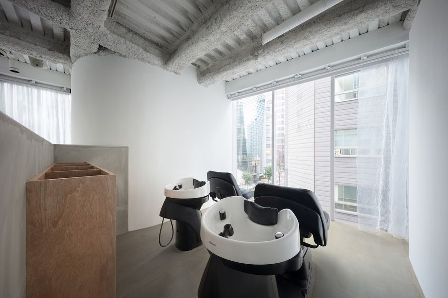
▼洗发区,hair washing area ©Takumi Ota
▼眼部护理区,eye-care area ©Takumi Ota
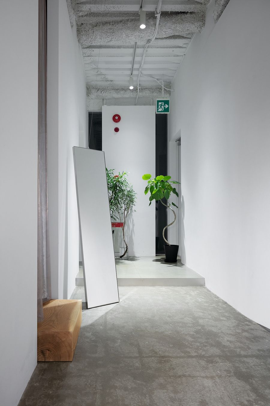
▼入口玄关,entrance area ©Takumi Ota
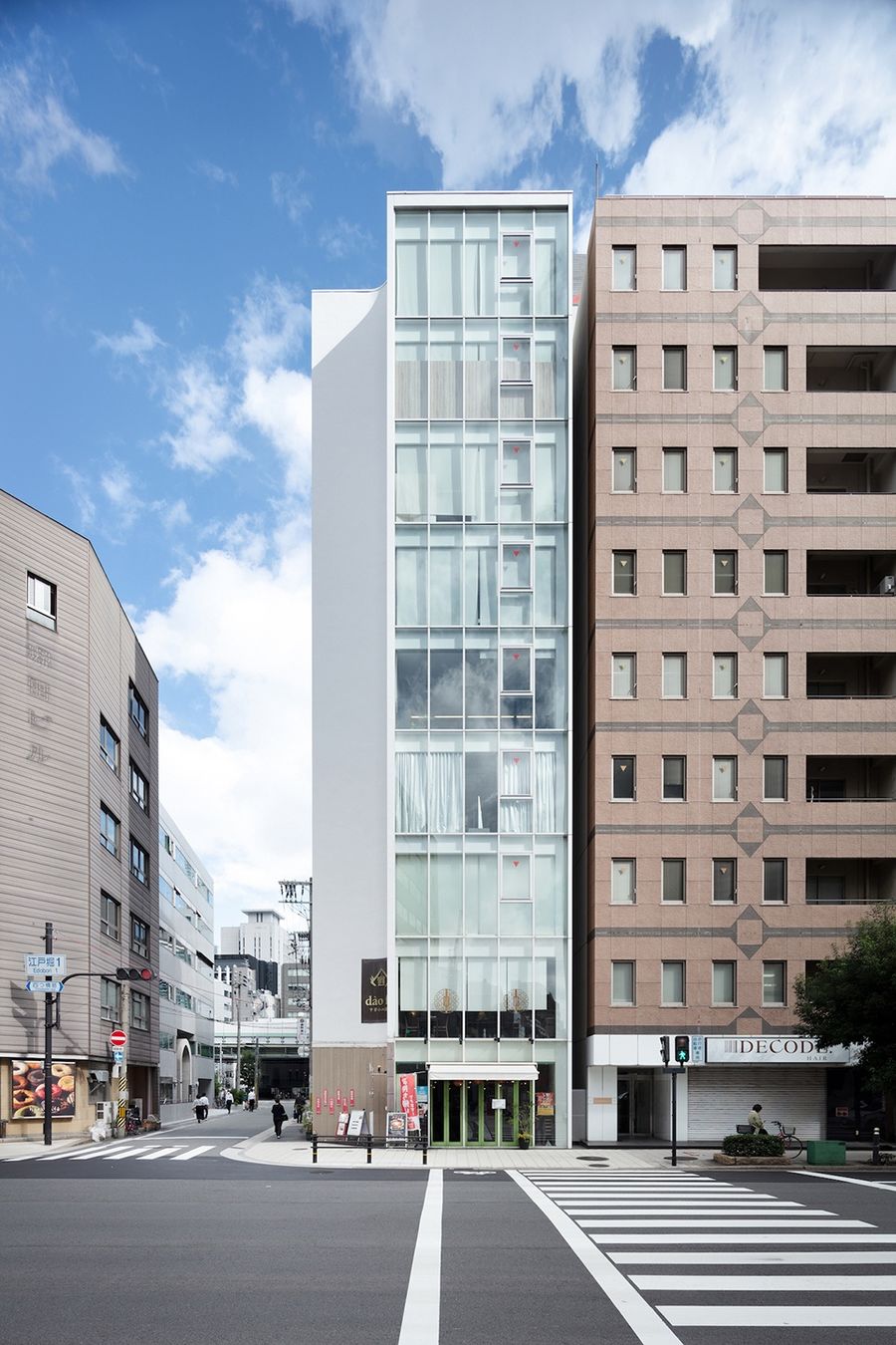
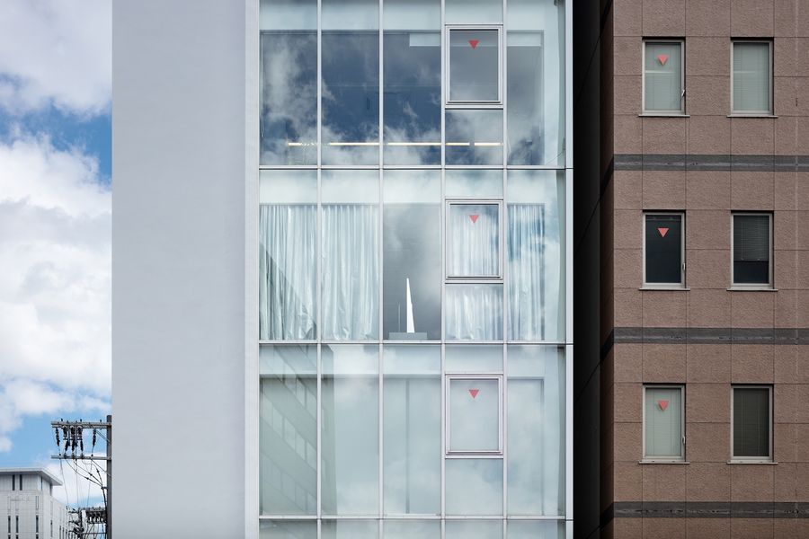
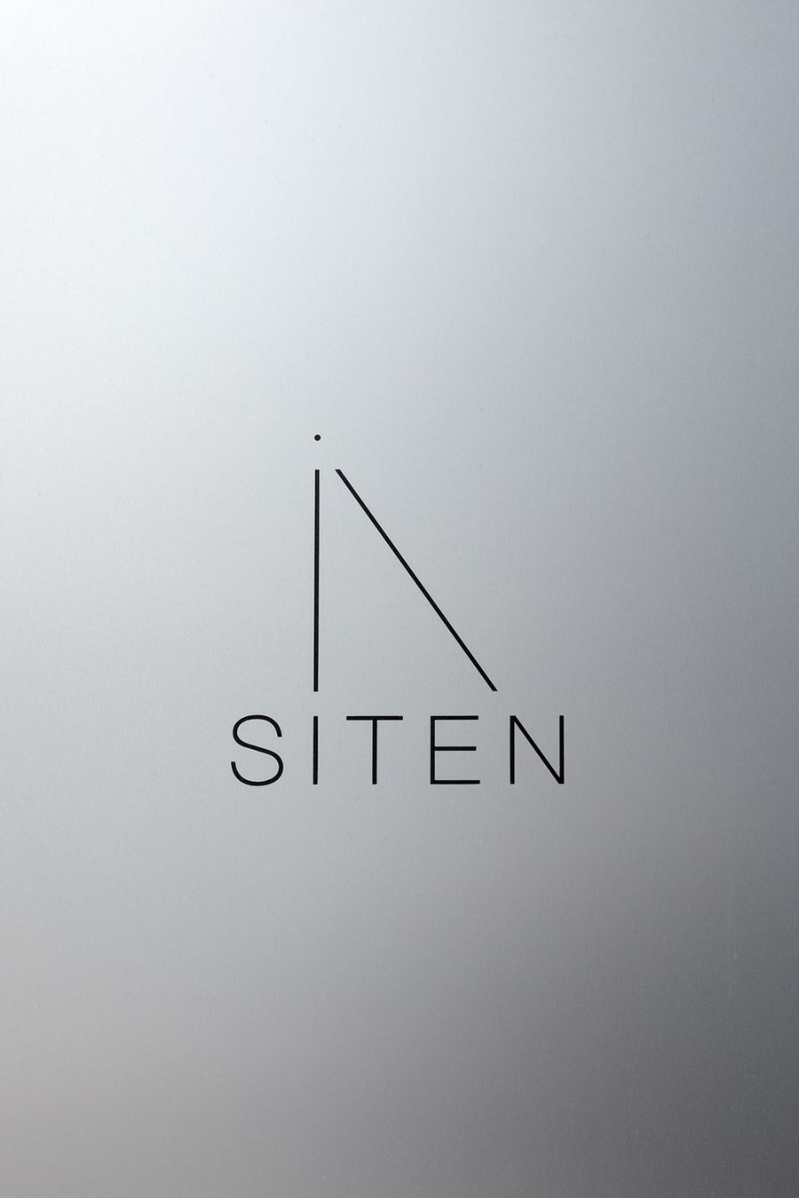
虽然沙龙坐落于大楼的四层,但是从街道的十字路口便可以清晰地看到镜子侧面的轮廓。垂直与倾斜轴线形成的镜子侧立面代表了沙龙的形象,与品牌logo产生共鸣,象征着“视角、视野、视点”。
Despite being on the fourth floor, the end face of the mirror set, shaped by its skewed axes, is visible from the intersection on the avenue. Serving as the symbol of the salon, it also resonates with the logo, which symbolizes perspective, field of view, and viewpoint.
▼沿街立面,exterior view of the salon ©Takumi Ota
▼从外部可以清晰地看到镜子侧面的轮廓,viewing the end face of the mirror set from exterior ©Takumi Ota
▼镜子与logo,the mirror and the logo ©Takumi Ota
透视的微妙变化所带来的舒适感,以及镜子中丰富的背景所投射出的空间,为沙龙营造出独一无二的空间氛围,值得人们来此亲身体验。
The comfort created by subtle shifts of perspective, and the space projected by the rich background in the mirrors, are worth experiencing.
▼平面图,plan ©SIDES CORE
Name: siten (https://y2yuuki.wixsite.com/siten)
Usage: Hair and eye salon
Size: 72.6m2
Spatial design: Sohei Arao
Logo and graphic design: Sumiko Arao
Design office: SIDES CORE (http://sides-core.com/)
Photography: Takumi Ota
Construction company: VENCER inc.
Lighting design: Daiko Electric Co., Ltd. and Yoriaki Kokubu
Address: Kadoma Bldg. 4F, Edobori 1-8-20, Nishi-ku, Osaka, Osaka Prefecture
Design period: April 15 to June 19, 2022
Construction period: July 1 to July 27, 2022
Date opened: August 3, 2022


