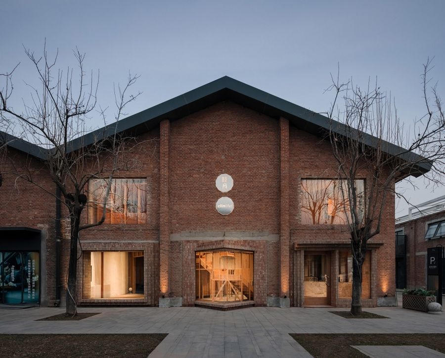
前身为北京纺织仓库的郎园station园区内,有一排建于六十年代的连续坡屋顶砖墙的厂房。 西涛设计工作室将其中的一个开间设计改造为家居设计品牌 – 吱音的展示空间。
Atelier tao+c has transformed an old textile warehouse into a showroom for ZIIN, an emerging furniture brand. The project site is part of Langyuan Station, which features warehouse with pitched roof and brick walls built in the 60s from last century.
▼项目外观,Exterior view © Wen Studio
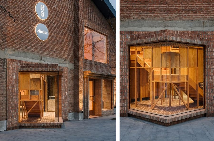
▼建筑外观近景,Close-up view © Wen Studio
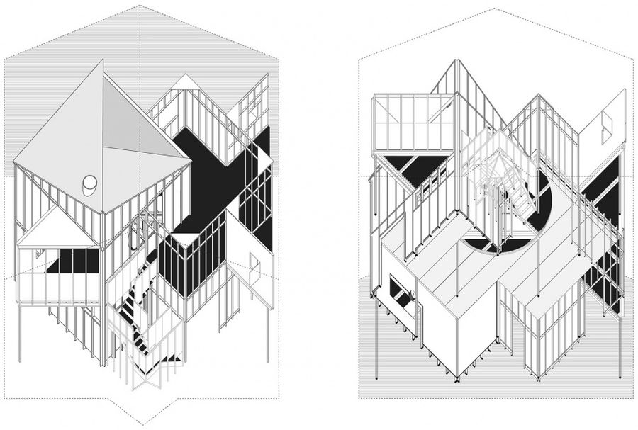
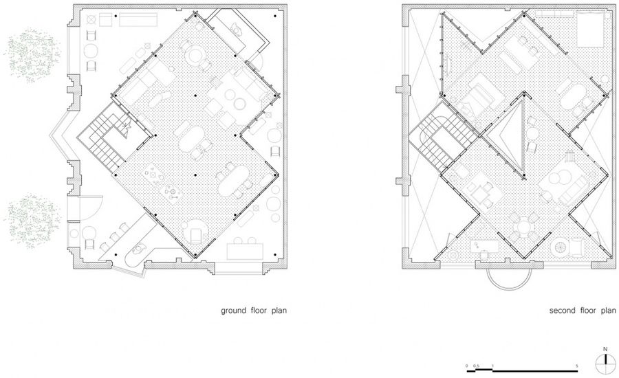
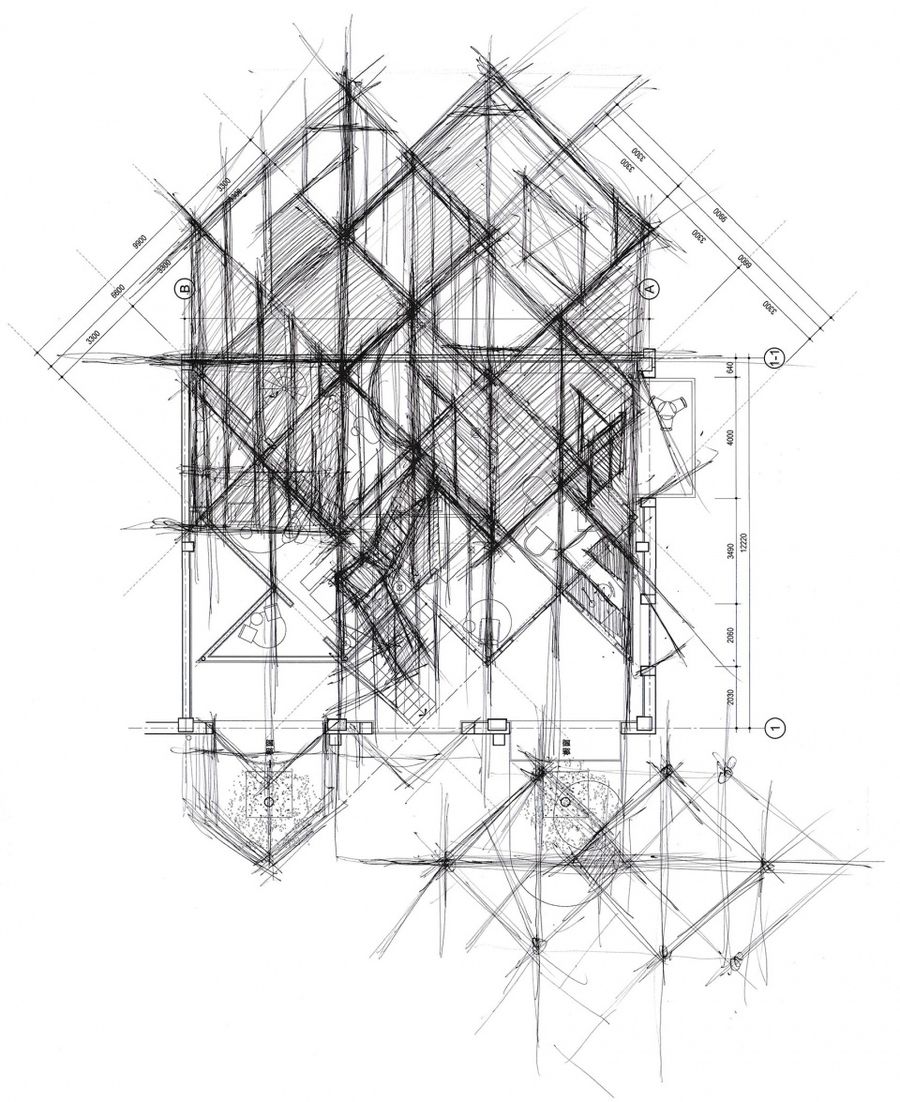
通过建立两个相交的方形构架,并旋转45度与原始砖墙保持贴近又脱离的关系,形成一个独立嵌套的屋中屋结构。于老厂房中寻求既有的场地和新的功能、展览和售卖之间的平衡。
Two intersected square frameworks were erected, meticulously rotated at 45 degree, staying sole as an individual structure while also connected to the original brick wall, which forms a separate “house within a house” journey. Atelier tao+c sought to balance the relation between the existing site with new functions, exhibition and sale, background and objects in the aged industrial space.
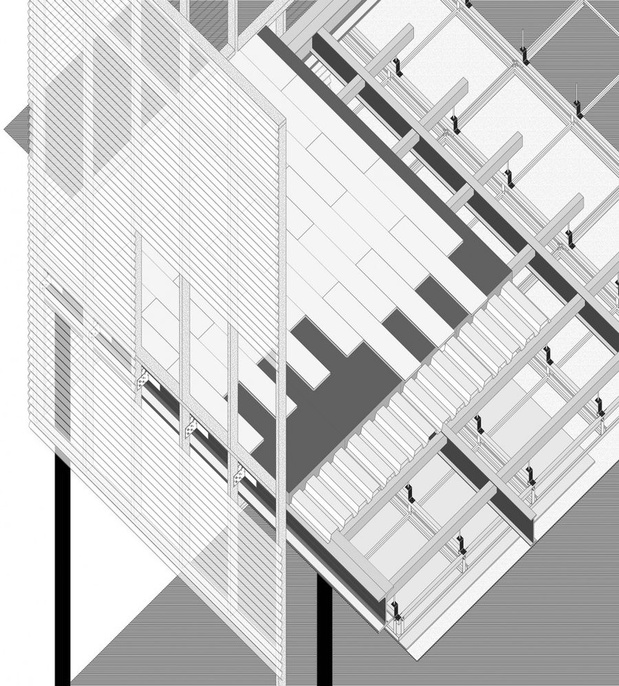
▼轴测图,Axon © atelier tao+c
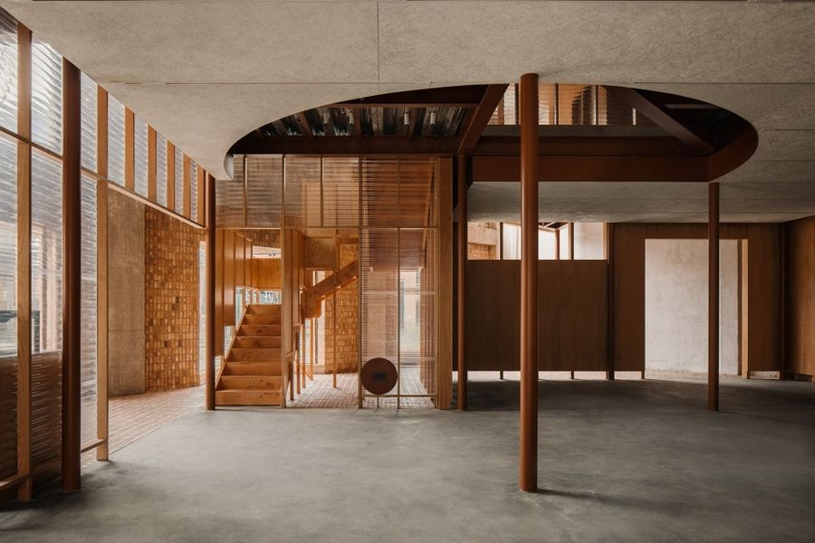
▼首层空间,Ground floor © Wen Studio
▼独立嵌套的屋中屋结构,A separate “house within a house” © Wen Studio
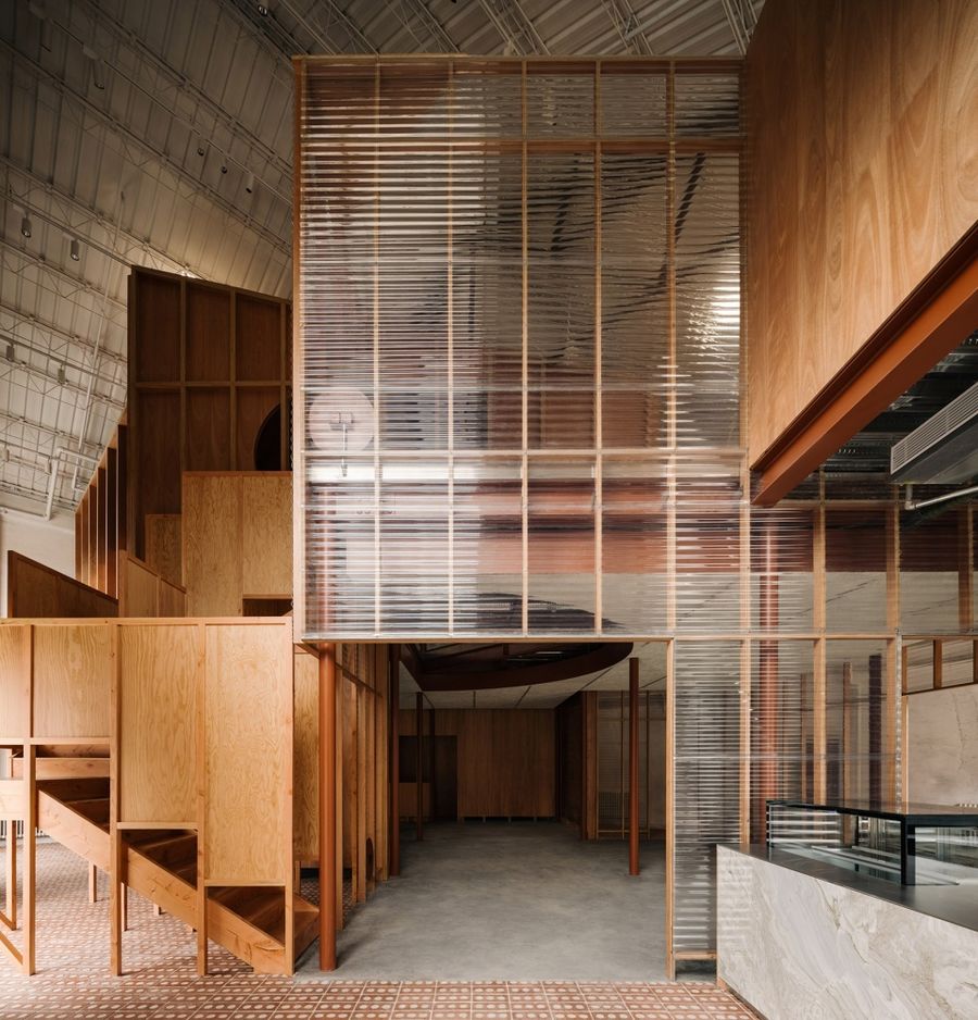
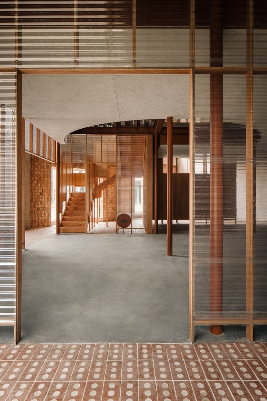
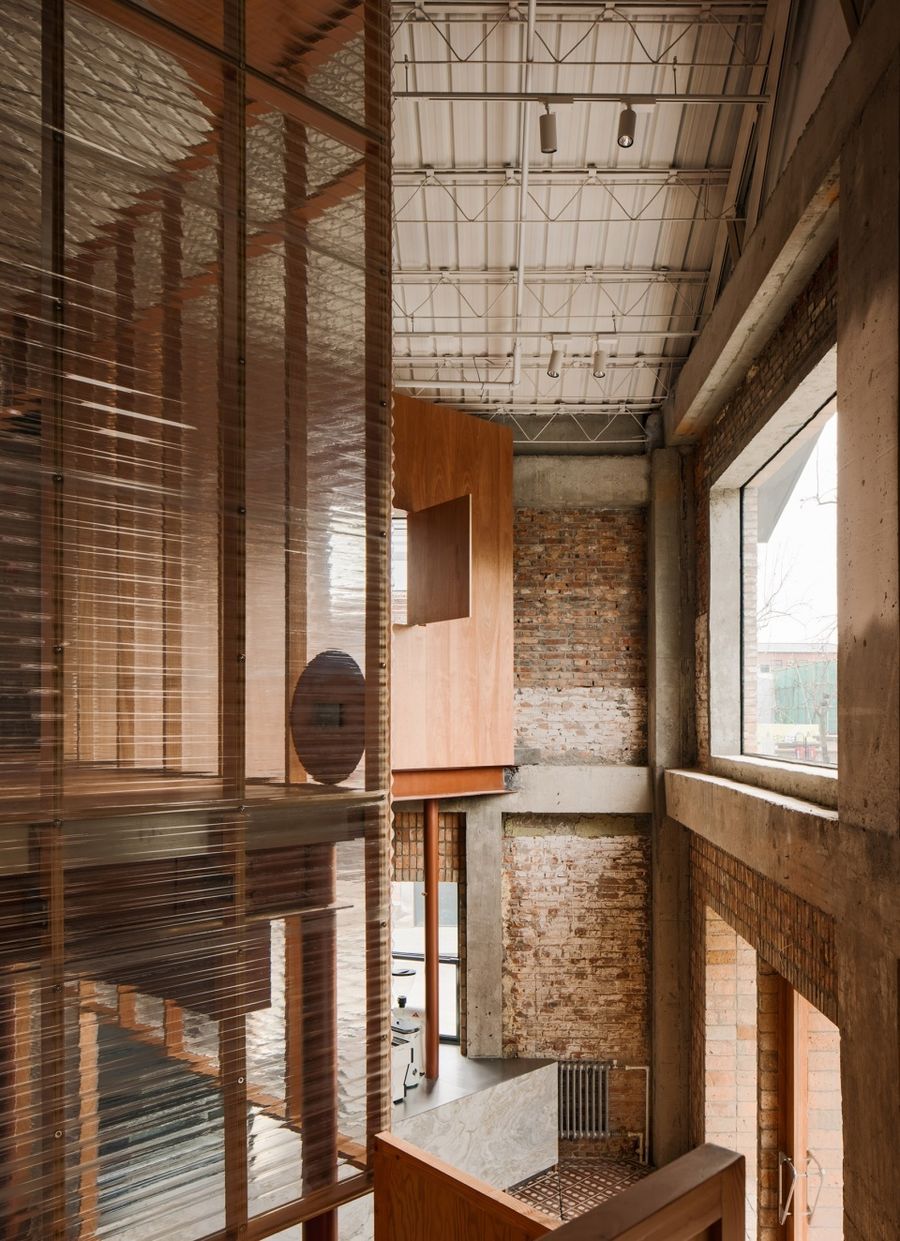
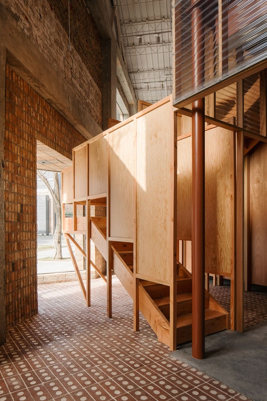
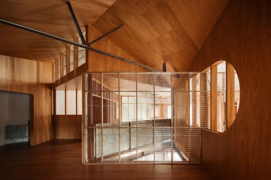
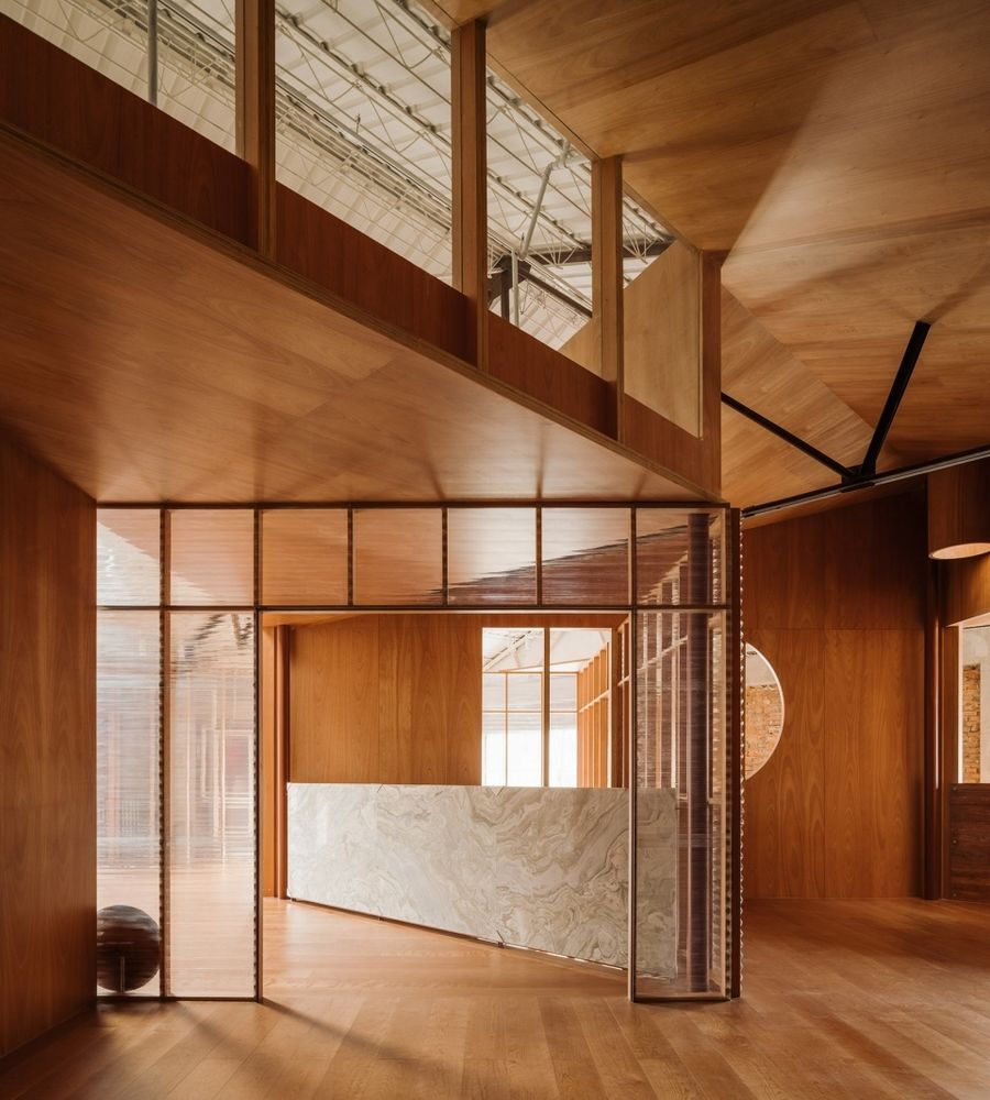
两个新构架,一个是透明的一个是实体的,相互交错成晶体状的结构。从入口进来,先看到的是一个木头骨架和波形板组成的透明的房子。阳光从南侧的窗户进来,穿透第一个房子, 照入深处的以木板包裹的房子,让人一眼就可以感知两个构架层叠的关系。相对于边界45度的放置,让对角线关系成为了空间的新秩序和方向,拉长了视觉和行走体验的纵深感。
The two interlaced frameworks were treated divergently in transparent and solid, establishing a crystal-like structure. The first hint of the interior space is suggested to the public by a transparent house, cladded with corrugated polycarbonate panels. Most days, the sunshine is welcomed from the south window through the front house to the back one wrapped in timber panels, proposing the overlapping relation of the two stacked frameworks. Comparatively being positioned at 45 degree, the diagonal direction marks a new spatial order and circulation, enriching the depth both visually and experientially.
▼透明构架和实体构架相互交错 © Wen Studio
The two interlaced frameworks were treated divergently in transparent and solid
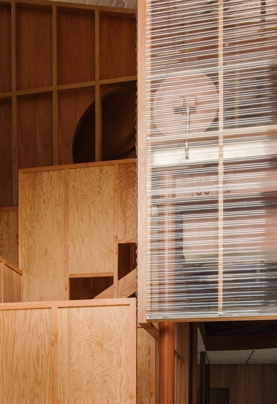
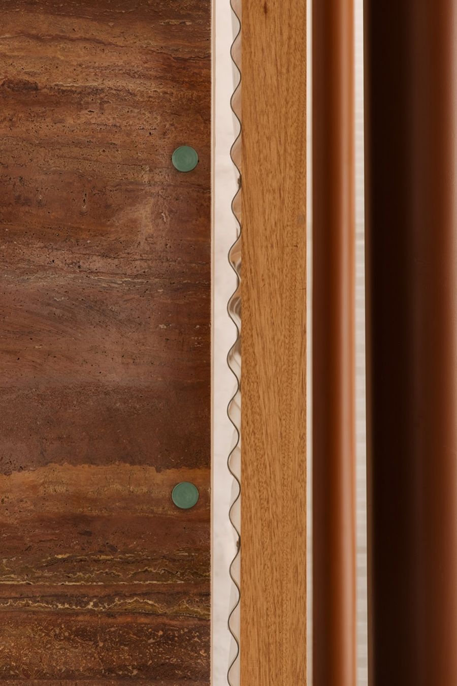
▼木头骨架和波形板细部 © Wen Studio
Detailed view of the corrugated polycarbonate panels
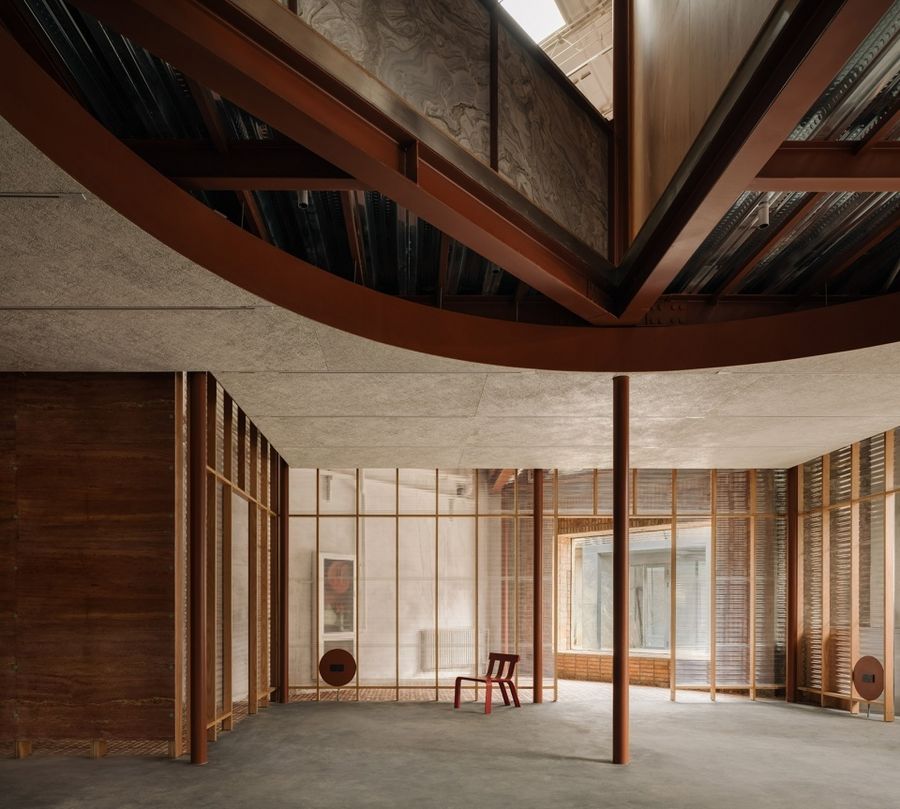
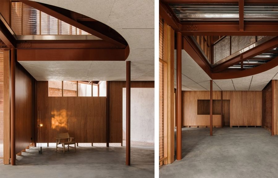
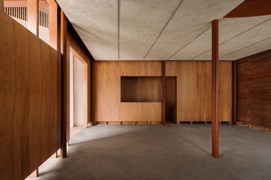
构架由两组完全一致的柱列组成,也形成了连续的房间单元序列。每个单元是通用均质的,单元之间又是相通渗透的,为各种松散定义的活动引入灵活变化的可能性。
The carefully curated structure also groups homogeneous rooms in a continuous sequence organized in two sets of identical columns, wherein one designated room leads into another. This route brings, both for different events and spontaneous gathering, flexible places with different possibilities.
▼相通渗透的单元,The continuous sequence of rooms © Wen Studio
▼开放灵活的空间,Open, flexible space © Wen Studio
▼室内空间,Interior view © Wen Studio
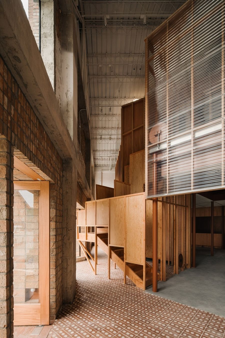
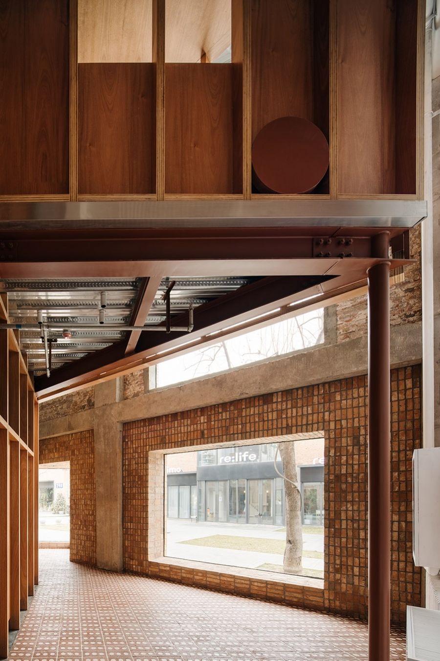
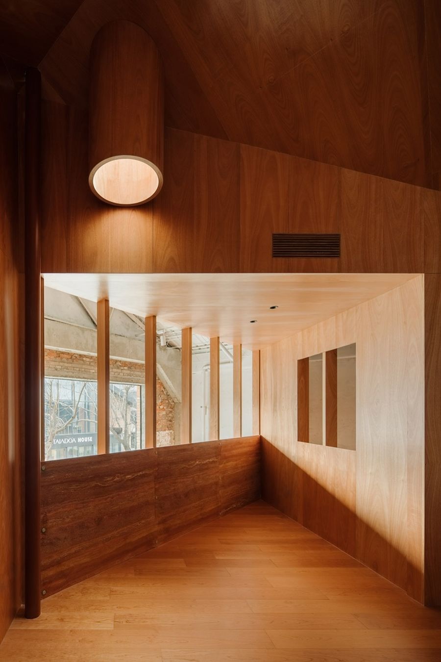
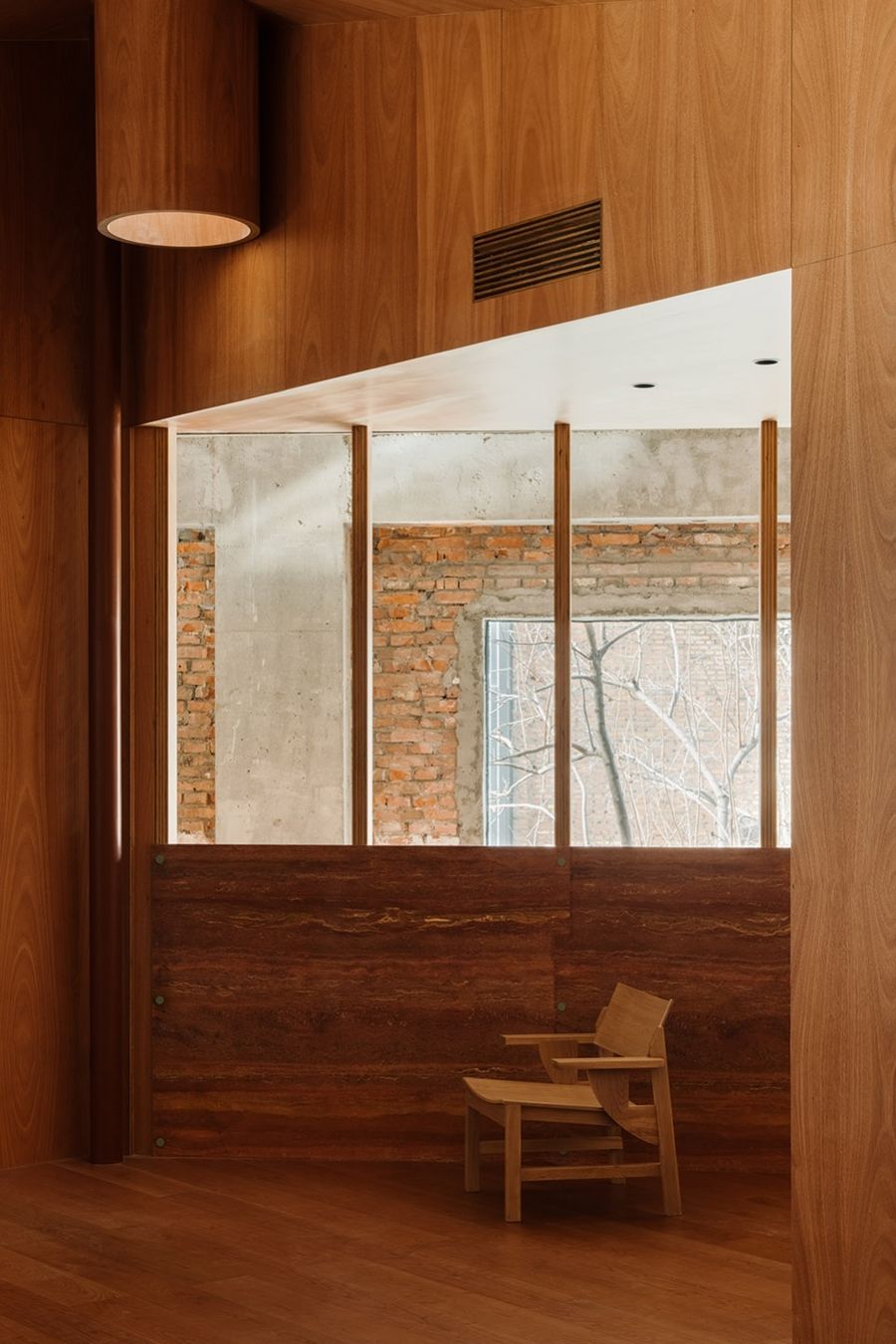
原砖墙之内和新构架之外的剩余空间,有一种介于半室内半室外的场所感。从新置入的房子二楼因势随形地探出一些三角阳台、凉棚和楼梯,适应性的引入意外的空间,成为项目中有趣的元素。
The negative space, in between the existing brick walls and the new frameworks, that flows along the perimeter, introducing the notion of “semi-interior and semi-exterior”. On the mezzanine floor, unexpected space of triangle balcony, pergolas and staircase were adaptively molded into the new inserted dwelling according to the circulation, becoming interesting elements embedded in the project.
▼新构架与既有砖墙间的关系 © Wen Studio
The relationship between the new frameworks the and the existing brick walls
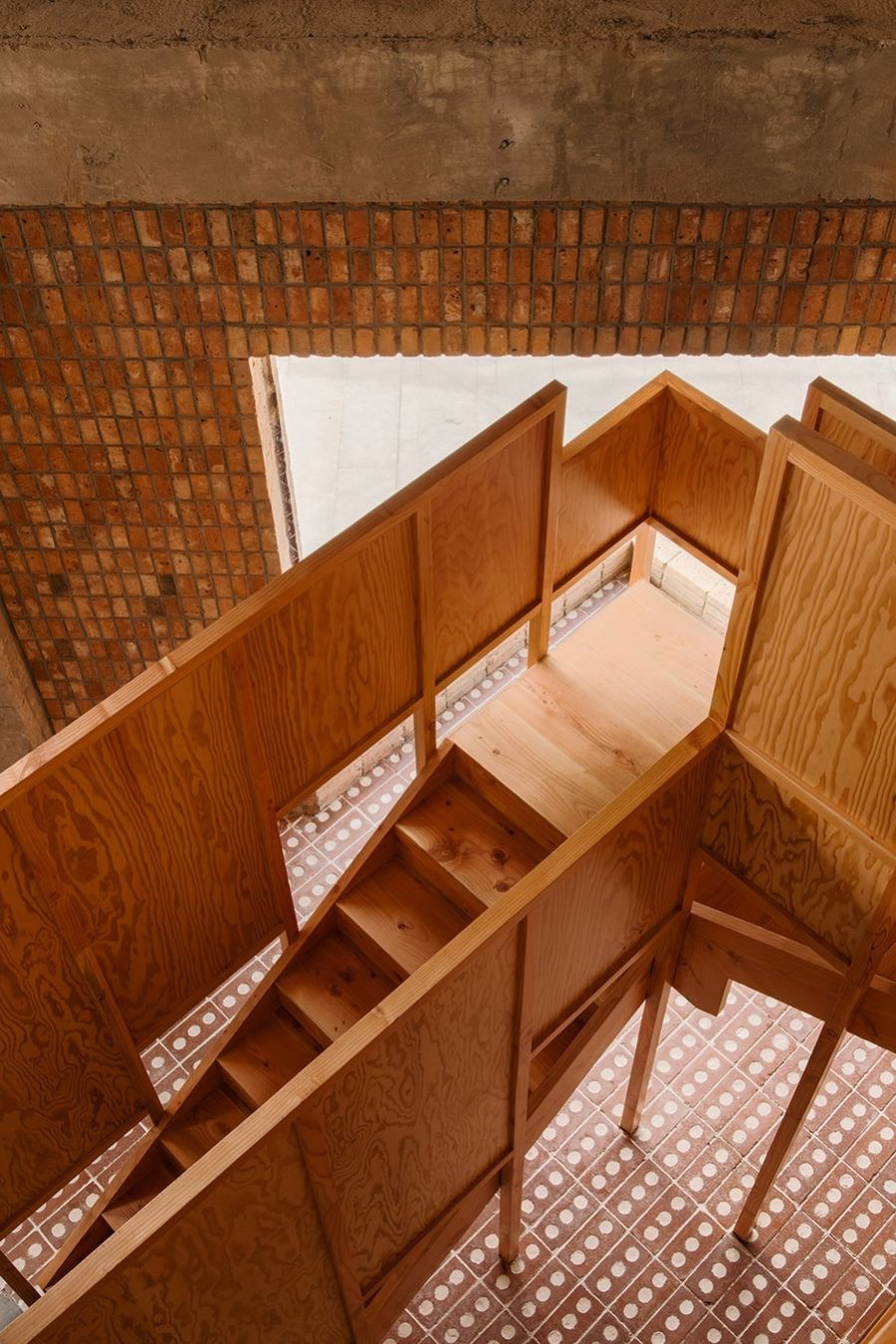
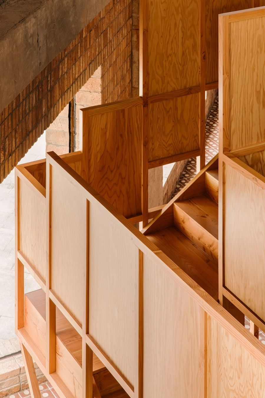
楼梯就处于一个局促的三角区中,从转角处冲出外立面顺势形成一个三角玻璃盒,表达建筑边界与内部构件之间的张力。这些离散的结构元素,在成为一个不可分割的整体的同时又彼此分离,呈现各自的独立性和相关性。
The staircase has been placed in a rather constricted area, ‘seeping out’ purposefully and generating a glass box on the façade in triangle shape, thus the tension between architectural boundaries and interior components could be revealed. These scattered structural elements were employed as an integration while detached from one another, presenting its independence and similarities.
▼从首层望向木构架,View to the solid structure from the ground floor © Wen Studio
▼楼梯,Staircase © Wen Studio
▼二层空间,Second floor © Wen Studio
▼二层房间细节,Interior detailed view © Wen Studio
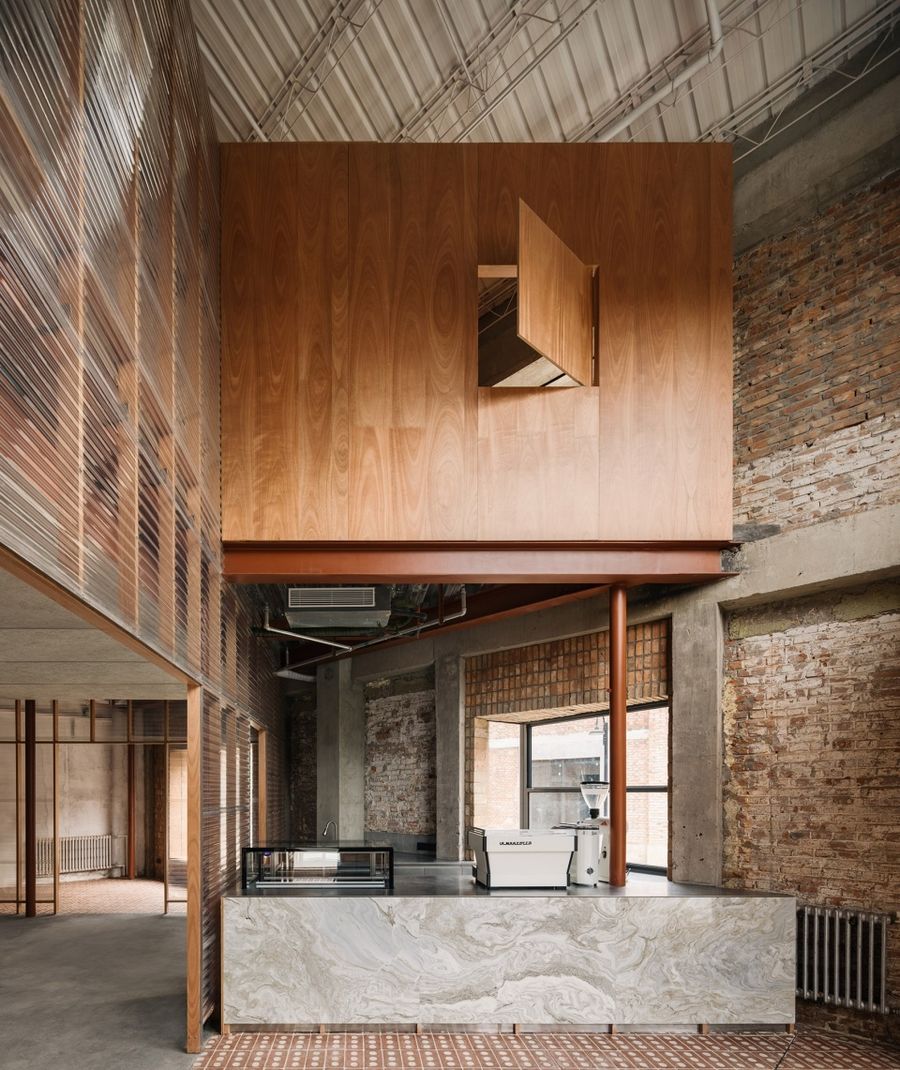
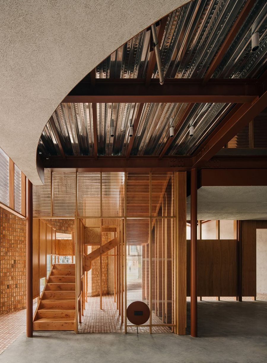
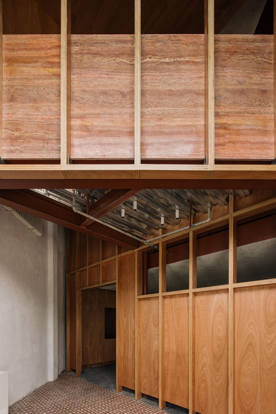
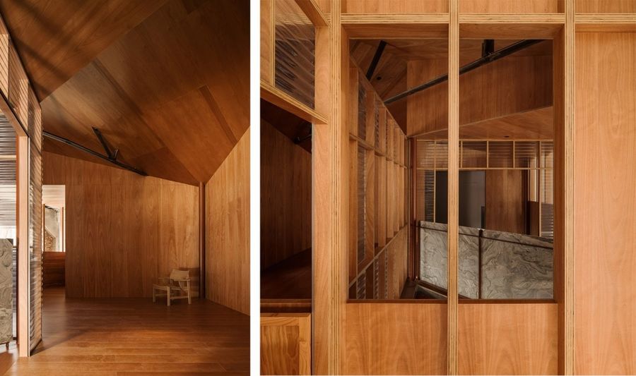
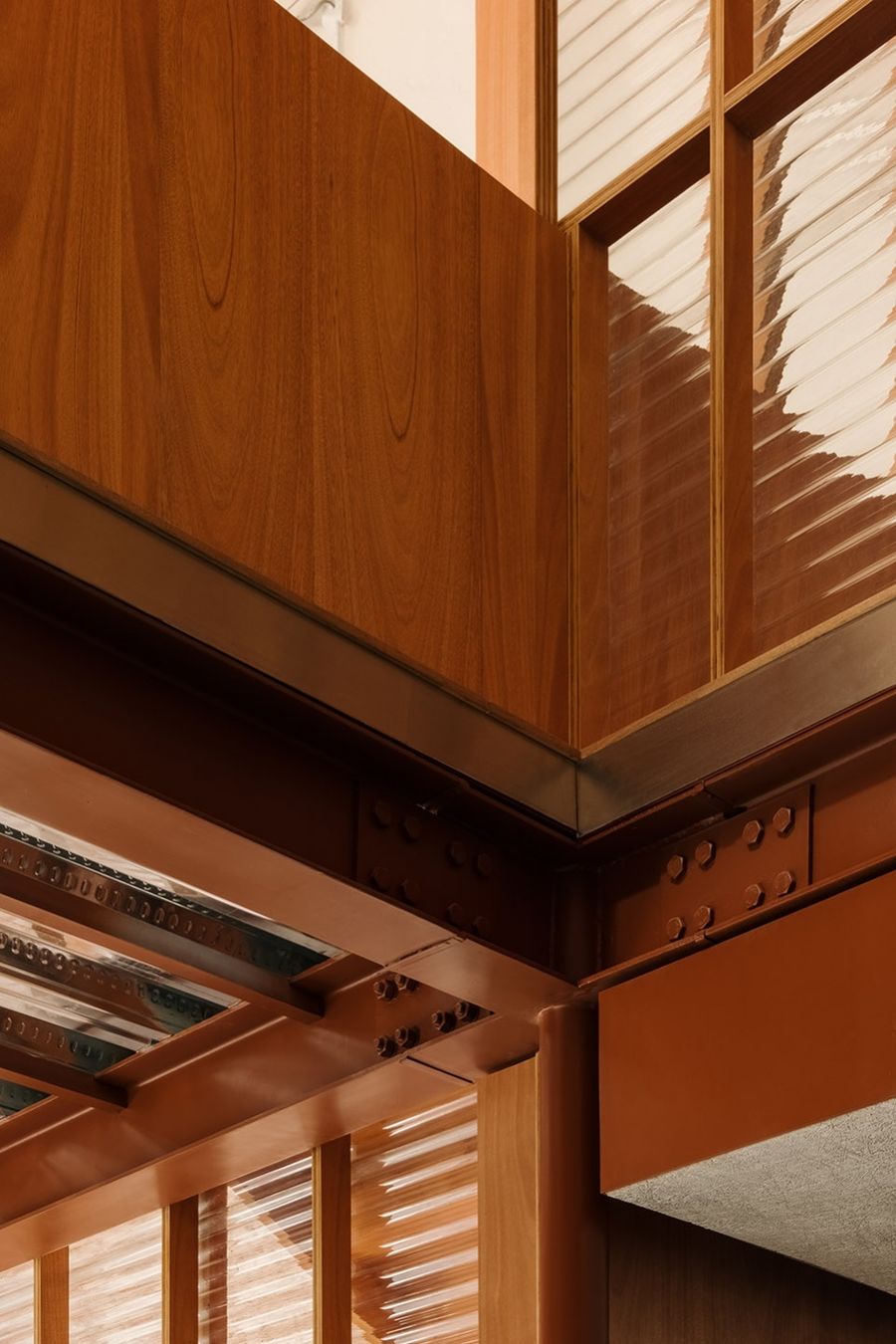
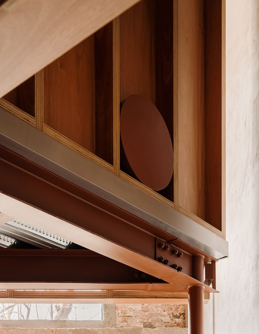
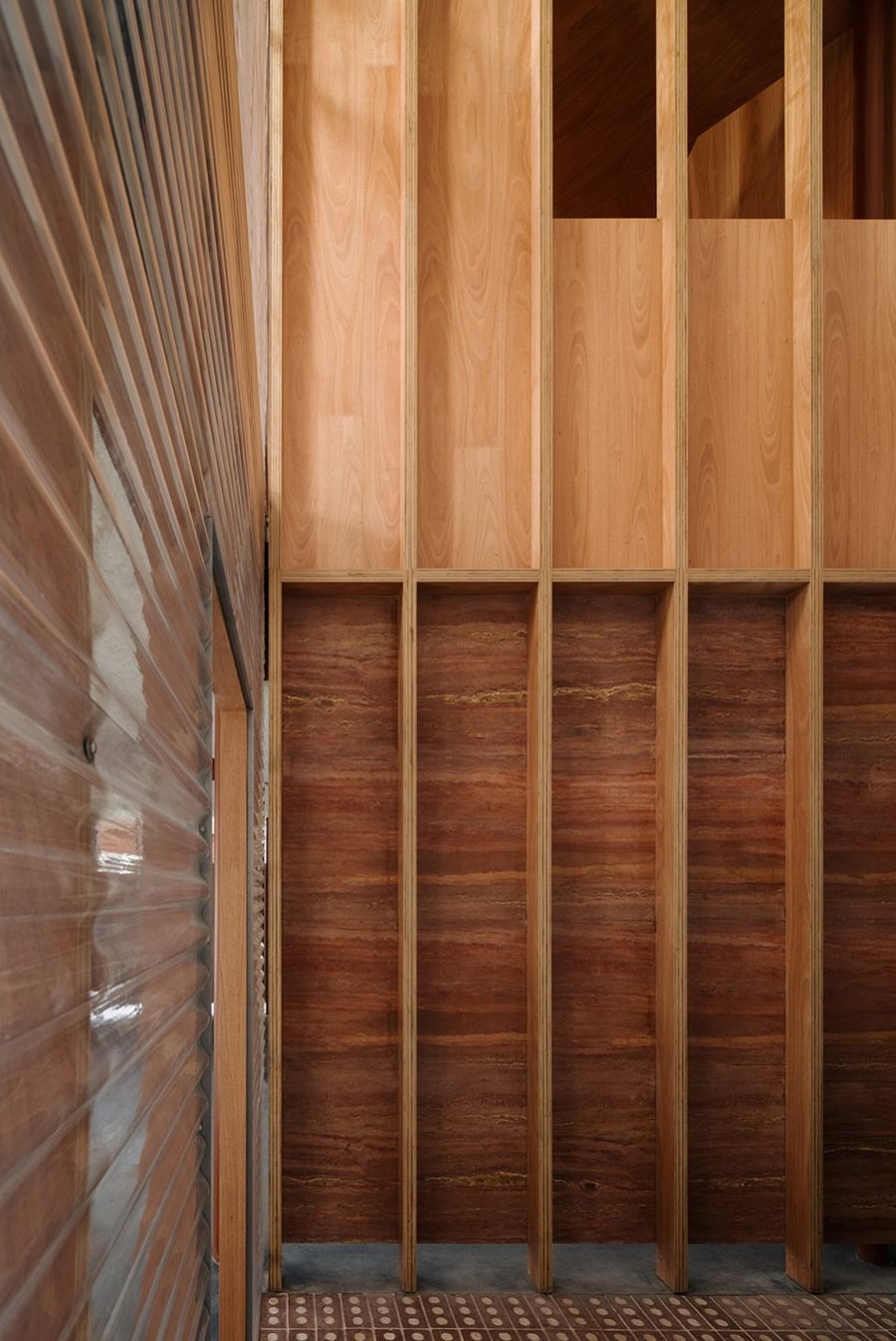
在这个室内建筑中我们尝试构造的袒露做法,表达结构本身的叙述性。从钢结构骨架、木柱框架、墙体辅助构造层到装配的材料面层,每个构件的归属是清晰可辨的。在两层之间的挑空处,从浇筑楼板的钢承板到工字钢梁,到设备管线层和天花吊顶,层层施作的构造做法叠加的痕迹像土壤分层一样。完成的构架既显示出设计过程,也显示出建造和装配过程,讲述着结构是如何被搭建出来。
Atelier tao+c aspires to capture the authentic craft of construction and express the narrative of structure itself. From the steel structure, timber frame, the substructure of walls to the assembled finish panels, every component is visible and traceable. Each layer of the structure was superimposed during construction, amplified from the steel floor decks to the I-beam, the ducts, piping layer and the dropped ceiling, simulating layers of the earth, clear and identifiable to the viewer. They are both the structure and the finish, recording both the design process and the construction process, vividly telling the story of how the frameworks were built.
▼每个构件的归属是清晰可辨的 © Wen Studio
Every component is visible and traceable
▼结构细节,Structure detailed view © Wen Studio
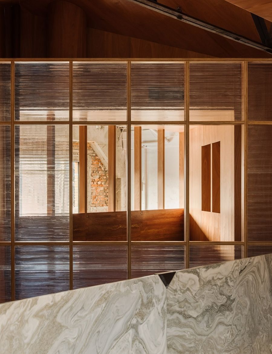
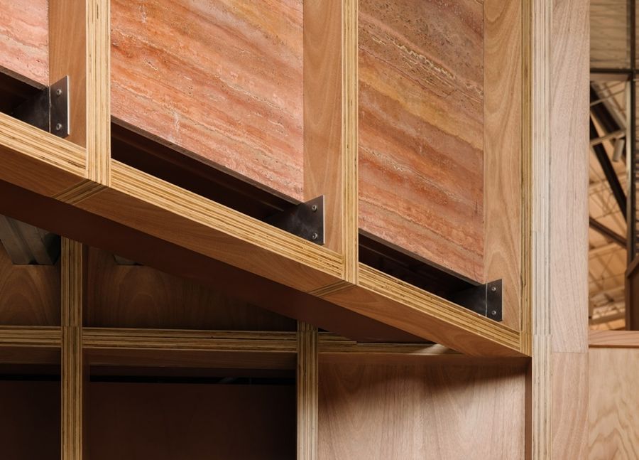
项目中使用的都是常见即用的工业化生产出来的标准材料产品。结构标准件、型材、木头、 大理石和红砖水泥,各种材料不分贵贱、粗糙或是光滑,消除了等级差别,构造层也是完成面。通过寻找普通标准化材料的特性和组合方式,重组并置于一个立面上,每一个节点都被描述,形成了温暖舒适又轻松有趣的场景。
Common industrial materials, particularly standard steel beam, profiles, timber and bricks, make up the finish of project structure regardless of cost and grading, roughness or smoothness. By adopting this material selection, we aspire to eliminate the hierarchy, simultaneously making no distinctions in Ziin Store. The inherited character of ordinary materials was studied and their juxtaposition were re-combined on one elevation, narrating an embodiment of every detail design while projects a warm and fun scene. This is an effective cost-control project that uses basic formal logic, mundane materials and construction techniques to deliver a deep expression of adaptive re-use space and details.
▼材料细节,Material details © Wen Studio
▼构造细节,Detail drawing © atelier tao+c
▼平面图,Plans © atelier tao+c
▼设计草图,Sketch © atelier tao+c
设计事务所:atelier tao+c 西涛设计工作室
项目类型:建筑改造,展厅设计
场地地址:中国北京
完工日期:2022.03
室内面积:186 sqm
设计团队:刘涛,蔡春燕,宋浩嘉, 王唯鹿、蔡晶莹(实习)
主要材料:水曲柳多层板,花旗松,波形板,木丝板,工字钢,钢承板,红砖 大理石
产品:吱音
施工团队:上海添赐建筑装饰有限公司
摄影师:Wen Studio
Architect: atelier tao+c
Project Type: adaptive reuse, showroom design
Site Location: Beijing, China
Completion Date: 2022.03
Area: 186 sqm
Design Team: Tao Liu, Chunyan Cai, Haojia Song, Weilu Wang,
Jingying Cai (intern)
Materials: ashtree laminated board, corrugated polycarbonate panels, firber cement board, brick, marble
Products: ZIIN
Construction Firm: Shanghai Tianci Architecture Deco, Limited, Co
Photographer: Wen Studio


