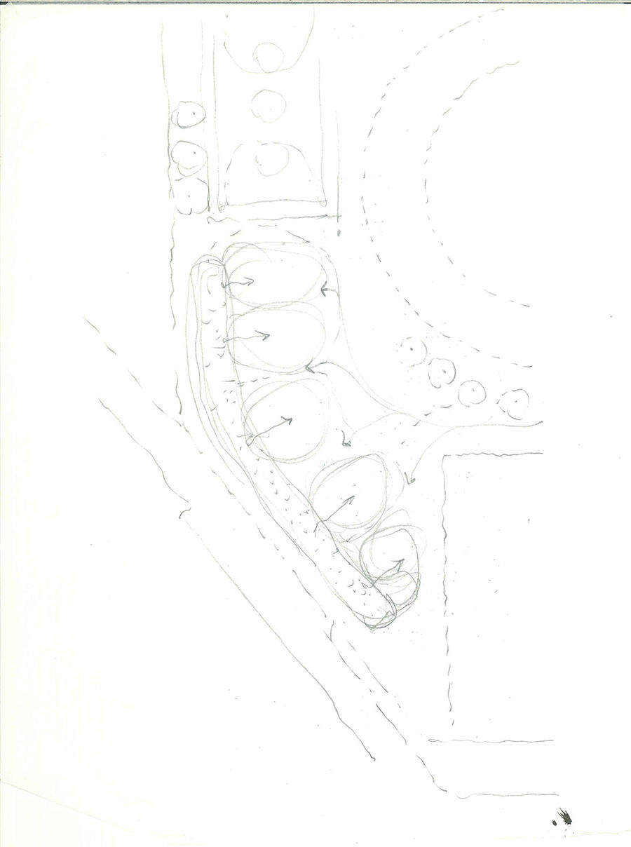
台湾幼儿园现状
The current situation of kindergarten in Taiwan由于台湾人口出生率的下降,越来越多的学校习惯于把小学里的闲置教室直接当作幼儿园使用。然而,幼儿园真的需要教室吗?境衍設計与林柏陽建築師事務所给出的建议是:为闲置的教室赋予其他功能,例如社区大学学堂等;而幼儿园则应该更多地融入城市的小角落与自然环境。
Because of the reduction the birthrate, more and more school get use to fill the program of kindergarten directly into the empty elementary school classroom. However, do kindergartens really need classrooms? We suggest the empty classroom could be another use such as community college classroom, and kindergarten should be more engage with little corner and nature environment.
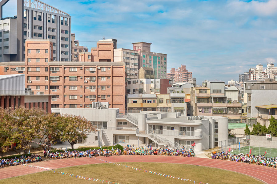
▼项目鸟瞰
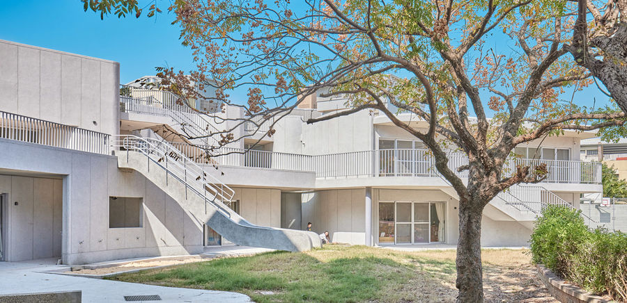
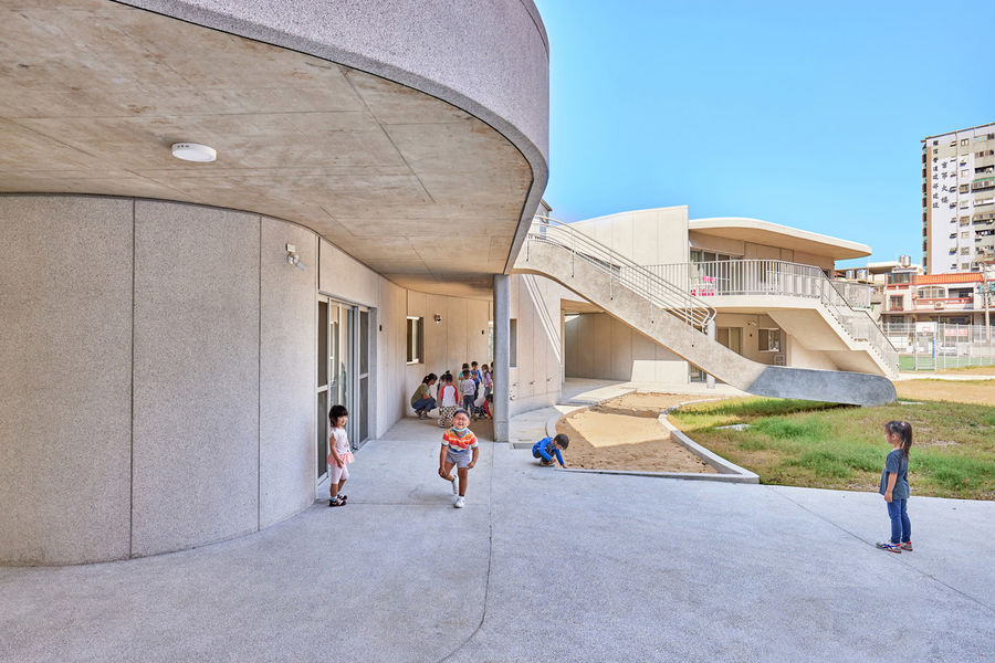
设计的核心旨在将建筑与环境融为一体,为人们带来全新的视角与空间体验。整个建筑就如同一系列学习角的组合。从室外到室内,孩子们可以绕着曲面的墙壁追逐嬉戏,在他们自己最喜欢的地方聚集。本项目不仅开创了一种更好的学习单元模式,同时也在一定程度上打破了台湾幼儿园的现状,重塑了一个更好的校园环境范本。
The architecture merges with the environment and allows people to experience new perspectives. The whole architecture is a combination of learning corners.From exterior to interior, children can run around the curve walls and gather at their individual favorite spots. This project provides not only a better learning unit, but also reshape a better environment of the campus.
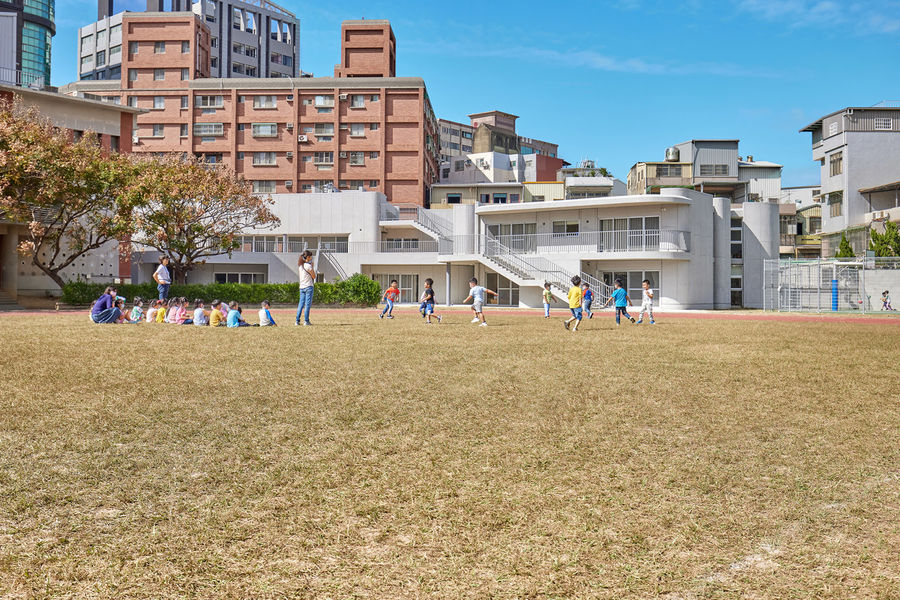
▼由操场看建筑
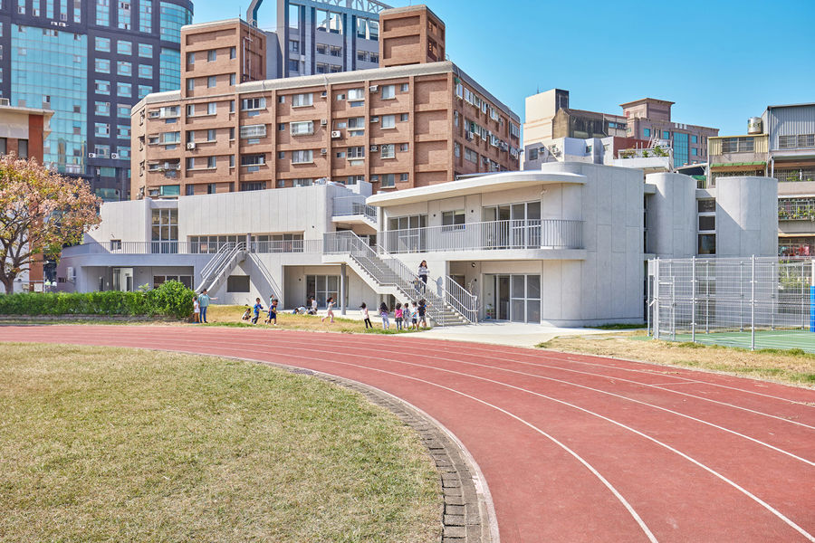
▼轻盈灵动的建筑包围在密集的城市建筑环境中
儿童视角
From children’s view发自本能的探索|Explore by instinct由空间所引发的暧昧情感会镌刻在孩子们的记忆中。他们以独特的视角感知空间,并对空间做出反应。因此,为儿童而设计的空间应该是无明确定义并充满无限可能性的。由于孩子们的身心都处在迅速成长的阶段,因此,本项目旨在利用丰富的空间尺度与规模,启发他们的思维,为他们的成长带来更多的灵感。
Feelings of ambiguous space will be engraved in children’s memories. They sense and react to the space with unique viewpoints as undefined uses allow numerous possibilities for children’s creation. Since their bodies and mind are rapidly growing, the design imagines a place that provides for more inspiration and exploration in every scale.
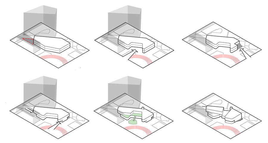
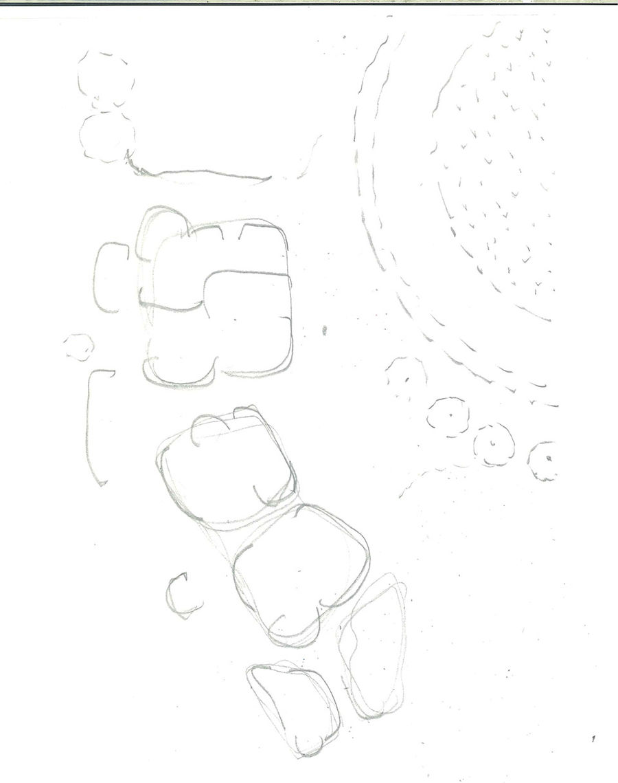
▼分析图,
难以形容的氛围|Indescribable atmosphere对孩子来说,所有的事情都是迷人的,大多数时候,他们会持续观察周围环境的所有细节。因此,设计的优先考虑事项是为孩子们提供一个安全且活跃的场所,以包容他们旺盛的好奇心,鼓励他们可以去尝试各种不同的活动内容。
All things for children are fascinating and most of the time they keep observing all the details of surrounding environment. The design prioritizes the need to provide a secure and active place which the children can engage in a variety of activities.
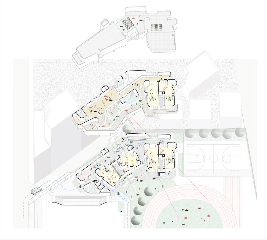
▼轴测分析图
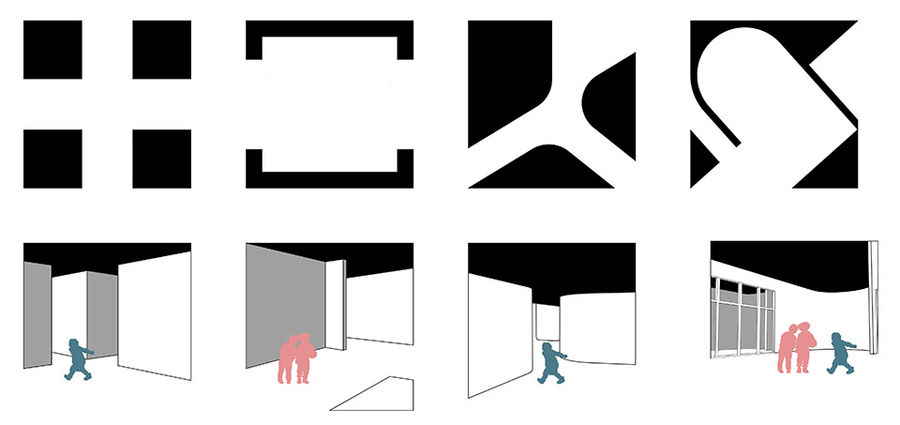
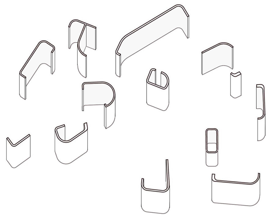
学习表达的过程|Process of learning to express学习的意义是什么? 孩子们试图用语言表达自己的想法,但是,在将所有内容清晰地表达成一个完整的句子的过程中难免会出现错误。有时候,他们表达出来的内容,就如同把句子的成份分别放在括号中,再打乱组合一般。这不仅让人好奇,当所有语句和括号都以独特的方式排列组合时,会带来什么样的体验呢?本项目的空间设计便巧用了这一概念。
What is the point of learning? Children try to express their idea in words, while making mistakes in the process of articulating all the content to form a complete sentence. Like the content in the brackets, the design plays with this spatial concept which makes one wonder how is the comprehending experience when all the content and brackets are arranged in an unique way?
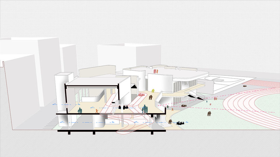
▼剖面流线与视角分析图
建筑视角
Architectural statement记忆空间|Occasional encounter通过打破空间符号的规则,我们可以以多种方式对空间的组合进行想象。这种灵活自由的组合方式,为孩子们在小空间里提供了无限的可能性。当他们长大后回忆童年时,虽然不能记起具体的空间场景,但是却能清晰地回忆起这里的氛围。
By breaking the rule of symbols, we can imagine in multiple ways. The alternative combinations provide children infinite possibilities in little space. They can recall the atmosphere but not the specific plan.
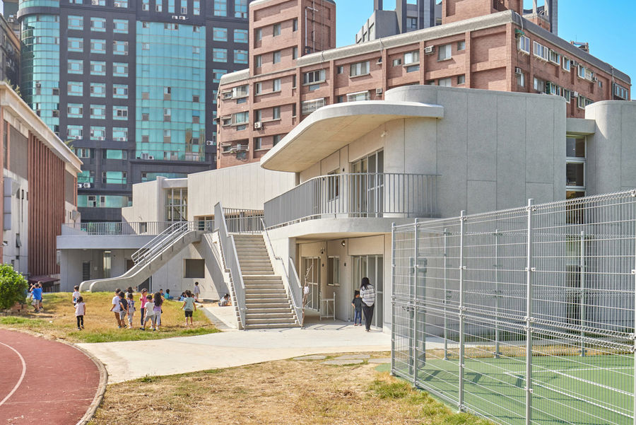
▼幼儿园外观
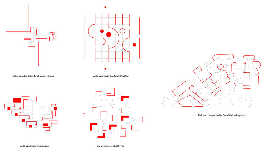
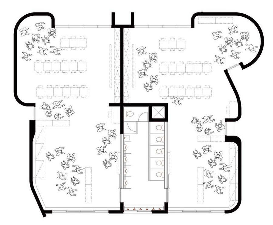
缝隙空间|In-between space建筑师探索了一系列空间平面组合的方式,重点在于创造氛围而不是建筑本身。密斯·凡·德罗强调空间的延展性、透明性与通用性,奥尔多·凡·艾克强调空间的顺序与层级。然而,日本建筑师小嶋一浩 (kazuhiro kojima)却削弱了建筑的力量。在他的学校建筑作品中,所有教学与娱乐活动都汇总在同一屋檐下,家具成为界定空间最重要的对象,每面墙壁都是L型的,并总有一个角落向外开放。缝隙空间在小嶋一浩的作品案例中展现出无与伦比的灵活性,而本案的建筑师也将这种灵活性运用在了设计之中。
There is a series of plan which is designed to mostly create atmosphere and less about the building itself. We learn about the sense of extension, transparency and universal space emphasized by Mies van der Rohe, and the order of numbers and hierarchy of architecture from Aldo van Eyck. However, the Japanese architect Kazuhiro Kojima has reduced the power of architecture further more. In his studies of the school typology, furniture became the most important object to define the space, while all the walls are L-shaped and always open to a corner. All the activities are juxtaposed under a big roof. We learn a spectrum of flexibilities of in-between spaces from these projects.
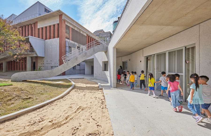
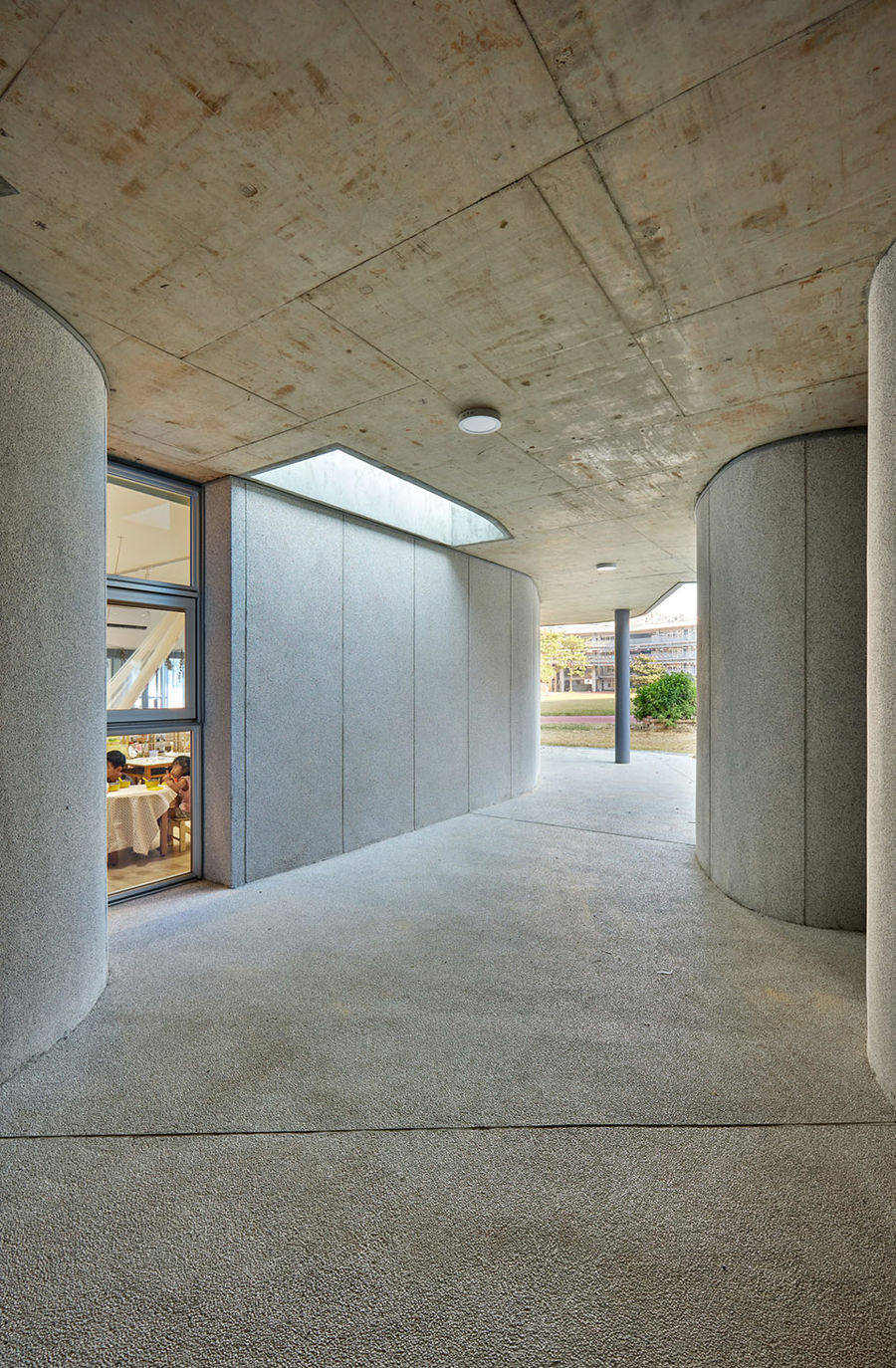
▼底层的廊下空间
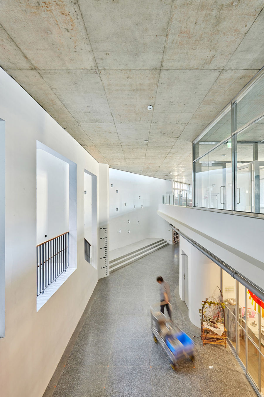
▼丰富的空间层级与自由的交通流线
▼由底层缝隙空间看室外
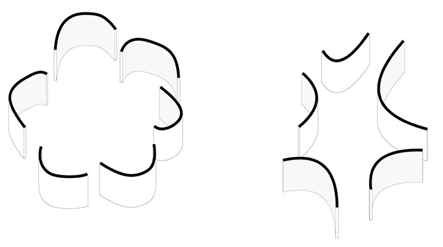
柔性空间|Wrinkles in the universal space建筑让位于家具,柔性的边界在最大限度地提高了空间的水平延伸感和活动感。然而,幼儿园所在的新竹市的城市环境本身就如同一个无序景观的集合。单纯地在这种混乱的环境中放置一个轻盈、透明、灵活的建筑是不够的,因为类似的场景会不断重复,并不能引起足够深刻的印象。面对这种情况,建筑师利用曲线形的墙壁围合出一系列微妙的封闭空间,使空间脱离同质化。这种设计营造出独特的空间效果,在提升校园空间品质的同时,使建筑融于环境之中。
The power of architecture gives way to furniture arrangement maximizing the sense of horizontal extension and activities. However, the urban environment of Hsinchu City is already a landscape without order. It is not settled enough to place a light, transparent and flexible architecture in this messy environment, since similar scenes will keep repeating themselves. To confront this situation, we found that a little curve on wall will make a subtle enclosure and free the space from homogeneity. We use the effect to reengage the campus environment and enhance the quality of space in traditional Taiwan campus planning.
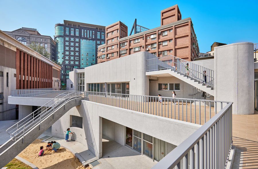
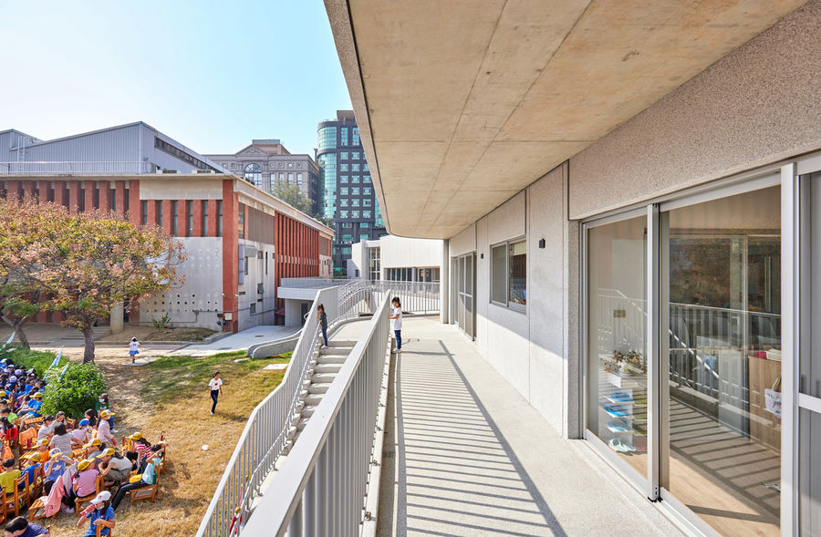
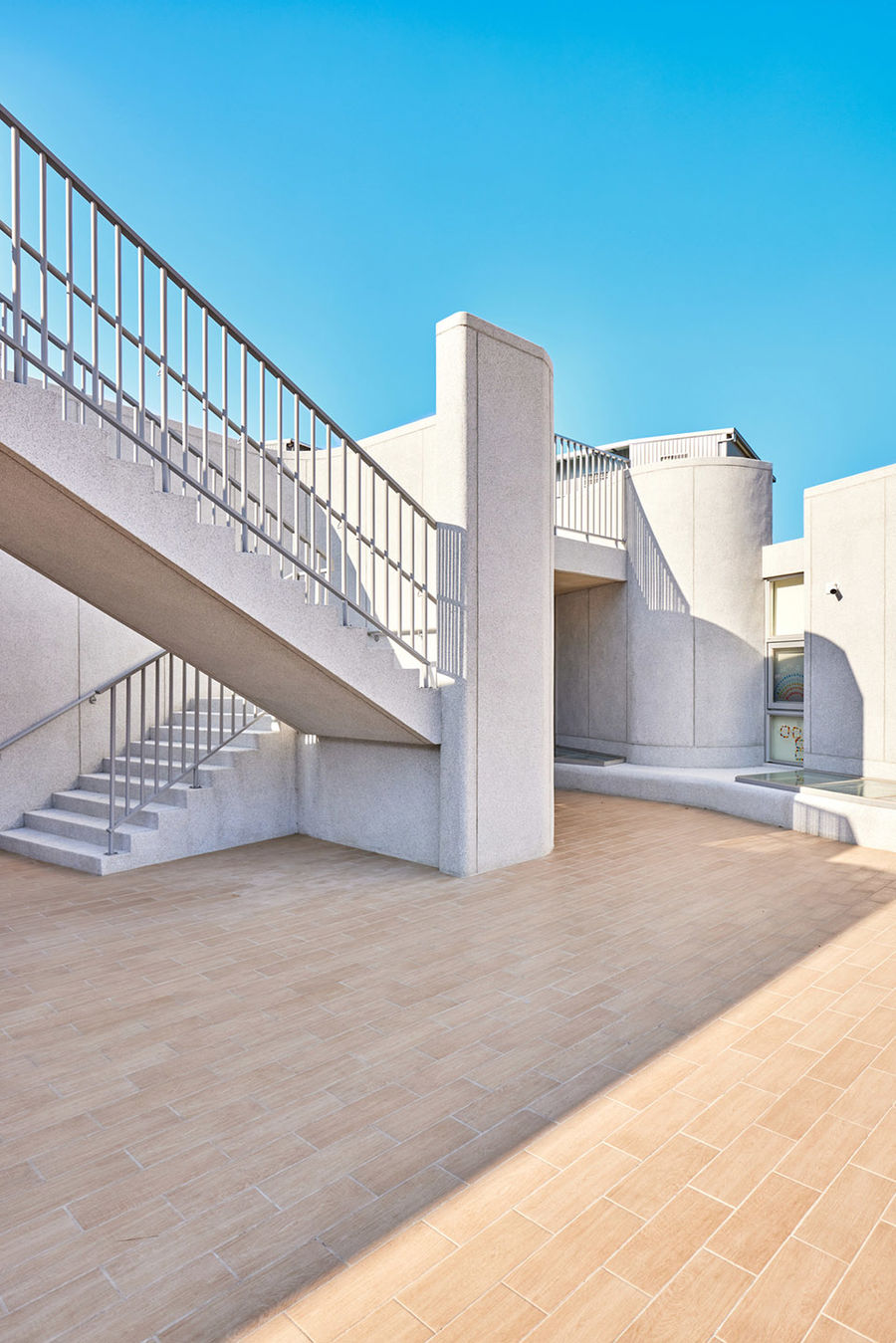
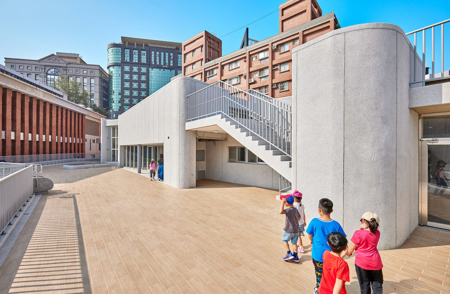
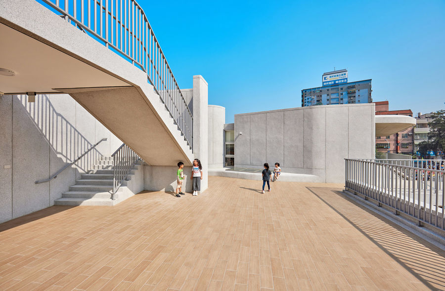
▼二层露台
▼室外露台为孩子们提供了聚会游戏的场所
项目借鉴了小嶋一浩的设计理念,在未被明确定义的通用空间中引入了一系列带有雕塑感的柔性边界,以划分出不同的学习角落。因此,虽然人们可能不记得空间的具体安排,但仍然可以对在公共空间中移动的体验印象深刻。
The project focuses on the layer of in-between spaces like Kazuhiro Kojima, but introduces some random sculptural quality in the universal space to distinguish different learning corners. So while we may not remember the spatial arrangement, we can still impressed by the moving experience in the public spaces.
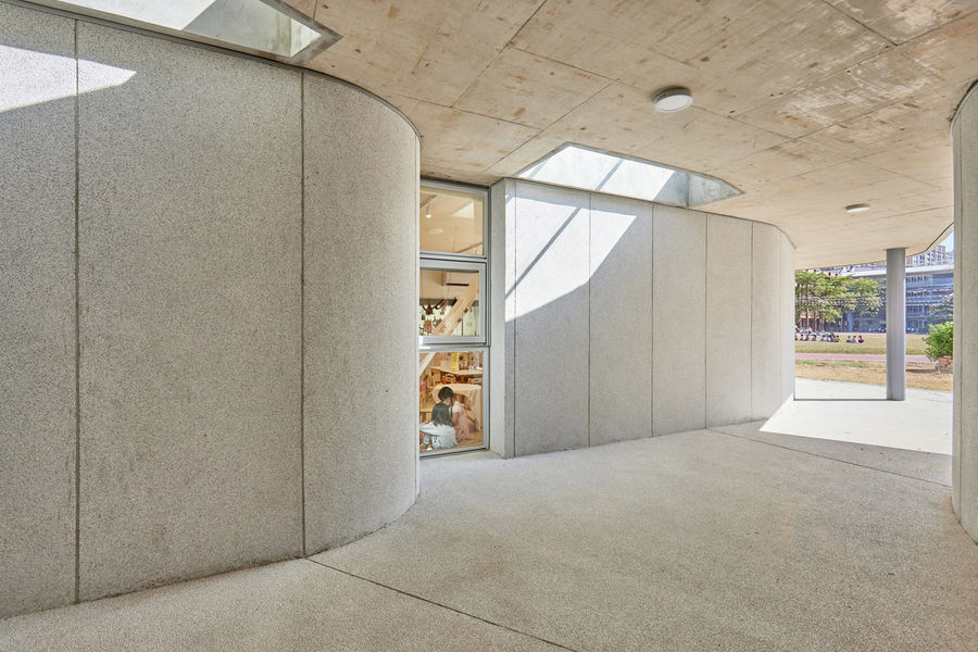
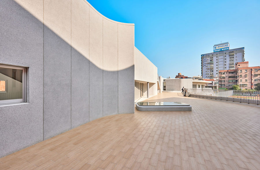
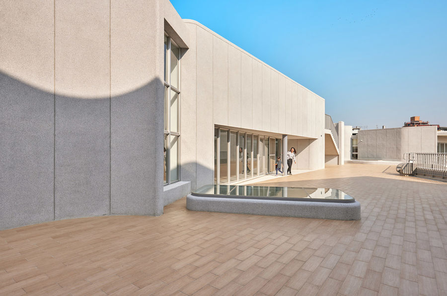
▼弧线形的外墙与天窗
▼由露台看周边环境
空间设计策略
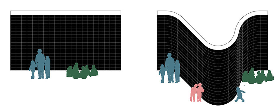
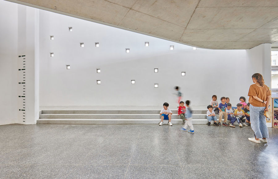
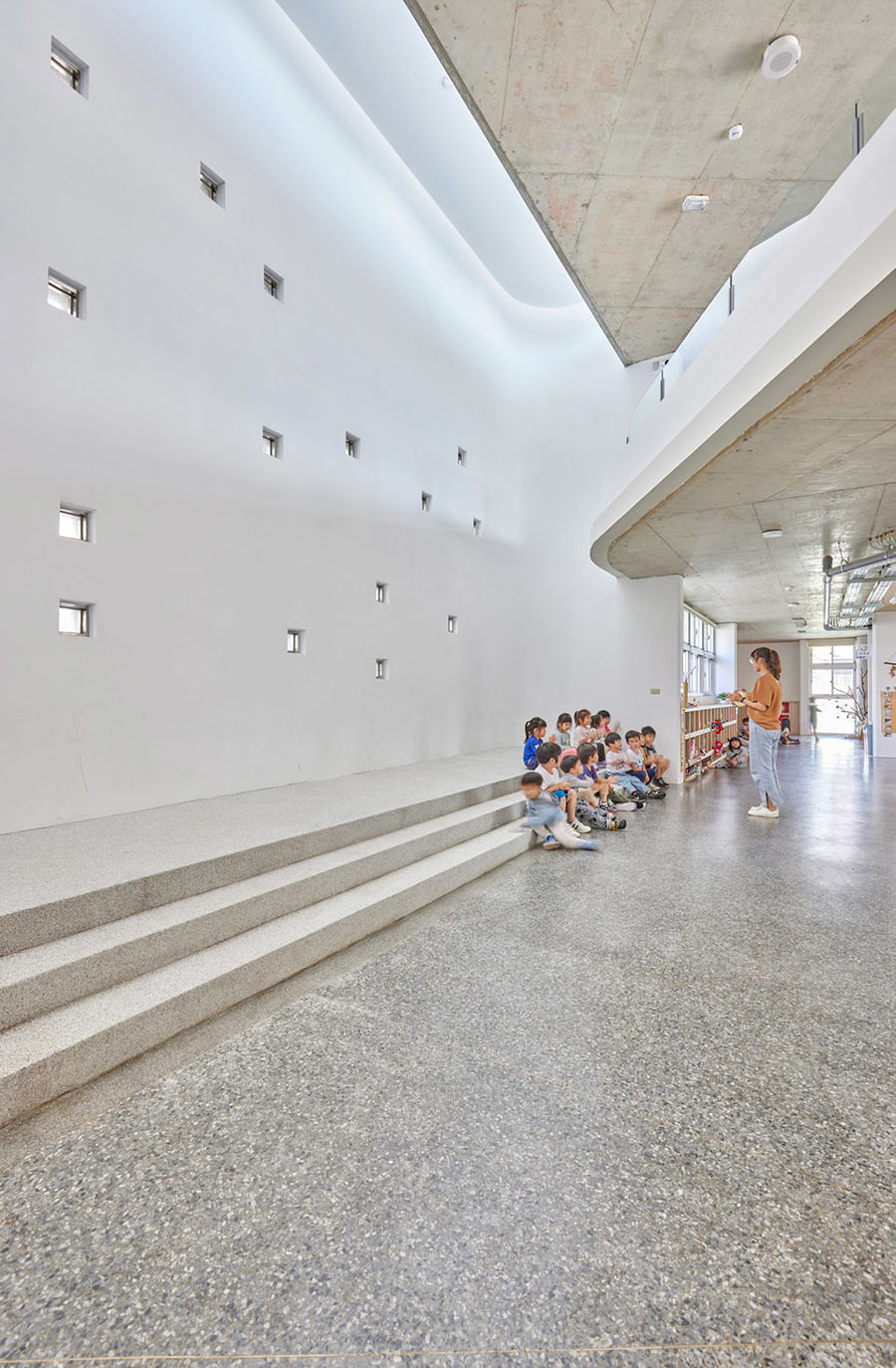
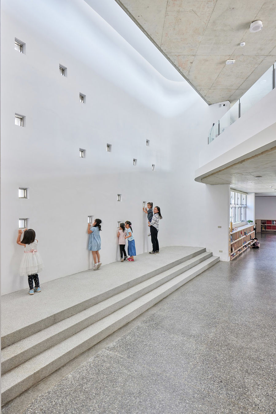
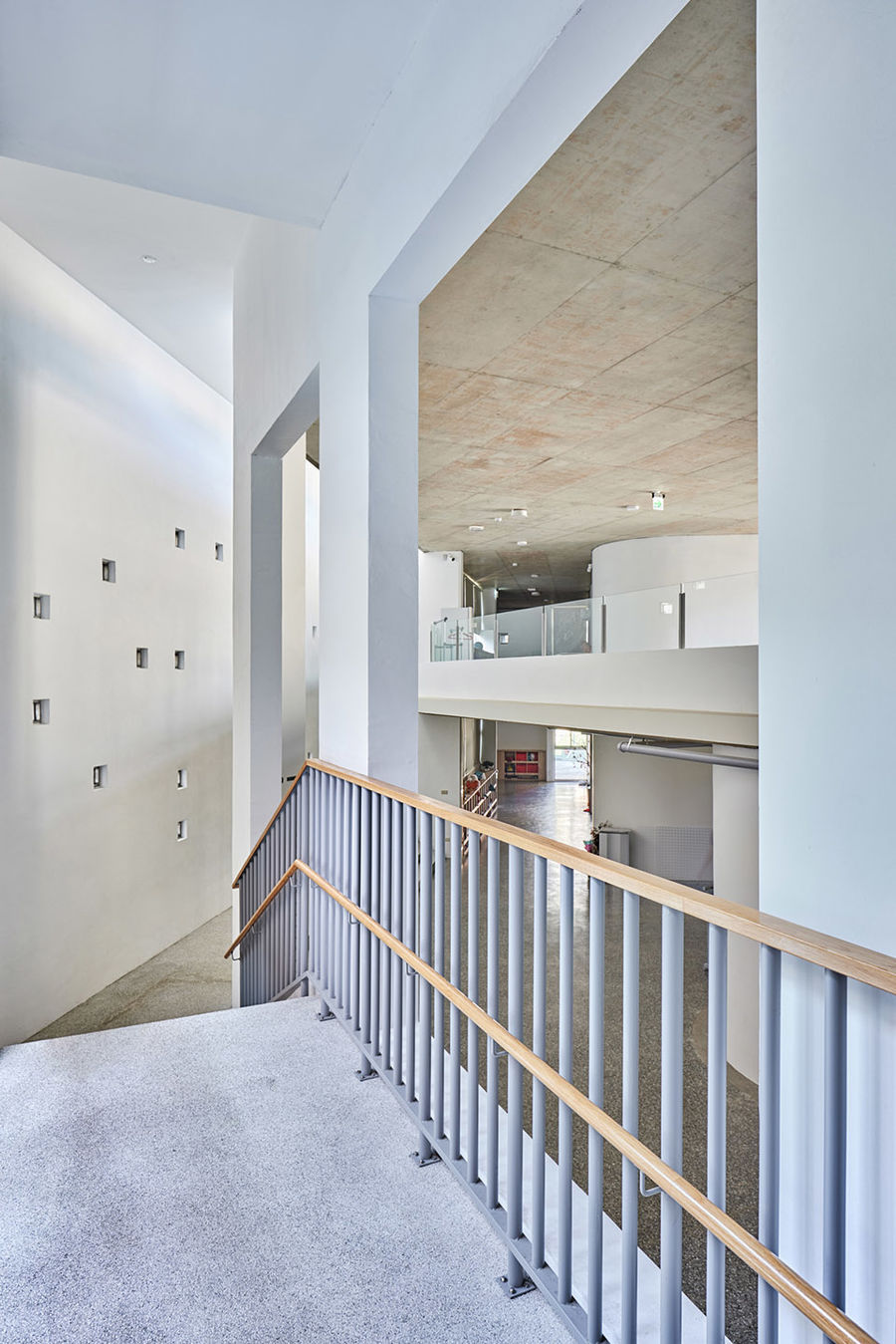
Spatial strategy创建空间角落|Create several corner流线形的墙体取代了传统的网格式平面规划,创造出独特的空间特征。所有设计元素都能成为活动的发生器,比如:墙壁视平线上随机开设的小洞,能够引起孩子们的好奇心,让他们不自觉地踮起脚尖从洞口张望。丰富的活动与意想不到的随机性使整个空间充满了童趣与活力。
▼不同空间形式对儿童心理产生不同影响
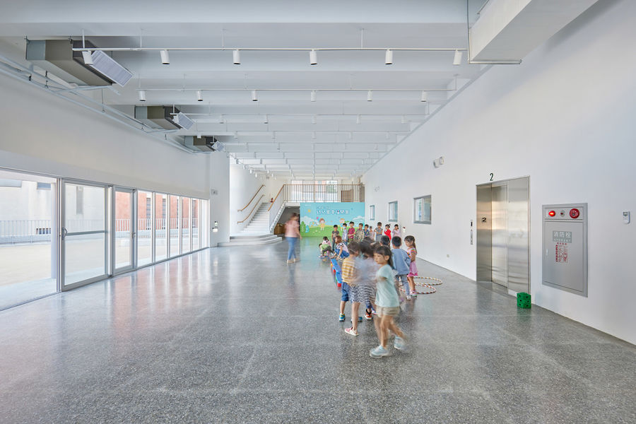
▼未被明确定义的公共活动空间
▼墙壁视平线上随机开设的小洞引发孩子们的好奇心
▼二层通高的中庭空间
平衡空间效率与流动性|Balance between efficiency and fluidity安全是幼儿园设计的第一原则,为了防止儿童磕碰到墙体边缘发生危险,建筑师设计了一种弧形的空间,大大减少了空间边缘的尖锐程度。所有的结构墙都是直线和曲线的组合,既满足了储物的需要,又迎合了整个项目流动的空间特点。可以说,本项目的空间几何形态所寻求的就是空间效率与空间流动性之间的平衡。
Since it is important to prevent children colliding to the edge of the wall, we designed a rounded space and reduced the sharp edge of the space. All the structural walls are combination of the straight line and curve to meet both the need of storage and characterized corner. The geometry of the space is the balance between efficiency and fluidity.
▼弧线形的墙壁避免了安全隐患
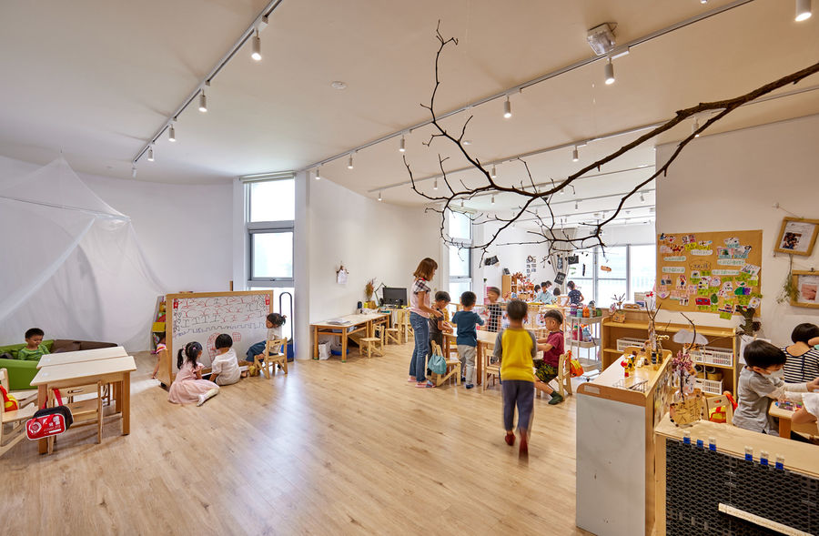
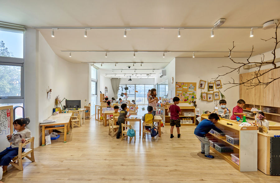
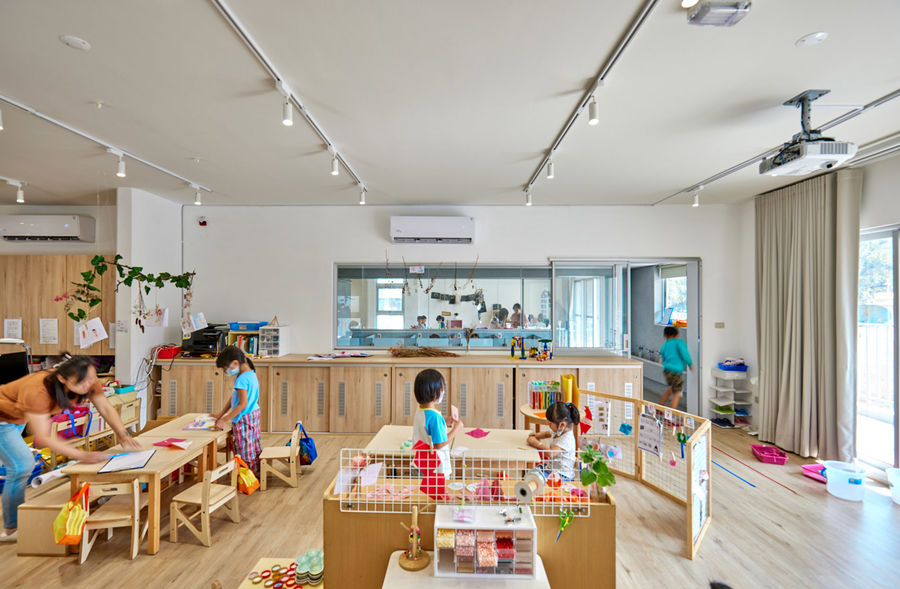
▼宽敞明亮的活动空间
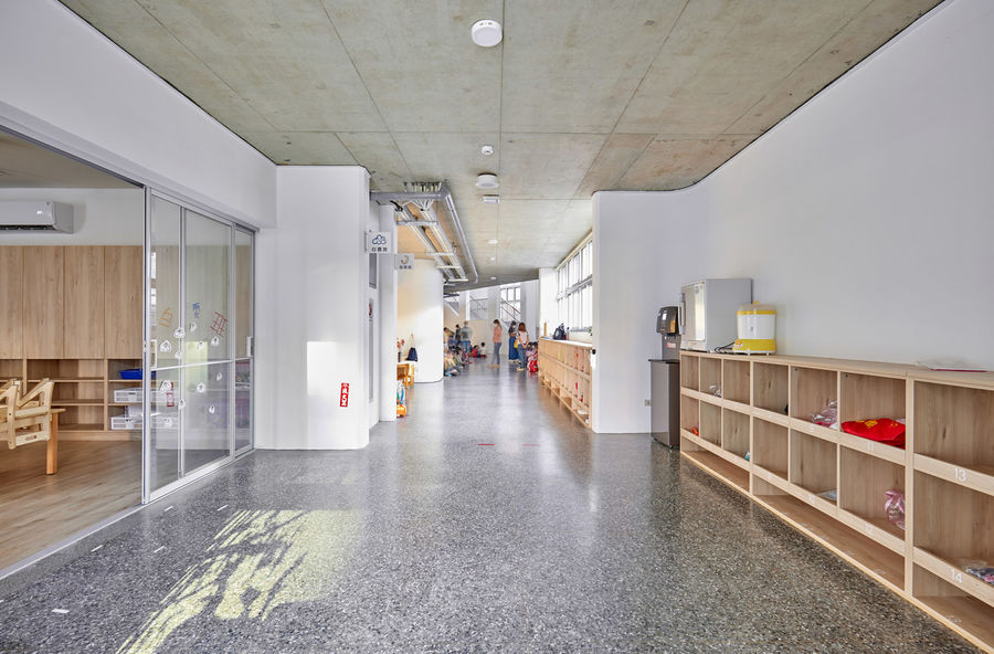
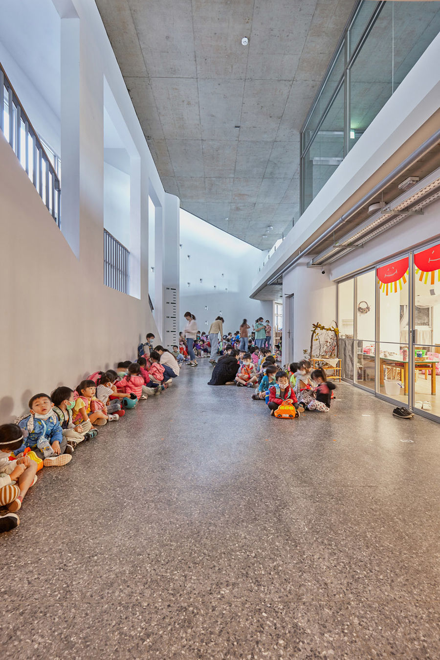
▼公共走廊
塑造场景灵活性|The flexibility in a sculptural scene不可预测的活动在雕塑般的空间背景中发生,这种雕塑感与灵活性的结合为设计增添了一种看似矛盾又不失和谐的辩证关系。这种设计,不仅为使用者提供了更多的自由,同时也使空间更具感染力与影响力,达到了重塑教学环境的目的。
It is contradictory that this project combines a sort of sculptural quality and flexibility. This contradictory idea allows the unpredictable activities happen in the sculptural background. Through this kind of design, we remain the customized freedom for users and maintain a formal influence to reorganize the environment of the campus.
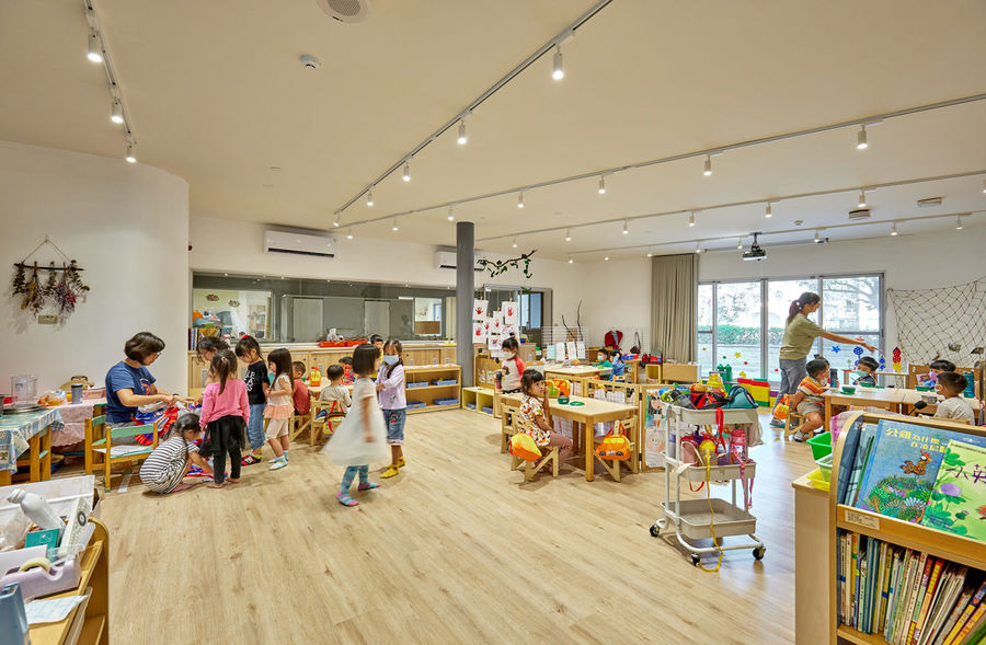
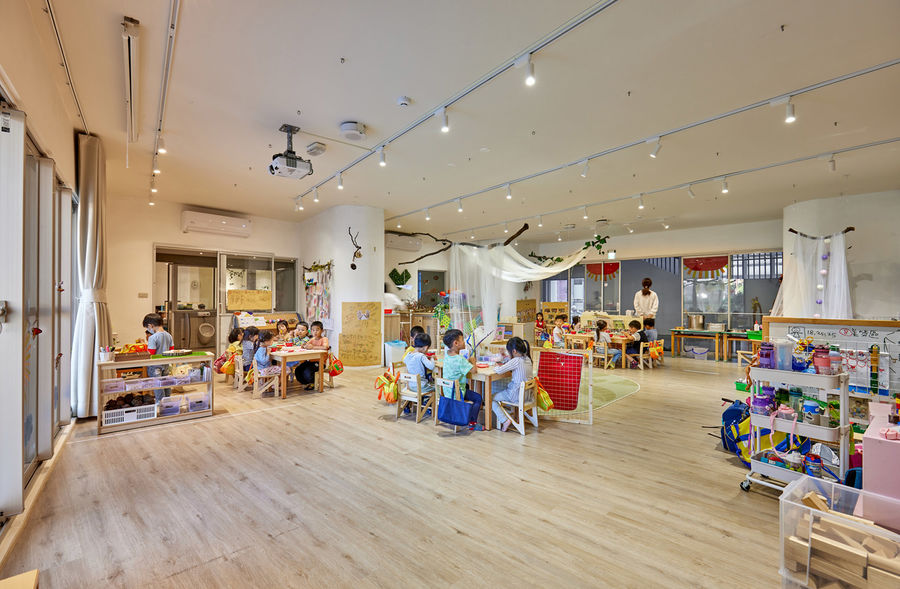
▼活动室概览
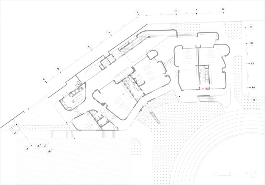
▼总平面图
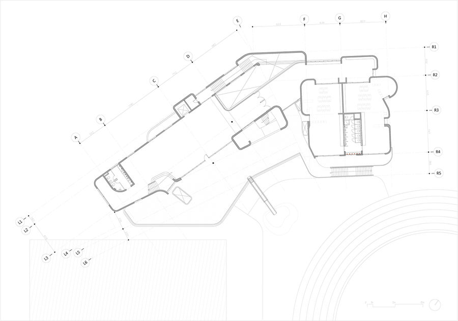
▼一层平面图
▼二层平面图
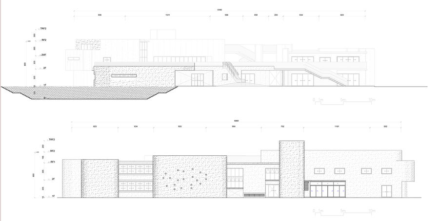
▼立面图
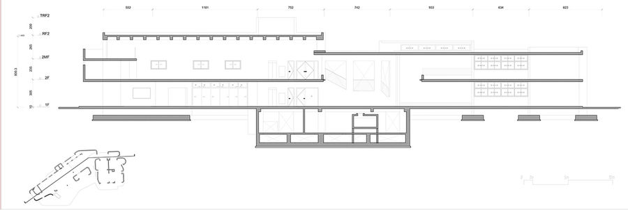
▼剖面图
项目名称:三民幼儿园
建筑设计:Fieldevo设计工作室+林伯阳建筑师事务所
委托人:三民小学
结构:胡玉辉结构工程师
地点:台湾新竹市东区子友路66号
主要用途:幼儿园
设计团队:Fieldevo设计工作室+林伯阳建筑师事务所
建筑材料:钢筋混凝土
场地面积:27321.84m2
建筑面积:1018.33平方米
总建筑面积:1900.29 m2
层数:2F+B1
设计时间:2018.3-2019.1
建设时间:2019.6-2020.9
施工建设单位:广州建设
室内设计:Fieldevo设计工作室+林伯阳建筑师事务所
景观设计:Fieldevo设计工作室+林伯阳建筑师事务所
电气和管道:MeowHuang Engineering
摄影:林伯阳文雅工作室


