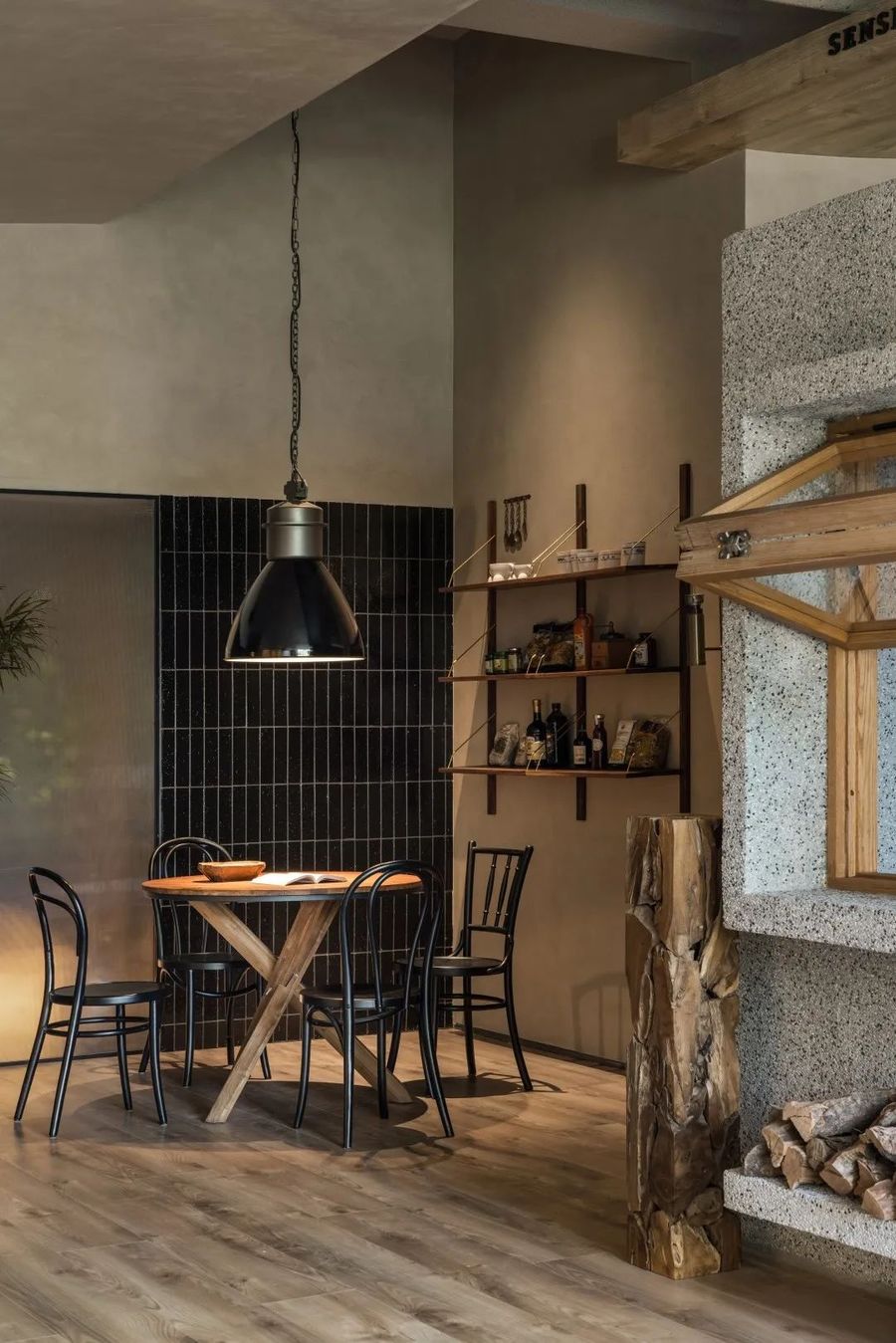
疫情封城期间,人们通过社交媒体相互交流饮食,在社区内互帮互助,重新感受“附近”的美好,这一切其实也能在社区餐饮店中发生。设计五感食喜的初衷,就是要为顾客的日常生活带来一个充满烟火味与人情味的城市空间。
During the lockdown period, people used social media to exchange food and drink with each other, helped each other in the community, and re-experienced the beauty of the "nearby". All of this can actually happen in community restaurants. The original intention of designing Wugan Shixi is to bring an urban space full of fireworks and human touch to the daily life of customers.
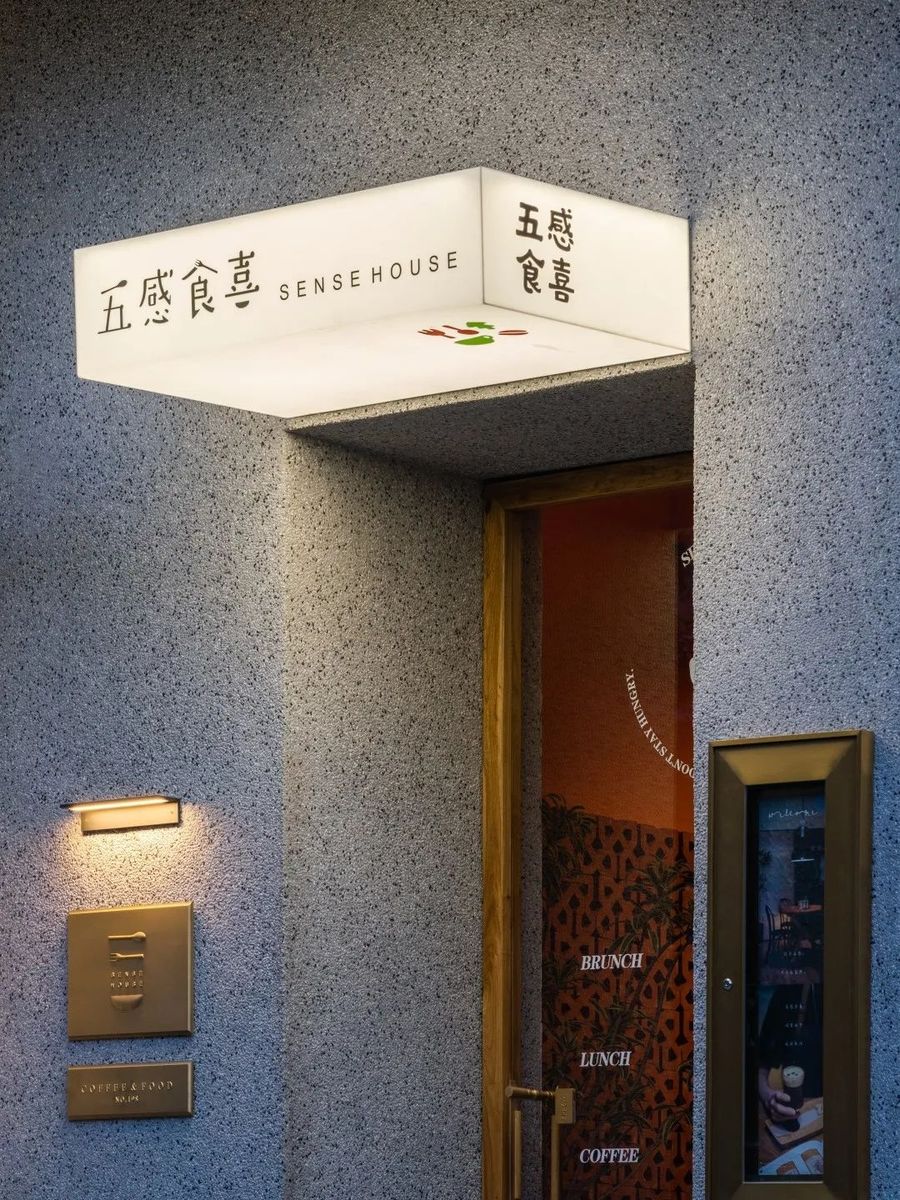
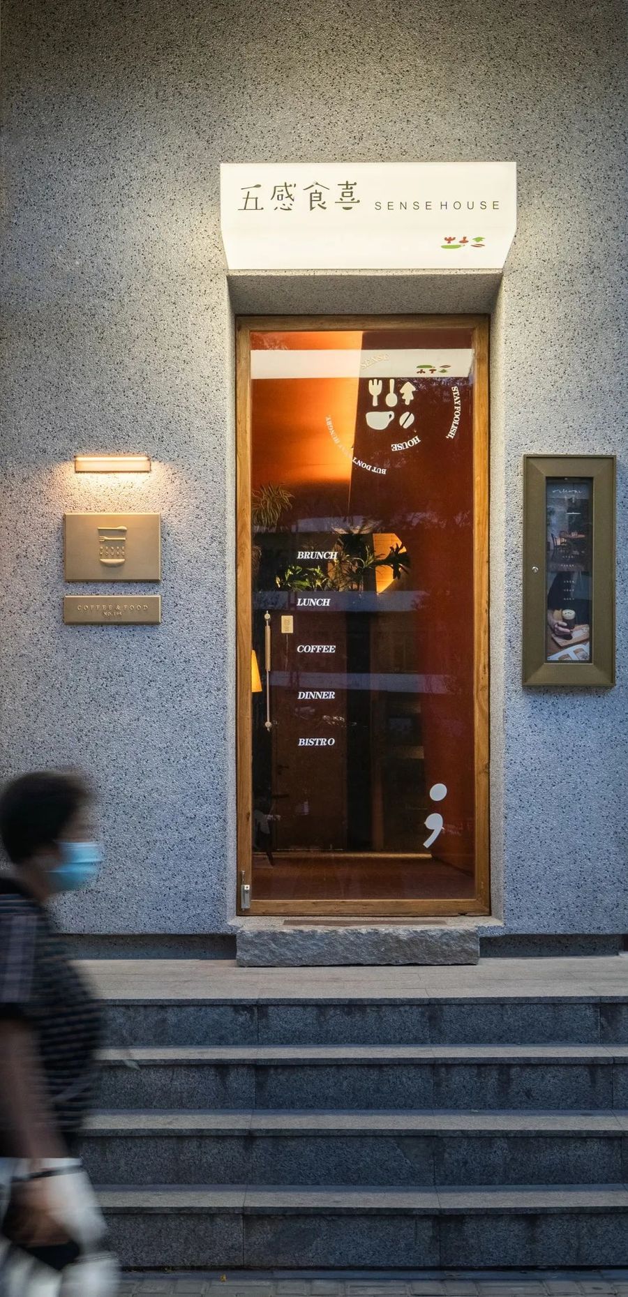
▼建筑主立面,main facade of the building © 吴鉴泉
在方案伊始,此空间委托方希望“消费者可以用视、听、味、嗅、触,五种感知世界的方式对品牌进行积极的探索”,同时也希望空间可以架起消费者与品牌之间沟通的桥梁,给商业注入生命。但原始空间的前身已是易手多家餐饮品牌的临街型商铺,入口立面的不起眼,与一层廊道的过于狭长,都给这个空间带来了不小的设计难度。
At the beginning of the plan, the client of this space hoped that "consumers can actively explore the brand through five ways of seeing, hearing, tasting, smelling and touching the world", and also hoped that the space could bridge the gap between consumers and the brand. A bridge of communication between people, injecting life into business. However, the predecessor of the original space is a street-facing store that has changed hands for many catering brands. The inconspicuous entrance facade and the long and narrow corridor on the first floor have brought great difficulties to the design of this space.
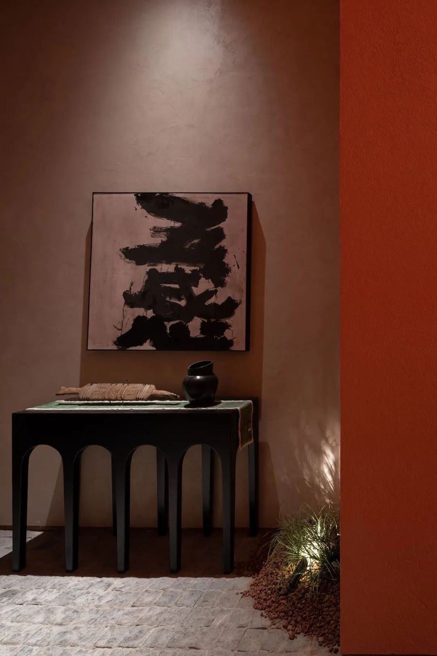
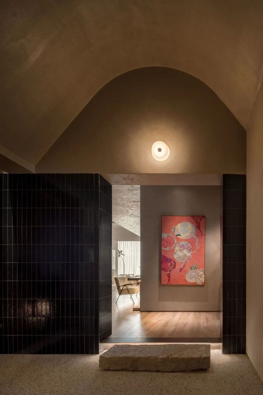
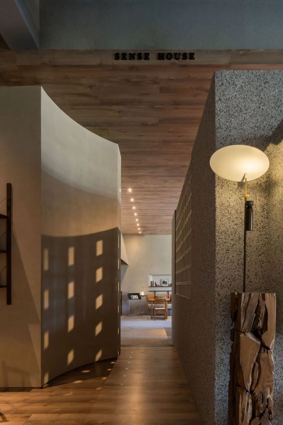
▼入口区域,entrance area © 吴鉴泉
当我们想到一个城市时,首先出现在脑海里的就是街道。街道有生气城市也就有生气,街道沉闷城市也就沉闷。街道是评价一个城市的标志。在城市形成时能看到街道的意义并富有强烈感情的,街道就是生活的一部分,不只是为了交通,而是作为社区存在的。
When we think of a city, the first thing that comes to mind are the streets. If the streets are alive, the city will be alive, and if the streets are dull, the city will be dull. Streets are the hallmarks of a city. Those who can see the meaning of the street when the city is formed and have strong feelings, the street is a part of life, not just for transportation, but as a community.
▼入口区域,entrance area © 吴鉴泉
项目接手后,我们希望制造积极的“缝隙”,将商业转变为公共的线性剩余空间,形成城市里面的新序列。像纽约高线公园一样,对其加以利用,重新赋予功能,将消极空间转换为城市社区的催化剂。城市中的缝隙空间则处于公共空间与私密空间分界的暧昧地带,在合理利用的情况下,令内外空间秩序得以流动,让这个不起眼的空间能发挥出促进城市与邻里互动的巨大潜力。
After taking over the project, we hope to create a positive "gap" and transform the business into a public linear residual space, forming a new sequence in the city. Like the High Line in New York, it is harnessed and repurposed to transform negative spaces into catalysts for urban neighborhoods. The gap space in the city is in the ambiguous zone of the boundary between public space and private space. Under the condition of reasonable use, the internal and external space order can flow, so that this humble space can exert great potential to promote the interaction between the city and its neighbors.
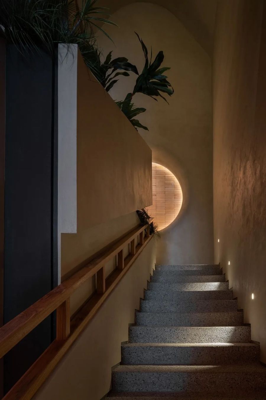
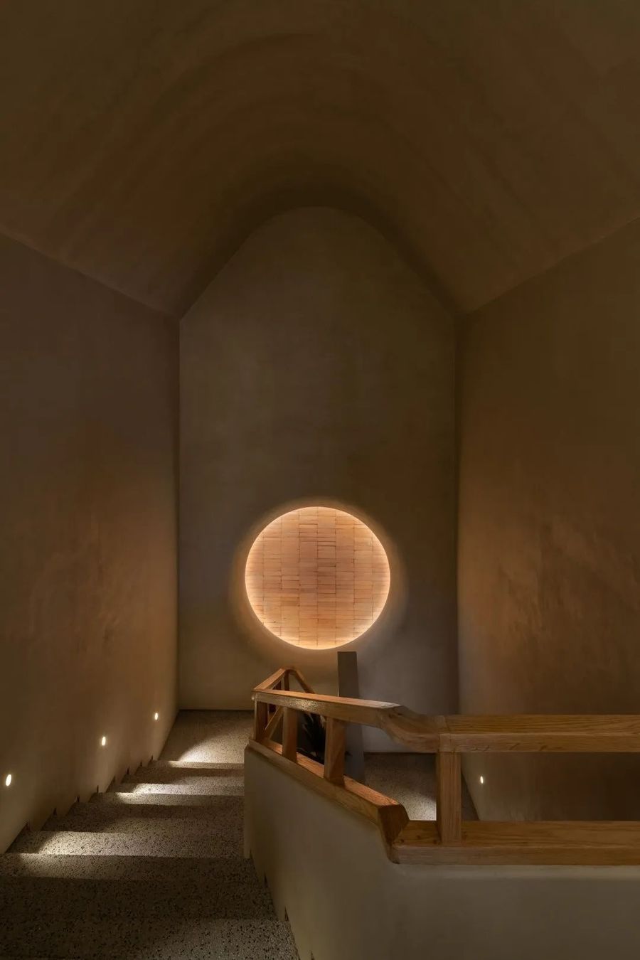
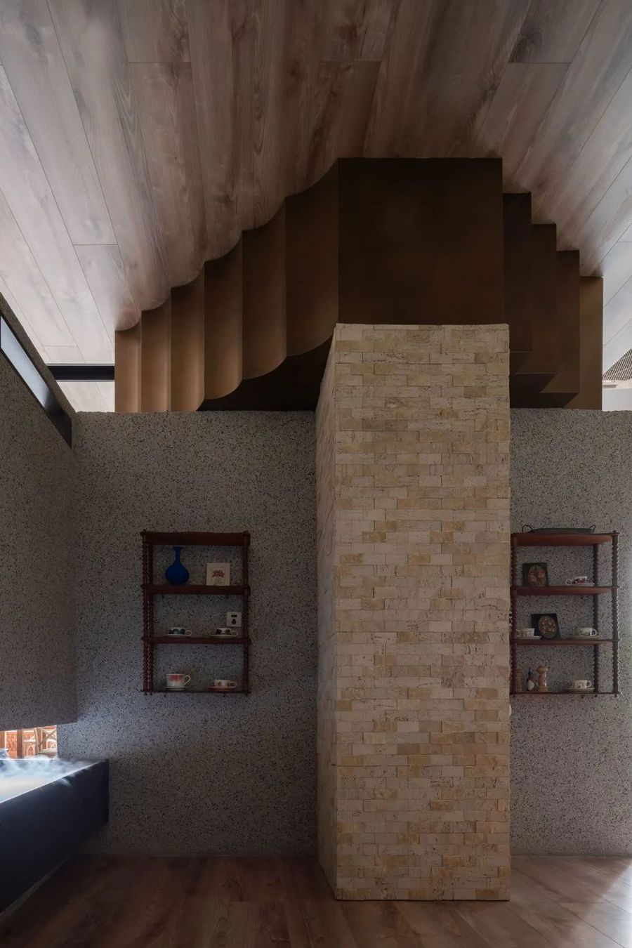
▼楼梯,The stairs © 吴鉴泉
缝隙对人具有强烈的吸引力,可以给人以神秘、新奇、刺激、欣喜的感觉。例如儿童试图将手伸进有狭缝的地方,探寻里面的秘密。自然景观中的峡谷——“一线天”、“地缝”等,总是能够吸引众多参观者和探险者。
The gap has a strong attraction to people, and can give people a feeling of mystery, novelty, stimulation and joy. For example, children try to put their hands into places with slits to explore the secrets inside. The canyons in the natural landscape - "a line of sky", "ground cracks", etc., always attract many visitors and explorers.
▼二层入口,Second floor entrance © 吴鉴泉
▼二层空间概览,Overview of the second floor space © 吴鉴泉
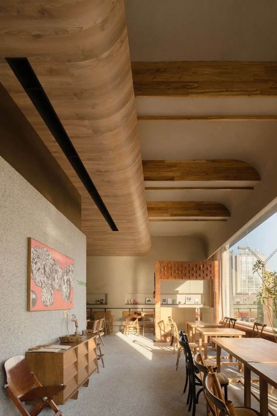
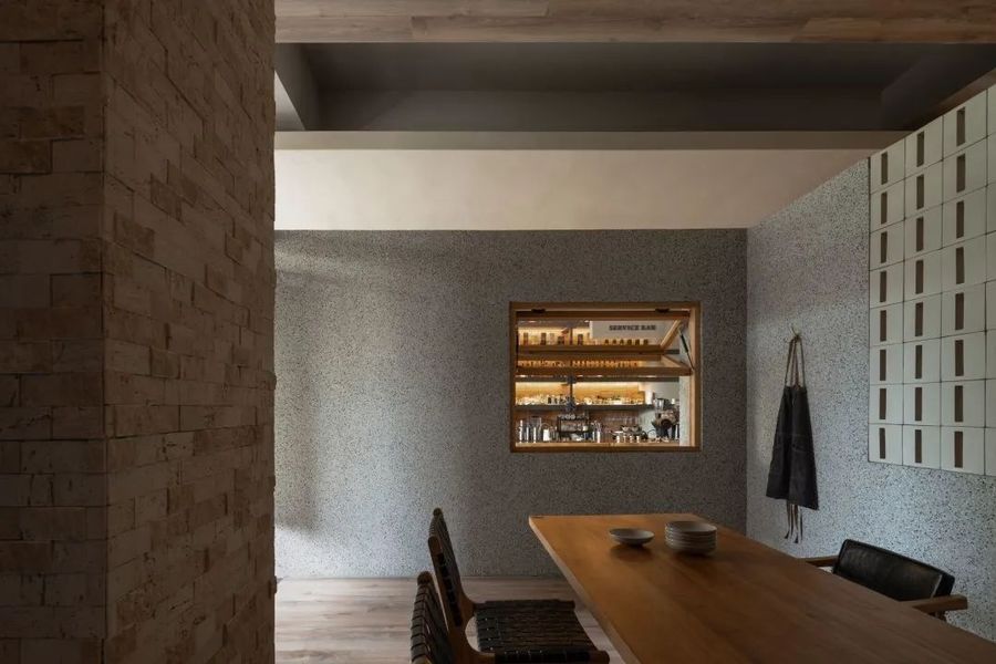
▼公共的就餐区,Public dining area © 吴鉴泉
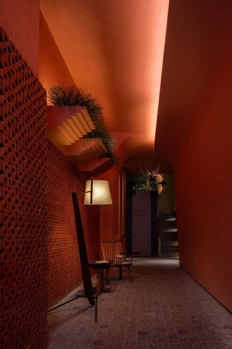
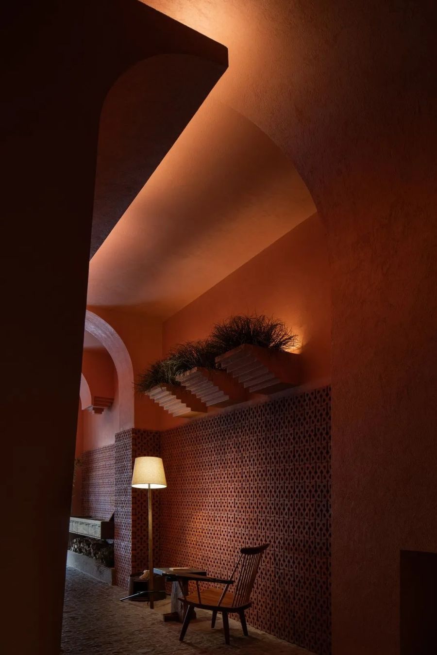
为了解决一层内部过于狭长的难题,设计将此廊道变成具有氛围感的公共区域,内部一层廊道用马蹄石铺设路面,墙面用红砖,来延伸“街”的概念。
In order to solve the problem that the interior of the first floor is too long and narrow, the design turns the corridor into an atmospheric public area. The interior corridor on the first floor is paved with horseshoe stones, and the walls are made of red bricks to extend the concept of "street".
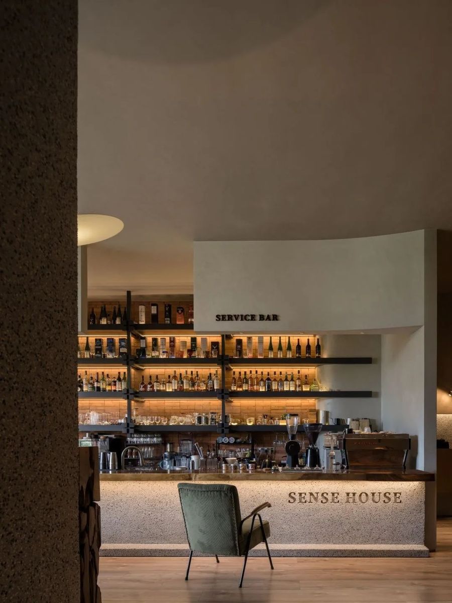
▼吧台与漂浮盒子的互动,Interaction between bar counter and floating box
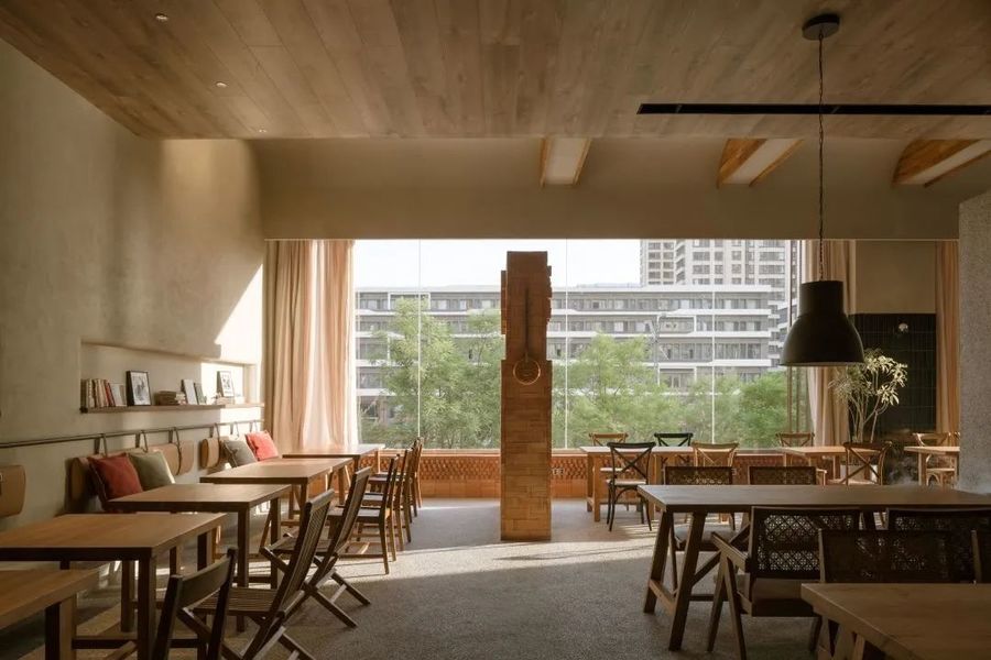
在垂直平面上,人眼视线的最大视区为视平线以上50度和视平线以下70度。因此有效展示面在临街行人的移动视野上只有一层入口立面,设计用更加融入室外的水磨石铺设立面,用品牌灯箱和铜质标识做视觉指引,使室外尽可能的向内延伸。二层立面则尽可能做减法,保持干净、通透的基础上保证室外自然光线可以尽量照入室内,让人在室内就餐时也能轻易的感受到外界的变化。
On the vertical plane, the maximum viewing area of the human eye is 50 degrees above the eye level and 70 degrees below the eye level. Therefore, the effective display surface has only one entrance facade in the moving vision of pedestrians facing the street. The design uses terrazzo to pave the facade more into the outdoors, and uses brand light boxes and copper signs as visual guidance to make the outdoors extend inward as much as possible. The facade on the second floor was subtracted as much as possible to keep it clean and transparent while ensuring that the outdoor natural light can shine into the interior as much as possible, so that people can easily feel the changes of the outside world when dining indoors.
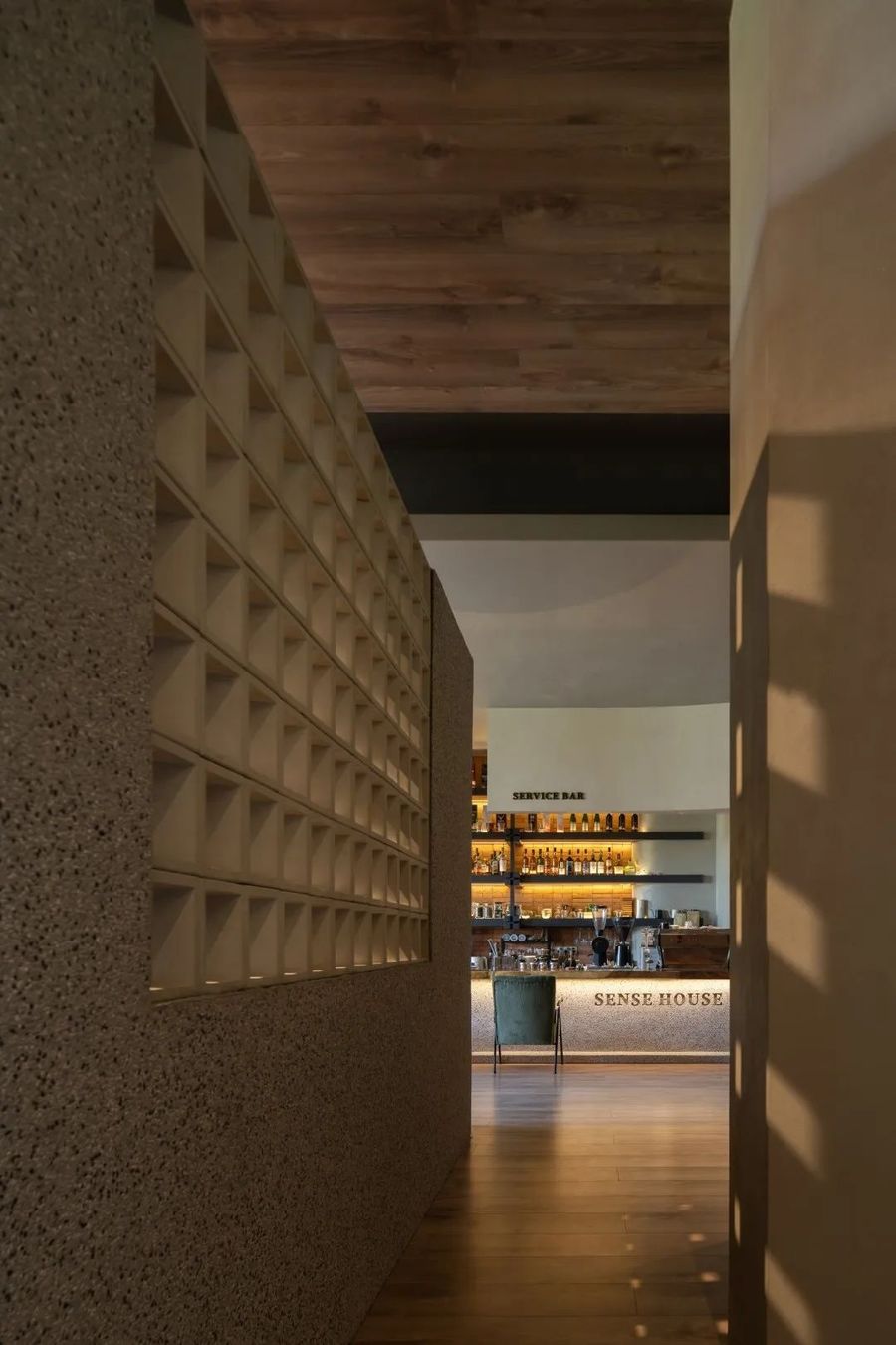
▼吧台区,the bar
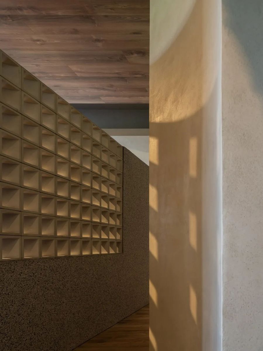
▼贯通的动线,Through moving line
将一层和阶梯构成的内部公共空间串联,通向更丰富的二层主功能区域。
The internal public space composed of the first floor and the stairs is connected in series, leading to a richer main functional area on the second floor.
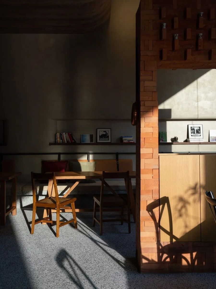
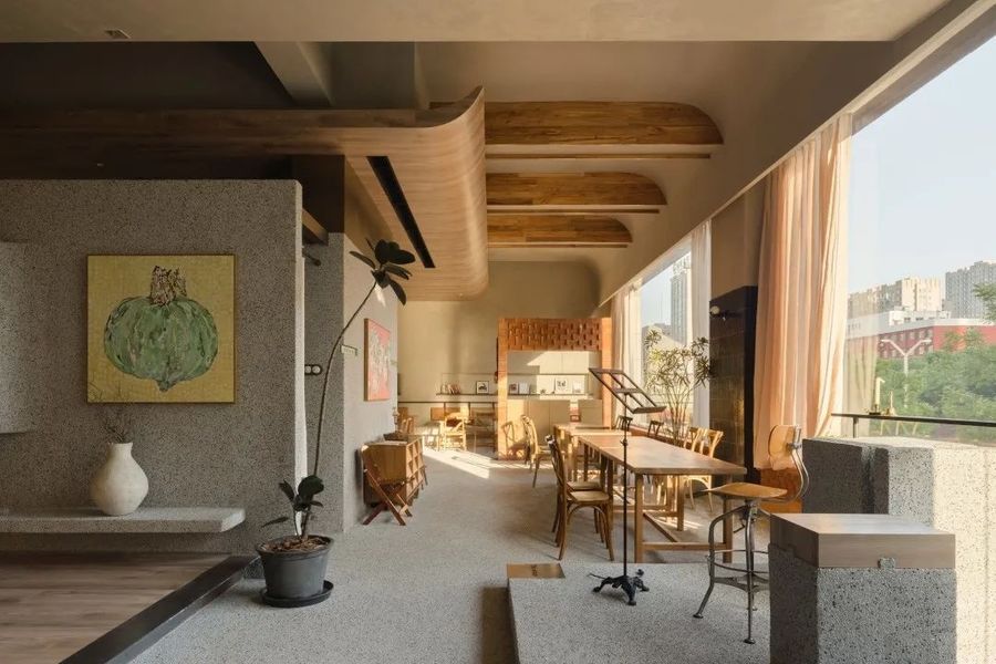
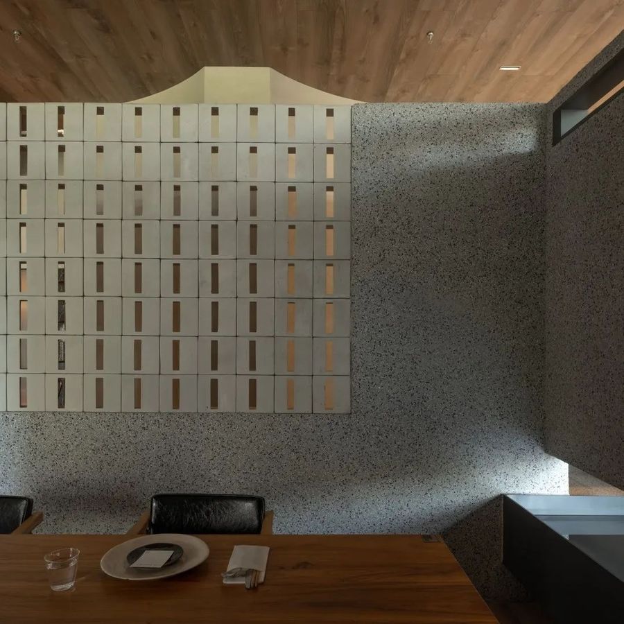
▼光线营造下的就餐区,Dining area created by light © 吴鉴泉
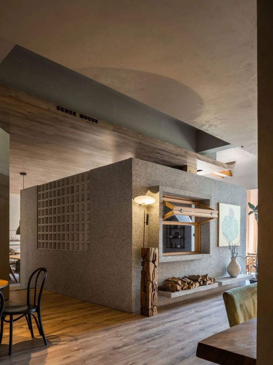
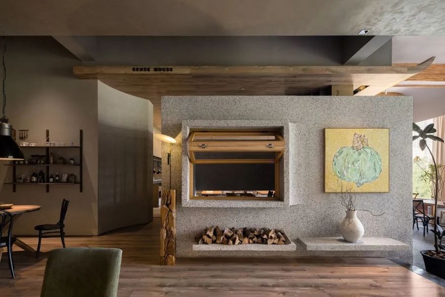
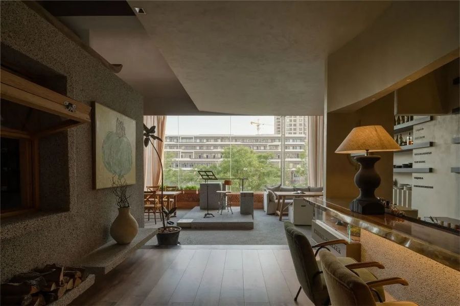
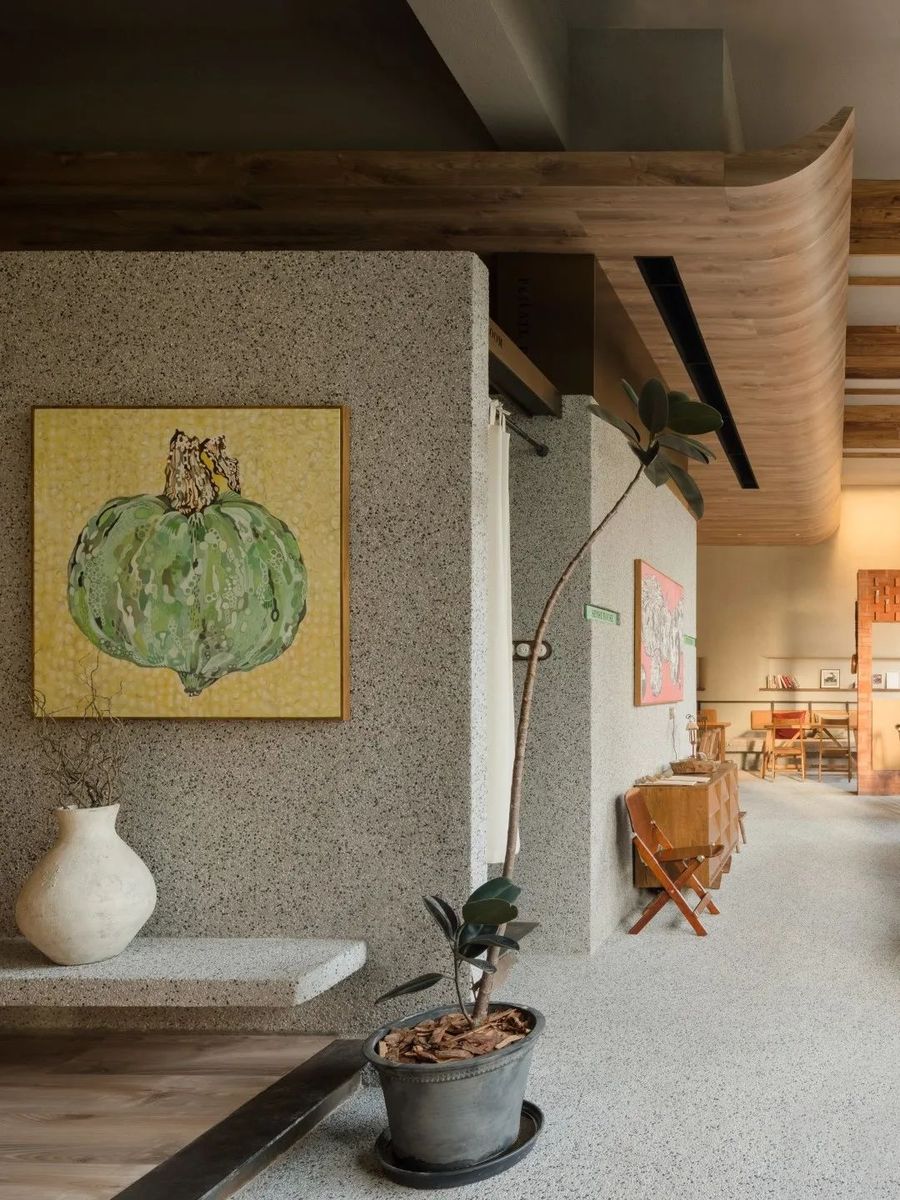
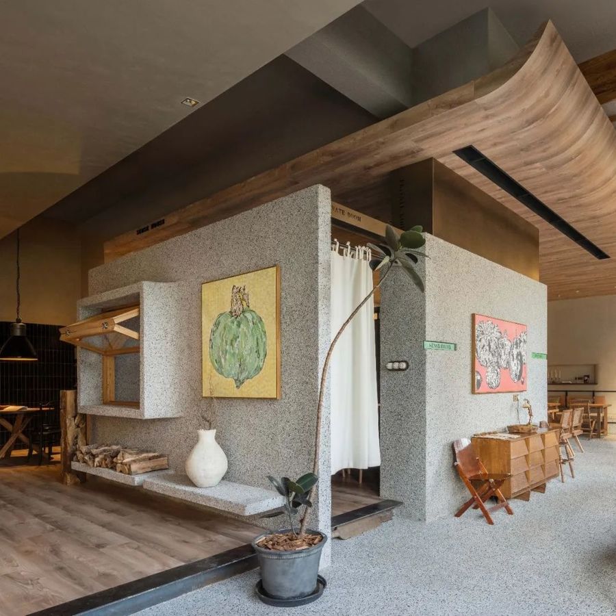
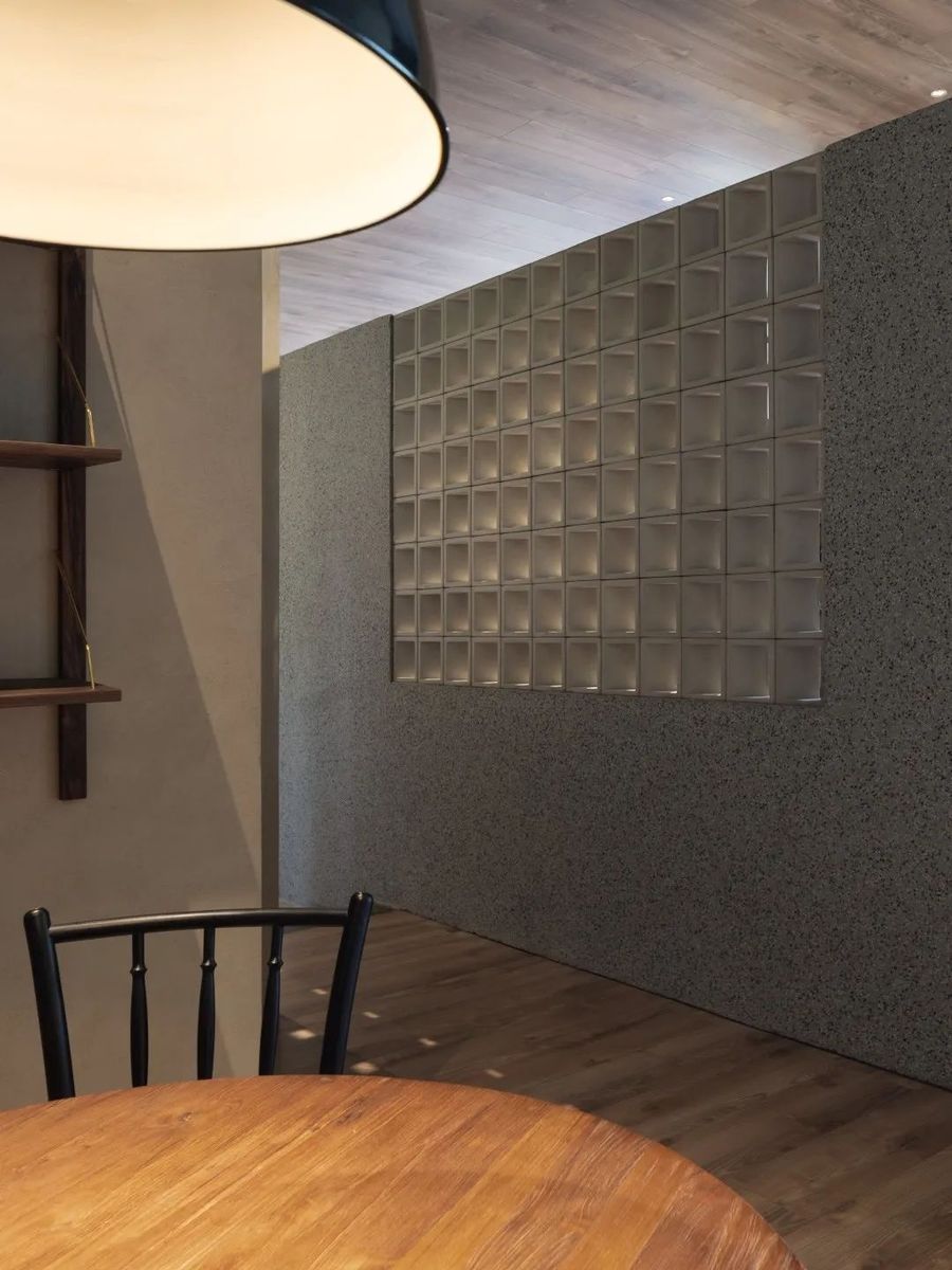
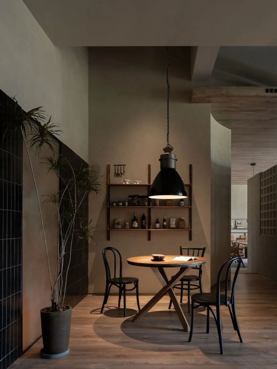
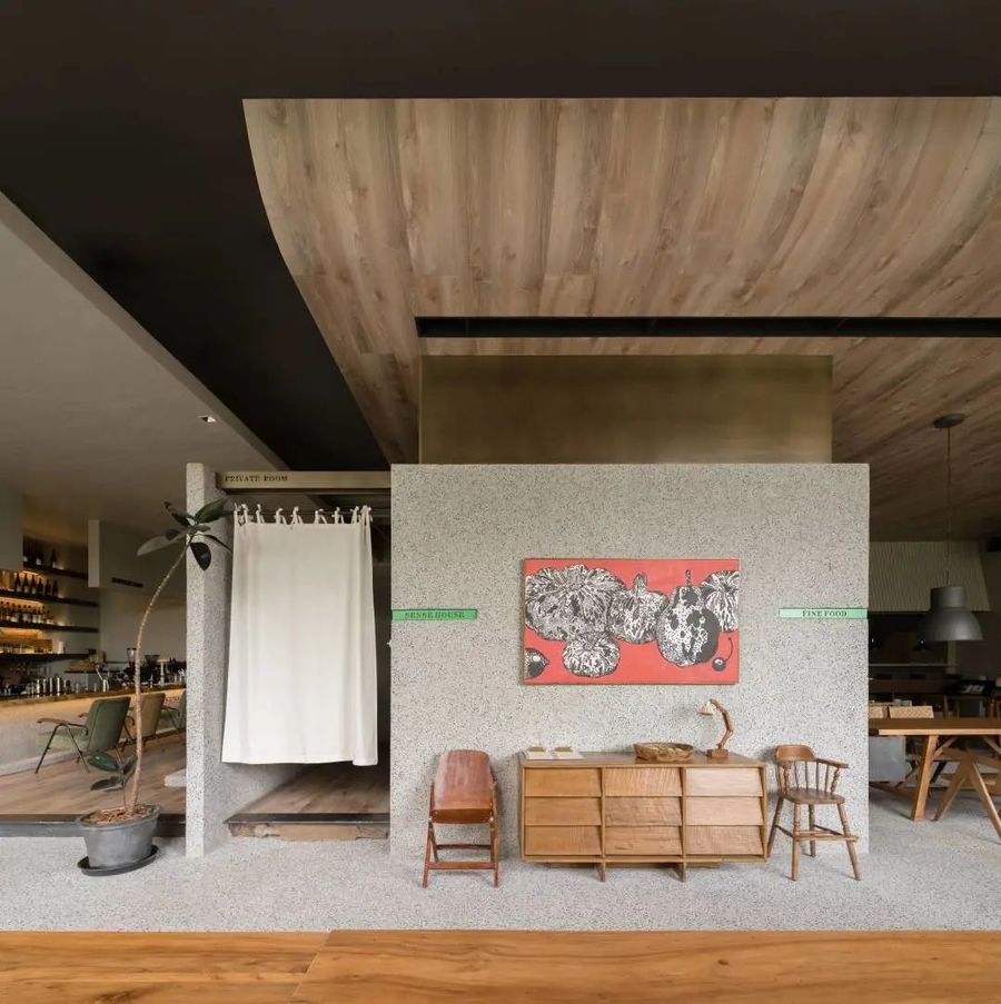
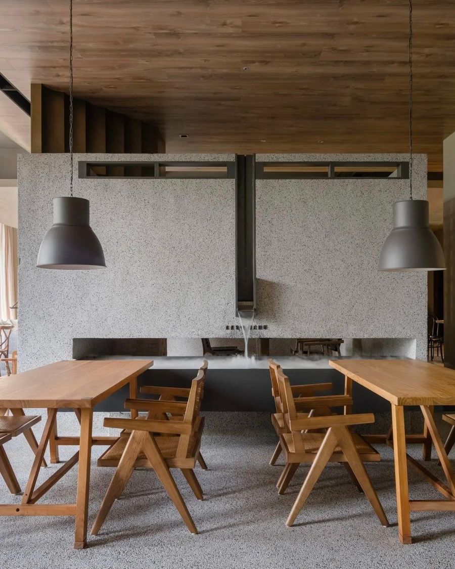
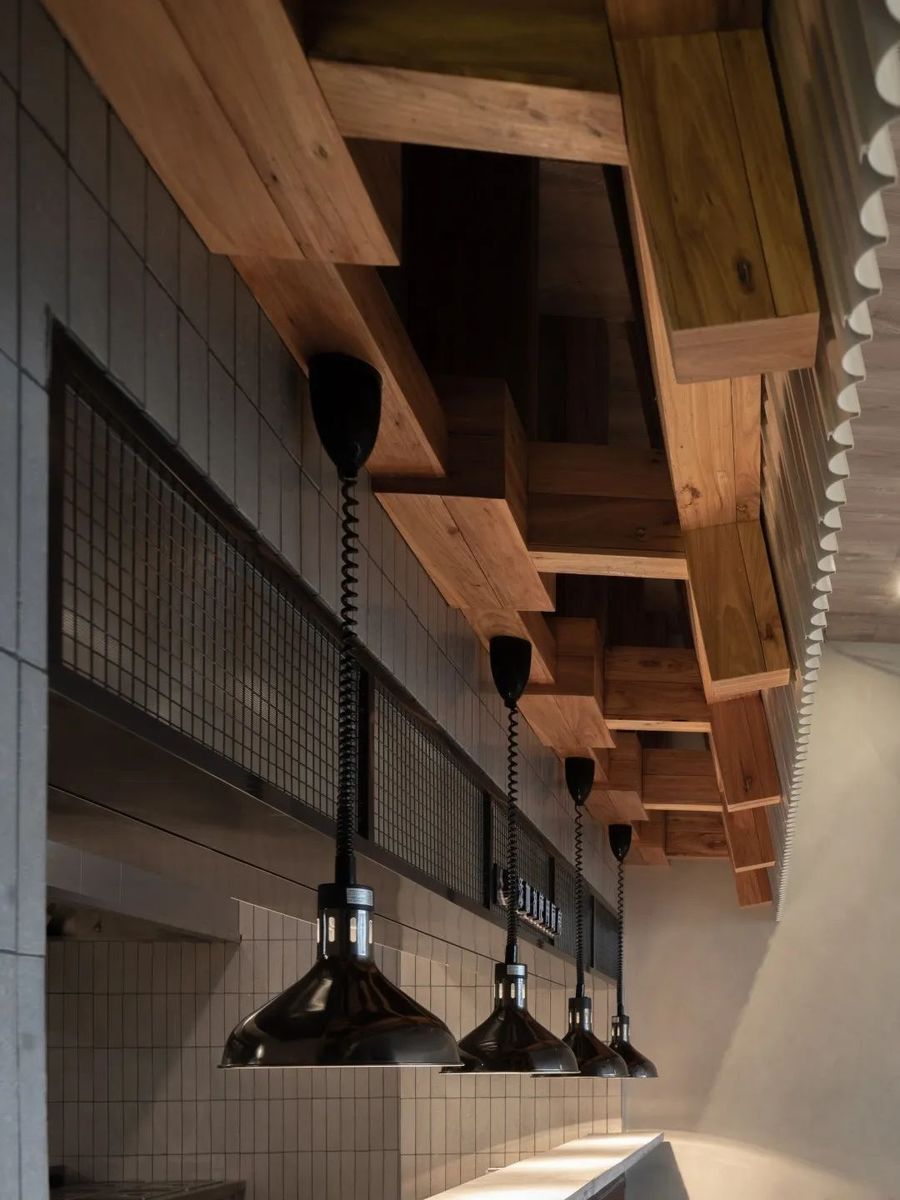
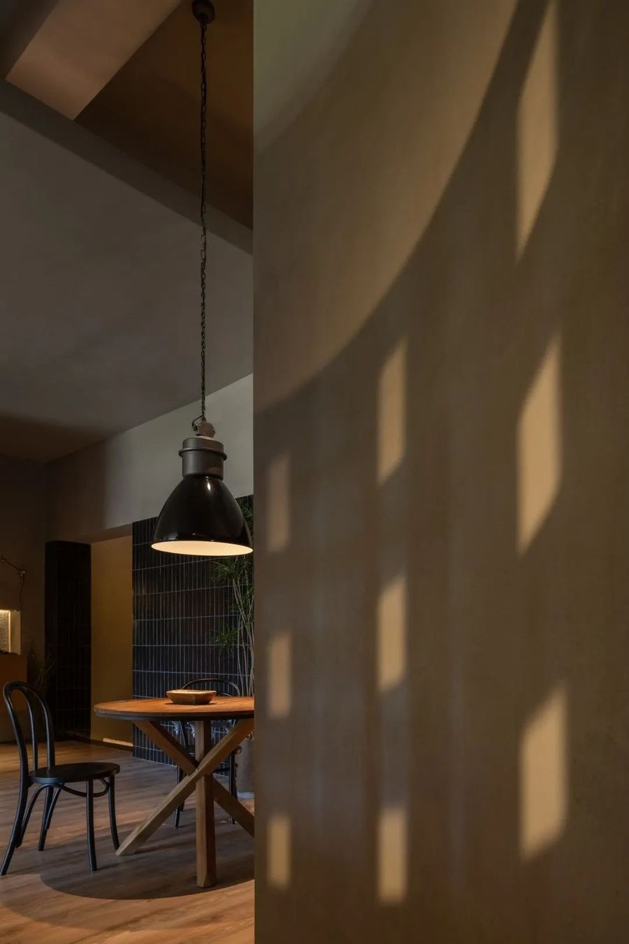
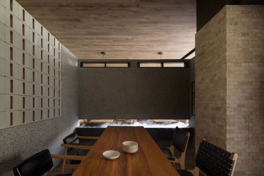
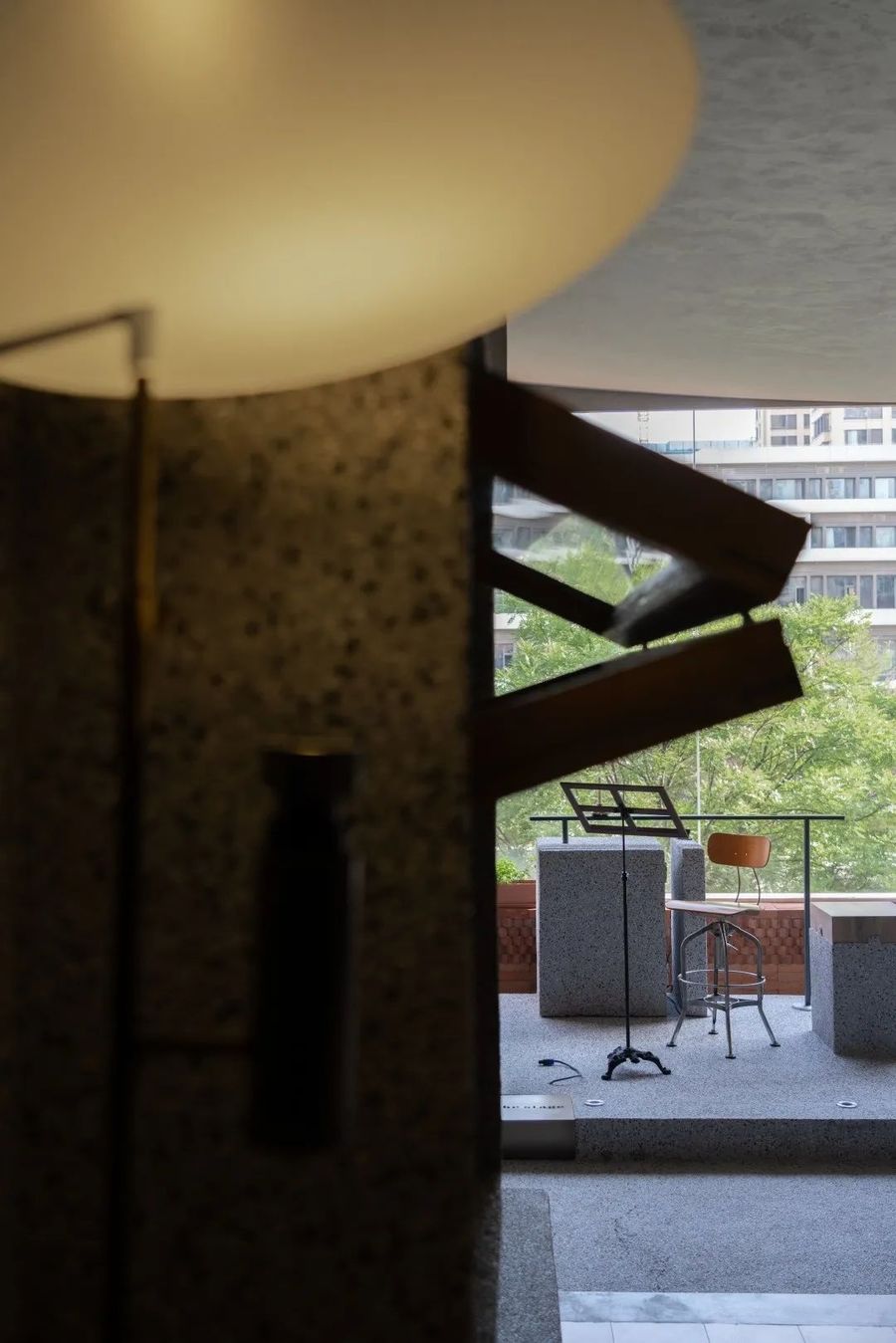
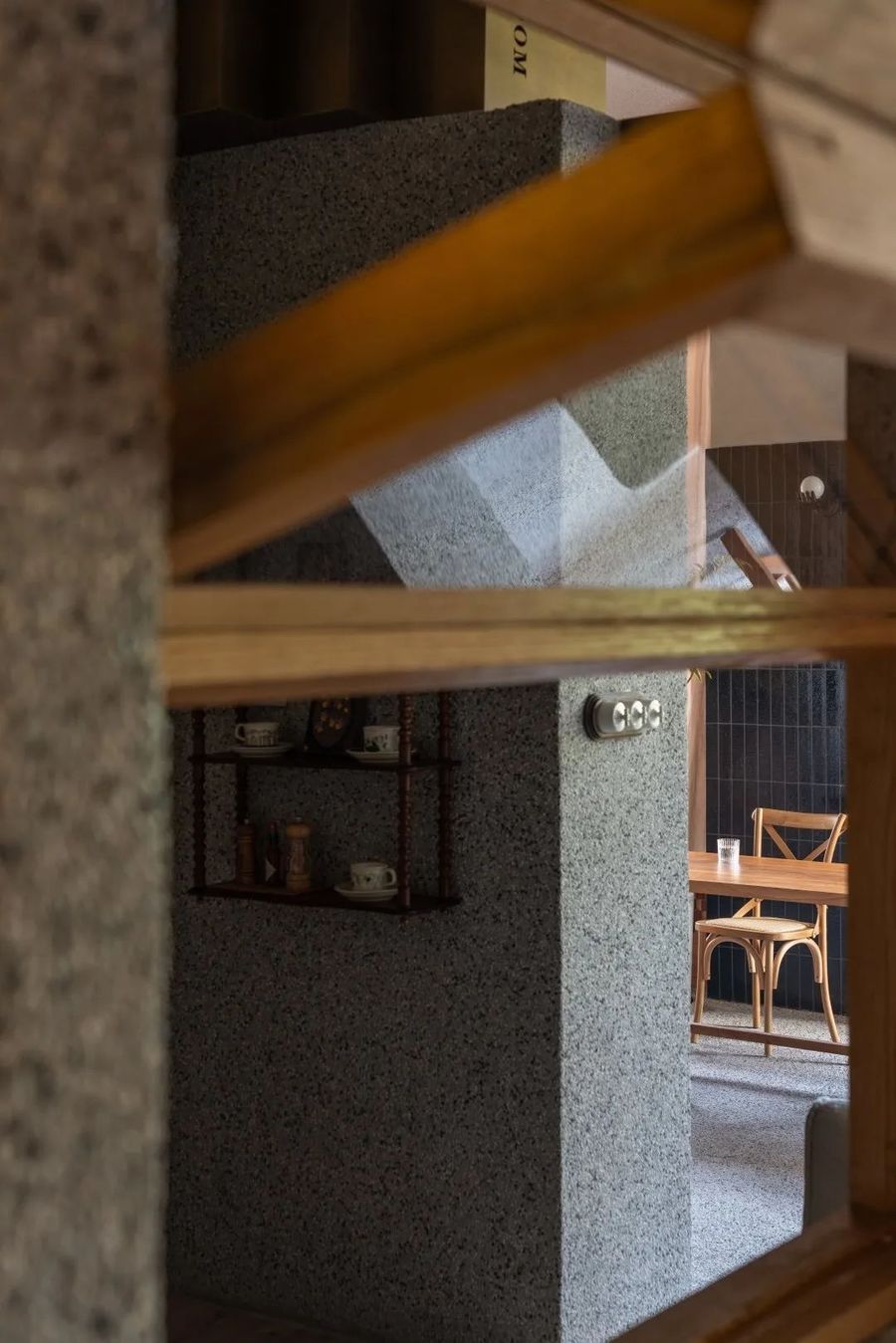
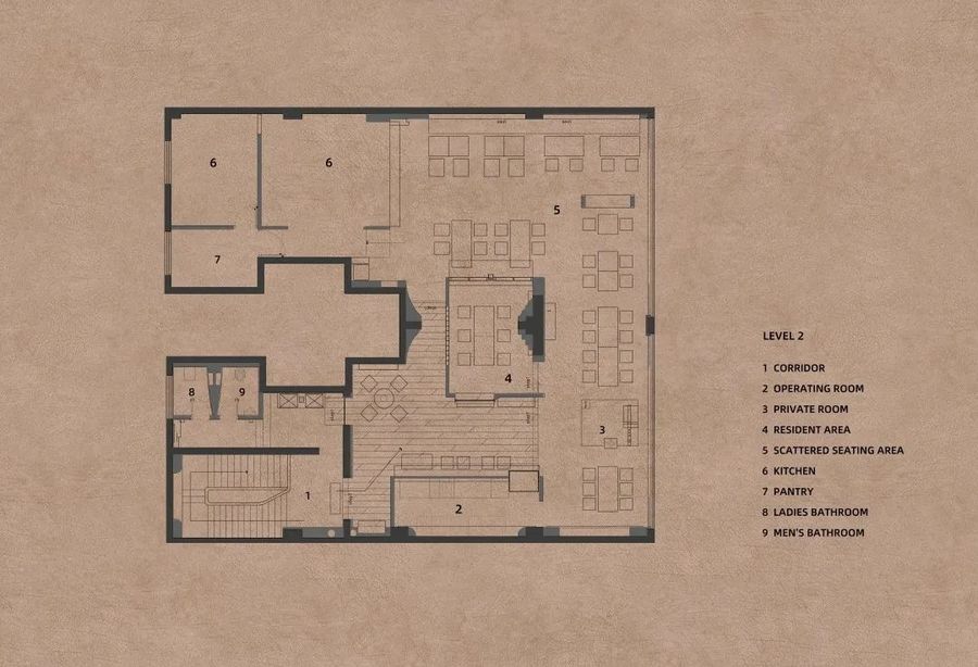
二层空间设计时,延续社区室外惬意的生活场景,将室内空间在不同是视角下不断重叠借景,让空间满足功能的同时也能感受到城市社区的生命力。二层就餐空间分为等候区、酒吧区、小型演绎区、散座区、长台区及vip包房区,将原本单一的空间混合布置,令内部空间得以流动,建立一种自由探索的奇妙就餐体验。
In the design of the second-floor space, the comfortable outdoor living scene of the community is continued, and the indoor space is continuously overlapped and borrowed from different perspectives, so that the space can meet the functions and at the same time feel the vitality of the urban community. The dining space on the second floor is divided into waiting area, bar area, small performance area, scattered seating area, long platform area and VIP private room area. The original single space is mixed and arranged to allow the internal space to flow and create a wonderful place for free exploration. dining experience.
▼不同区域的就餐区域,Dining areas in different areas
▼空间一角,A corner of space © 吴鉴泉
街巷缝隙餐饮对于社区的营造力量已不再是单纯的货品交易场所,在线上能够解决大多消费需求的当下,狭小的商业空间正快速的从“物”转向“体验”乃至“文化与价值观”。当下商业正在注入更多的文化、生活、社交的元素,其中佼佼者们逐渐构成了一个街区,乃至一个城市特色文化聚场,不仅为人们提供了一处休闲的场所,更以空间连接彼此,创造人们全新的生活场景。
The power of street and alley catering for community building is no longer a simple place for goods trading. At present, most consumer needs can be met online, and the narrow commercial space is rapidly shifting from "things" to "experience" and even "culture and values". . At present, business is injecting more elements of culture, life, and social interaction. Among them, the outstanding ones gradually form a block, and even a cultural gathering place with urban characteristics, which not only provides a place for people to relax, but also connects each other through space. Create a new life scene for people.
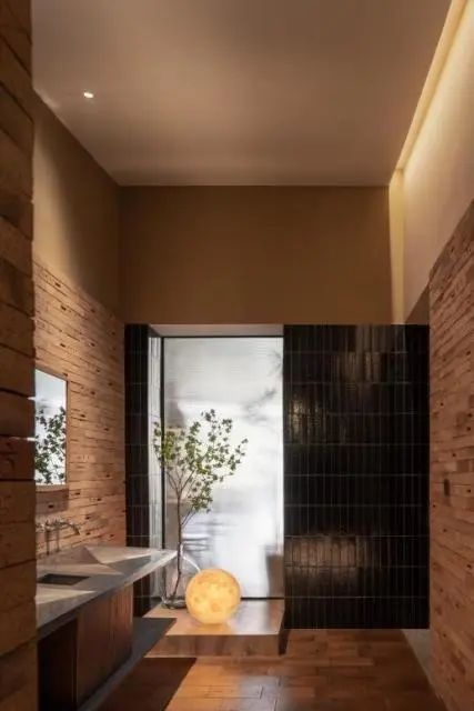
▼洗手间,The Toilet © 吴鉴泉
▼视线的穿透,Line of sight penetration © 吴鉴泉
延续整体空间设计的自然朴素质感,设计希望打造一个对空间敬畏、对料理期待的餐饮品牌,为此我们将水墨元素与品牌的视觉形象进行了融合,让空间体验充满调性的同时又不失趣味性,满足市民对空间体验的多维需求与想象。
Continuing the natural and simple texture of the overall space design, the design hopes to create a catering brand that respects space and expects food. Therefore, we integrate ink elements with the visual image of the brand, so that the space experience is full of tonality and fun, and meet the citizens' Multi-dimensional needs and imagination of the space experience.
▼包间,private area © 吴鉴泉
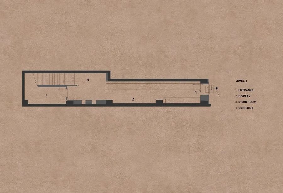
▼平面图,Floor plan © HOOOLDESIGN
项目名称:街巷缝隙 - 五感食喜
项目区位:山西太原
设计公司:HOOOLD
主创设计师:韩磊
设计师团队:荆超、黄德斌、李静怡、智鹏飞、郑天阳
照明团队:LST商业照明设计
艺术壁材:JCC精创色彩设计中心
项目面积:350平方米
项目类型:餐饮空间
完成时间:2022
项目摄影:吴鉴泉(WuSpace)
Project Name:Street Crevice - GOKANSHOKUKI
Project Location:Taiyuan, Shanxi
Design Company:HOOOLD
Chief Designer:Han Lei
Design Team:Jing Chao, Huang Debin, Li Jingyi, Zhi Pengfei, Zheng Tianyang
Lighting: LST Commercial Lighting Design
Art Wall Material: JCC
Project Area:350㎡
Project Type: Dining Space
Completion Date:2022
Photography: Wu Jianquan(WuSpace)


