随着新时代女性独立意识的崛起,在追求自我的过程中,从容自信、不被定义、活出光芒等词语,愈来愈为人们所强调。相伴于此,以悦己为需求的她经济,更催生了当下美体美肤产业的快速崛起。赫本秀HBbeauty,作为创立于深圳的知名美业品牌,专注于成就女性的美丽人生,赋予顾客【自然、健康、内在】的极致享受,其第三家千平旗舰店由MOSOM墨森设计倾力担纲。
With the rise of women's independence in the new era, words such as “ease and confidence”, “undefined” and “live sparkling” are increasingly emphasized in the process of self-pursuit. Besides, the she economy with self-pleasing as its demand has all the more contributed to the rapid rise of the beauty industry. As a renowned beauty brand founded in Shenzhen, HBbeauty strives to give women a beautiful life and a natural, healthy and inner pleasure. It’s third 1,000 sq.m. flagship store is designed by MOSOM DESIGN.
作为泛美业领域的设计的佼佼者,深刻洞悉此点的MOSOM墨森设计致力于通过“新美力”的专业赋能,解锁市场所需。以场景设计介入商业运营模式,其一面挖掘空间之于消费者的情绪感染力;一面通过场景互动的流量,辅助商业价值的可持续变现。
As a leading design firm in the pan-beauty sector, MOSOM DESIGN, with its keen insight, works to unlock the market demands through its “new aesthetic power”. By integrating scene design into the business operation mode, it attempts to dig out the space’s emotional appeal to customers. On the other hand, it supports the sustainable growth of business value via the traffic of scene interaction.
在其受邀担纲的赫本秀HBbeauty一案中,设计便很好地将这两点平衡 —— 沉浸式的共鸣体验与可持续的商业穿透力。“品牌与空间相辅相成。在此,空间某种意义上以建筑解构、光影塑造、空间材质、陈列规划等形式开启了体验的张力及节奏。沿着这些精心布局的'线索',我们力图营造的是一场共享之旅,以及从情绪价值的赋予至不销而销的潜在效果。”MOSOM墨森设计诠释道。
In HBbeauty, a great balance has been achieved between an immersive resonance experience and the sustainable business impact. “The Brand and the space complement each other. Here, the space has radiated its tension and rhythm through architectural deconstruction, light and shadow shaping, spatial materials, display and layout. With these exquisitely crafted details, we aim to create a shared journey and achieve a potential effect from emotional value to sales without advertising”, says MOSOM DESIGN.
如何在沉浸式体验中唤起顾客的持续吸引力,是MOSOM墨森设计在本案中力图实现的重点。“真正为空间体验感负责的不止是审美表象,随着时间推移,消费者在空间中所感知到的,多元延展的优雅意境、深刻入心的情感记忆,才是一种长久的体验。”
How to evoke the lasting appeal of customers in an immersive experience is the key point MOSOM DESIGN strives to achieve in this case. “Beyond aesthetics, it is the multifaceted elegance and deep emotional memory consumers perceive in the space that create a lasting experience over time.”
▲ 朗香教堂
▲ 赫本秀
由此,落笔场域氛围的营造,设计师以建筑美学为基底,取意于柯布西耶的朗香教堂。独特的架构形式,突破传统平铺直叙的块面,以不规则的墙体形态与洞口切割形式展开,指向于人对空间的深层探索。
Therefore, the designers draw inspiration from the La Chapelle de Ronchamp by Le Corbusier to create the field’s ambience. The unique architectural form, with its irregular walls and hole cutting, breaks with the conventional flat and linear blocks, encouraging people to explore the space in depth.
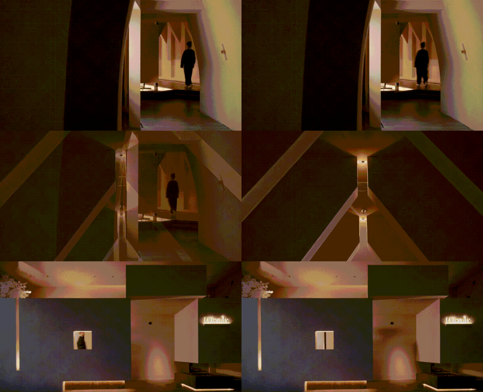
将空间交给观者探索,在人与场所的链接中,令其间的美感逐渐显现,是设计师在此透过建筑艺着力表达的。光束散落、越过层隙、落影于内,缓缓映现出教堂般的室内构造,人穿行其中,顿感一种无声的仪式。
The space is left to the viewer to explore the beauty through the art of architecture. The interior of the structure that resembles a church is gradually mirrored by dispersed light beams that pass through gaps and fall inside. This will give people a sense of silent ritual as they walk through it.
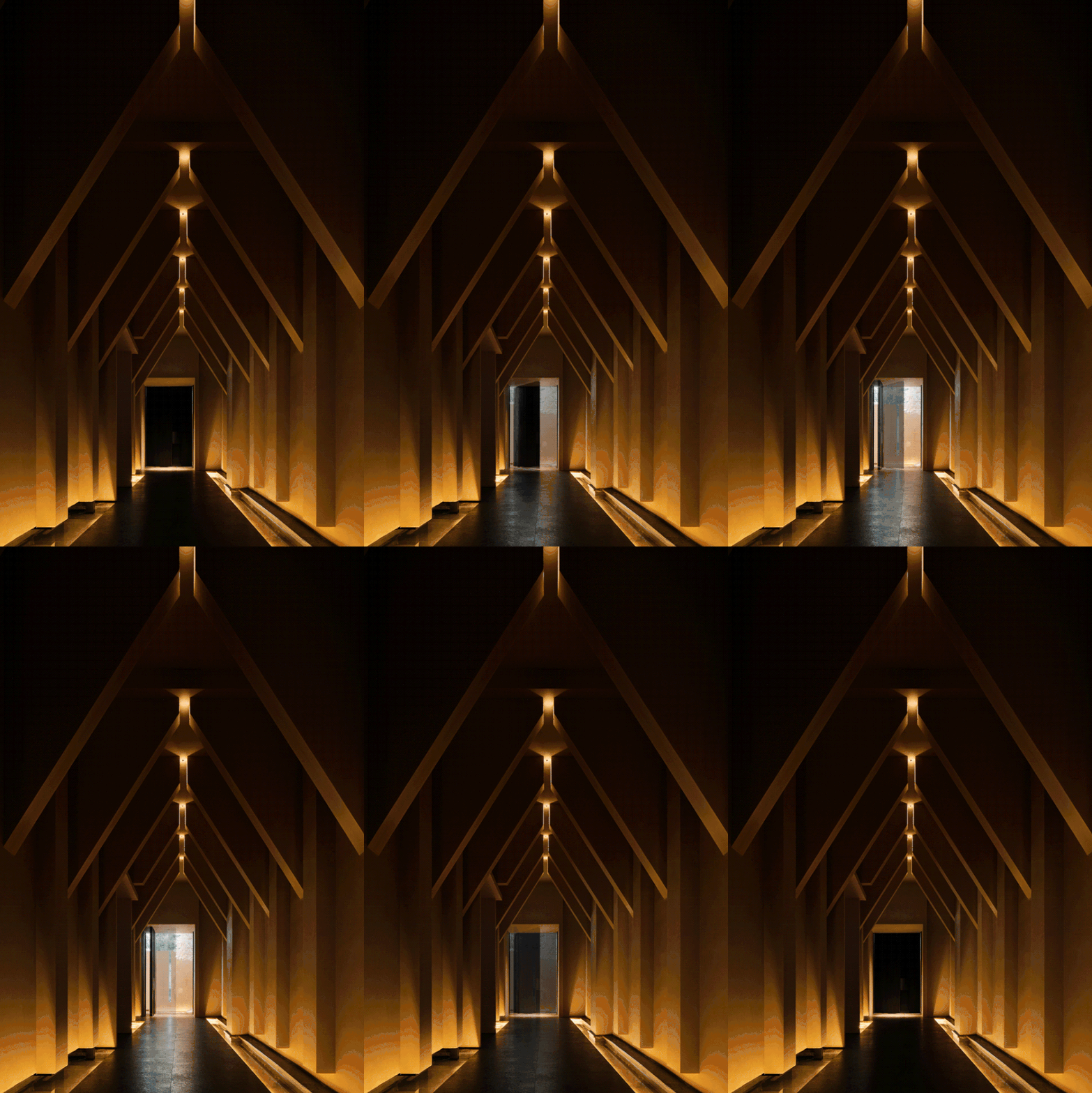
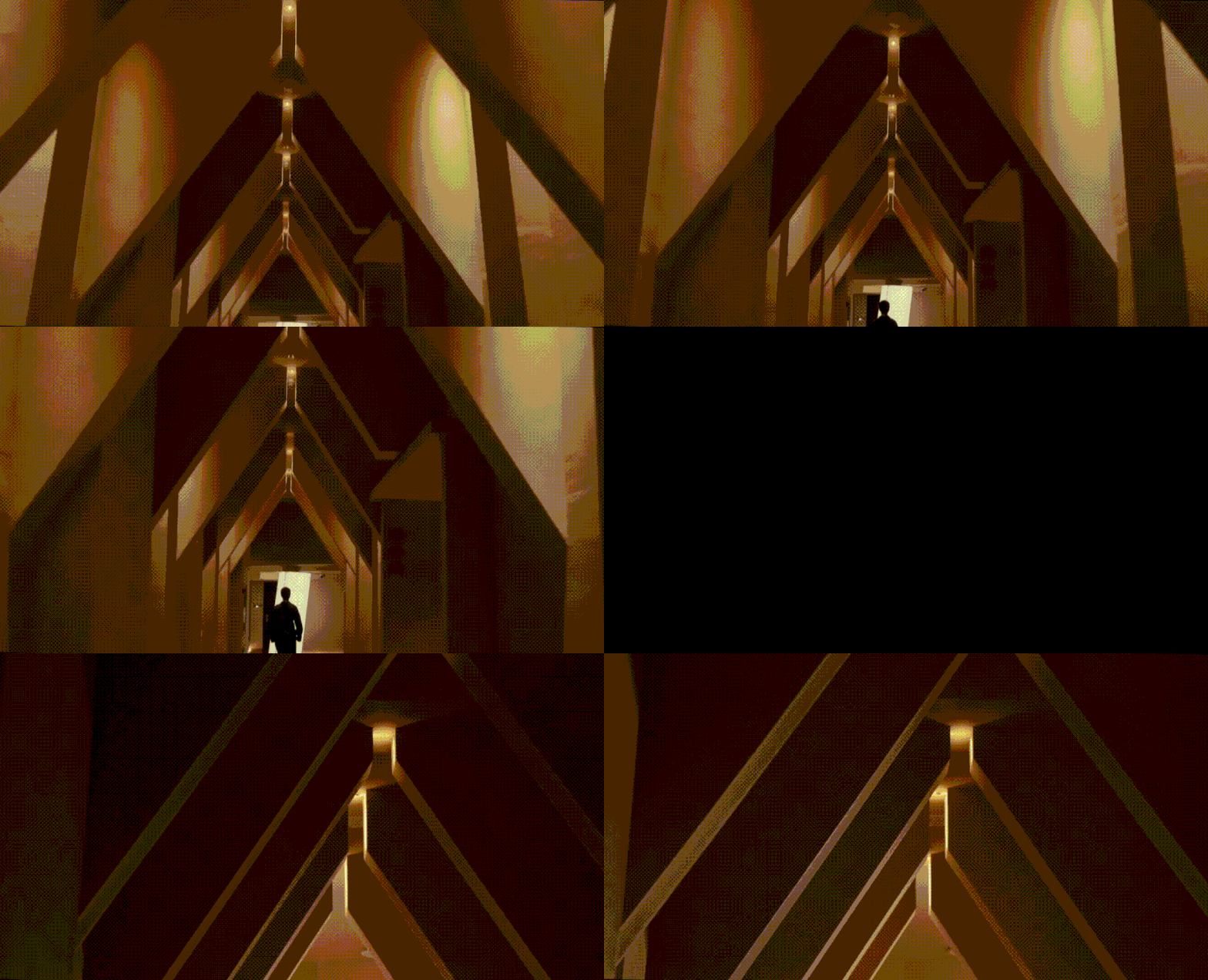
顺延巧妙设置的空间动线,在进入正厅的廊道处,设计师以递进式的空间结构,搭建优美的建筑旋律。当观者步入于此,刻意拉低的天花距离,将其包裹在一片新奇秩序与私密感中。犹如剧本中的转场,从门外到店内的转换,于无形间牵引着顾客的注意力,一场精心编织的“故事”就这样悄然开启。
Following the spatial motion line, the designers have created a wonderful architectural melody at the corridor of the hall with a progressive space structure. As the viewers enter, the deliberately low ceiling distance wraps them in a sense of novelty, order and privacy. The transition from the the store’s outside to the inside is like a scene change in a play, invisibly drawing the customer's attention. Thus, the expertly constructed "story" starts out subtly.
“光影与建筑的穿插、体块与结构的组合是关键设计逻辑。”三角式结构与垂直光线的建立,向外滋生出严肃的庄严感。“走进这里时,人们可能最先产生好奇,进而是理解与欣赏,这便是隐藏在设计语言背后的情感序列。”
"The interplay of light and shadow with the building and the combination of blocks and structure is the key design logic." The triangular structure and vertical light exude a sense of solemnity outwards. "Once inside, visitors could initially feel curious, then understood and appreciated. This is the emotional sequence hidden behind the design language."
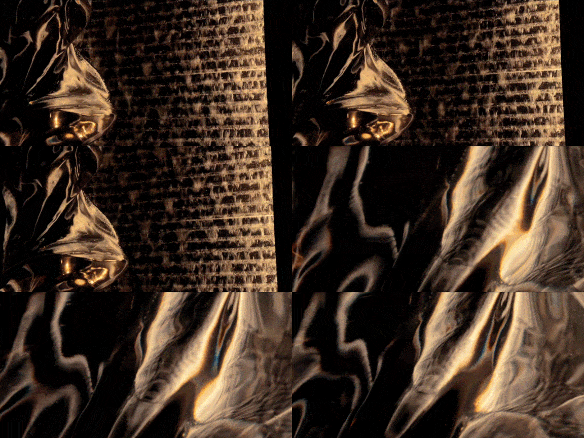
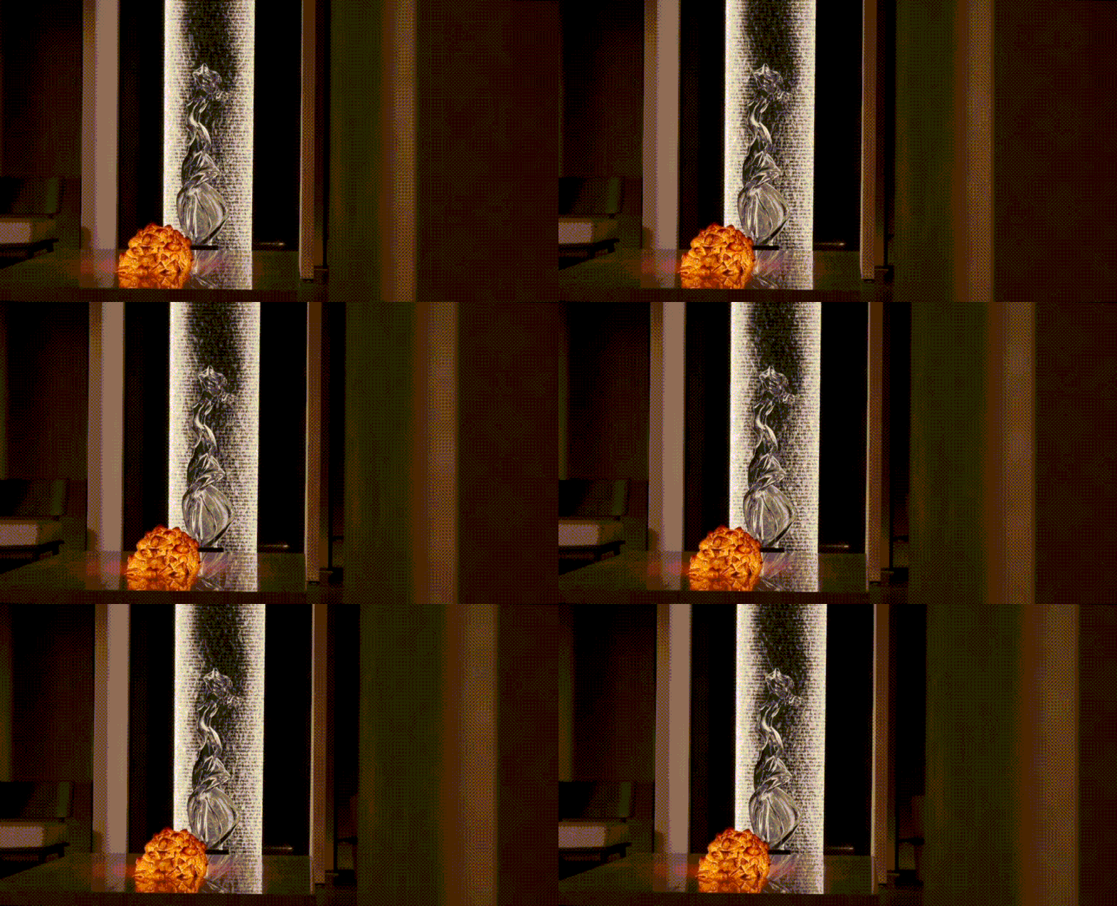
停留于消费者印象中的品牌调性如何精准传递?“高雅、纯粹与隐含的震慑力是我们想要赋予空间的性格。”从纯粹的清水混凝土、木艺材质、隔墙排列的座椅秩序,到占据视觉中心的火烧木装置,设计对氛围感的营造,贯穿着对尺度、色彩、画面的多维考量,每一个独特的元素,皆是一个打动人心的要点。
How to precisely express the brand tone that stays in the consumer's mind? "Elegance, purity and implied shock are the character we wanted to give to the space." From the pure fair-faced concrete, the wooden materials, the orderly seating arranged on the partition walls, to the flamed wood installation that dominates the visual centre, multi aspects like scale, colour and image have been taken into account for atmosphere creation. By doing so, each unique element is a key point that strikes a chord.
“进一步讲,建筑空间的设计贯穿着隐性的节奏感,我们有意规避额外的装饰,转而令细节经得起品味,于无形中传递至身心,唤起消费者的深刻共鸣。”
"Furthermore, there is an implicit sense of rhythm that runs through the design of the architectural spaces. We have deliberately avoided extra decoration in favour of details that stand up to taste. This will be invisibly conveyed to the consumes’ mind and body, evoking a deep sense of empathy among them."
在MOSOM墨森设计的笔下,空间的设计即是一场通达感物的编排。环伺四周,拱形门、灵动的楼梯弧线形态与原本直线条建筑的对撞,形成一支韵律回旋的“复调”,在丰富层次之余,润物细无声地勾勒着节奏,令观者漫漫感受时光的悠扬曲调。
According to MOSOM, the space's design allows access to the objects. Looking around, the arched doors and the curve staircase collide with the original straight lines of the building, thus developing a rhythmic "polyphony". While enriching the layers and the rhythms, it makes the viewers feel the melodious tune of time.
就这样,跟随设计的指引,空间的营造为体验者开启了日常生活之外的另一扇门。这一超越时间的意境感,正是在“空间即品牌,场景即营销”的前置策略下,激活品牌附加值的重要方式。
In this way, following the design guidelines, the space is created to open another door for the experiencer beyond everyday life. Based on the "space as brand, scene as marketing" strategy, this feeling of context that transcends time is a key way to activate the added value of the brand.
蜿蜒的弧线形态背后,从技法上讲是一种缓慢的协调、过渡。而从感官的塑造上看,弧线的背后,是变化,是生命力,向外传递着灵动的身心态度,而这也正道出品牌想要赋予消费者的体验内涵 —— 自在享受、悦己健康。
Behind the winding curved form is a slow coordination and transition technically. But in terms of sensory shaping, behind the curve is change and vitality, conveying a dynamic attitude of mind and body outwardly. This is exactly the experience that the brand wishes to provide to its consumers - to have fun and stay healthy.
对于线下商业品牌而言,体验空间的营造,为其提供着重要的生长养分。正如MOSOM墨森设计一贯在泛美业空间设计中所传达的 —— 空间即属于品牌识别度的一部分,它将场景体验背后的流量、记忆,导入商业的长续经营中。
For offline commercial brands, creating experience spaces is crucial to its brand growth. As MOSOM DESIGN has consistently stated in its pan-beauty space design - as part of the brand identity, the space integrates the traffic and memory behind the scene experience into the long-term operation of the business.
从固定的空间范式与场景概念中跳脱出来,在赫本秀HBbeauty中,一种解构主义的建筑美学、一场建立在五感六觉之上的身心体验,不再止于表层的美感,而是将其真实地转向于精神内核,隐含在人与空间关系中的商业转化上,从而建立起消费者与品牌的深度共鸣。
HBbeauty has emerged from the fixed space paradigm and scene concept, transcending deconstructed architectural aesthetics and a physical and mental experience. Instead, it has focused on the spiritual core, which is implied in the commercial transformation of the relationship between people and place, so as to build a deep empathy between consumers and the brand.
MOSOM墨森设计由知名设计师⾦柊⾠创立于深圳,立足国际视野,专注研究“新美力”,致力于美业会所、豪宅与办公的专业化设计,为客户提供美业商业顾问、空间设计、灯光设计、软装设计等一体化解决方案。
Founded in Shenzhen by the famous designer Mr. Zhongchen Jin with a global outlook, MOSOM DESIGN specializes in researching “new aesthetic power”. Engaged in the professional design of beauty clubs,luxury housing and offices, it strives to provide clients with integrated solutions like business consultant in beauty industry, space design, lighting design and soft decoration design.
多年来,基于对泛美业的全方位深入洞察、研究与实践,MOSOM墨森设计提出“多元趋变,优雅永恒”的核心理念,发挥“空间即品牌,场景即营销”的前端策略思维,聚焦商业的高频认知与高效变现,为设计之外的附加值而不断创造。在设计中,我们横向考量客户的投入成本与回报周期,纵深剖析建筑结构、材质美学、业态逻辑、商业坪效、品牌运营等因素,将空间从严密的整体拆解为有机的个体,整合上下游资源并有效缩短从概念设计到商业落地之间的节点,促进回报效率与商业产值的最大化,最终呈现出功能、美学与情感价值统一的复合态空间精品 —— 风格多元、气质优雅。
Over the years, based on the all-round in-depth insight, research and practice of pan-beauty industry, MOSOM DESIGN has put forward the core concept of “diversified change, elegance until eternity”, and given play to the front-end strategy thinking of “space is brand, scene is marketing” with a focus on the high-frequency cognition and efficient realization of business. With these efforts, the value-added beyond design is constantly being created. In the design, we consider the input cost and return cycle of clients horizontally, while analyzing architectural structure, material aesthetics, business logic, commercial economic benefits and brand operation vertically. Efforts have been made to turn a strict whole into organic units, integrate upstream and downstream resources and effectively shorten the nod from conceptual design to commercial landing. This is how we maximize return efficiency and business output value, finally presenting a quality complex space that combine function, aesthetics and emotional value -- with diversified styles and elegant demeanor.


