SOLEN餐厅,又名“太阳”餐厅,位于斯德哥尔摩历史悠久的肉类食品加工区。本餐厅也是米其林主厨二人组Adam和Albin与Specific Generic的第五次合作。
Restaurant SOLEN (the sun) is situated in the historic meatpacking district of Stockholm. The restaurant is the 5th collaboration between Michelin stared chef duo Adam and Albin and Specific Generic.
▼项目概览,overall of the project © Emil Fagander
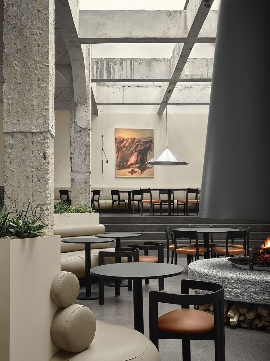
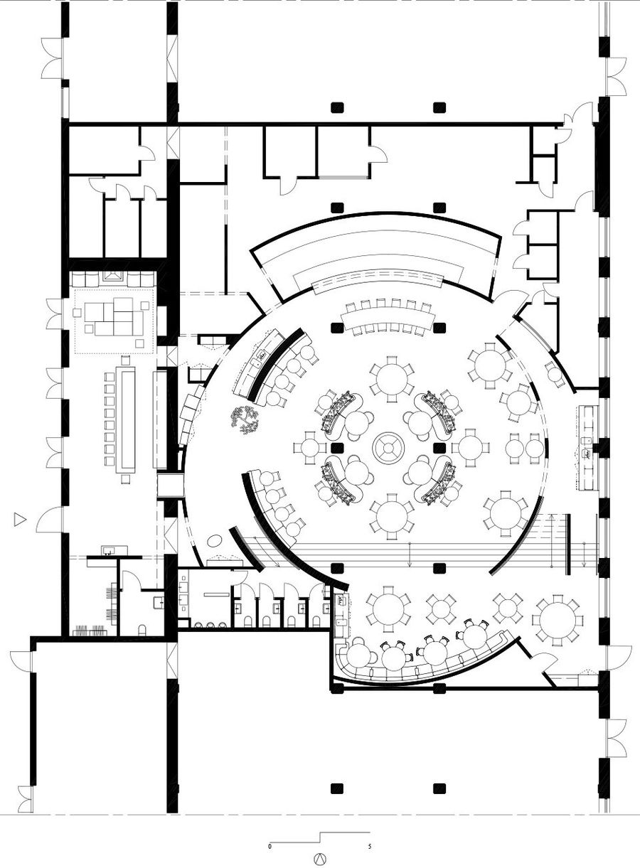
餐厅菜品的中心主题为太阳。当把这个主题转化为建筑空间时,Specific Generic的建筑师便将他们的想法转向了太阳系。在太阳系中,天体围绕着中心的太阳旋转,因此壁炉周围的墙壁采用了曲面的形式,宛如太阳周围的天体运行轨道一般。
The central theme for the food served at the restaurant is the sun. When translating this idea into the architecture of the space, our thoughts turned to our solar system, where celestial bodies revolve around a centered sun. We let the walls fold around the fireplace like the orbital paths around the sun.
▼曲面墙体,curved wall © Emil Fagander
这种规划方式造就了婉约的空间序列,进而引发了顾客们的好奇心,邀请着人们在空间中漫游探索。每张桌子都为人们提供了独特的空间视角。
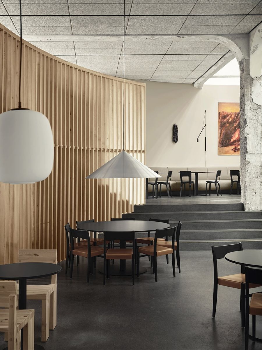
This manner of planning results in a space where not all of the room is revealed at once. We invite visitors to be curious and explore. Each table offers a unique view of the space.
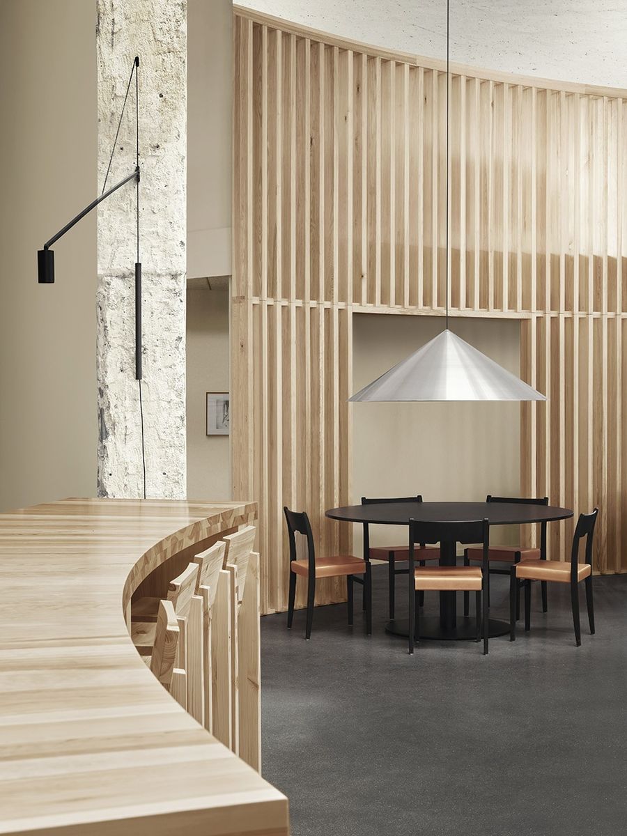
▼弯曲的松木厨师桌和木制隔墙,
the curved chefs table and the wooden partition wall © Emil Fagander
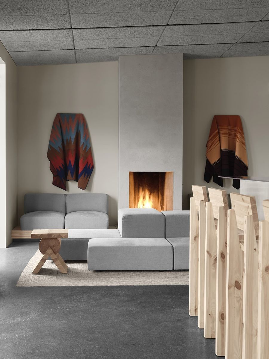
家具的选择灵感来自于北欧人简单而美好的生活方式,旨在唤起人们对于那些阳光明媚的旅行目的地的联想。简洁的家具设计与空间中的轻松气氛产生共鸣。
The furniture choices have been inspired by the idea of the simple and good life that people from the north associate with the places we travel to experience the sun. Their simplicity resonates with the lighthearted atmosphere that we want to create.
▼休息室,lounge © Emil Fagander
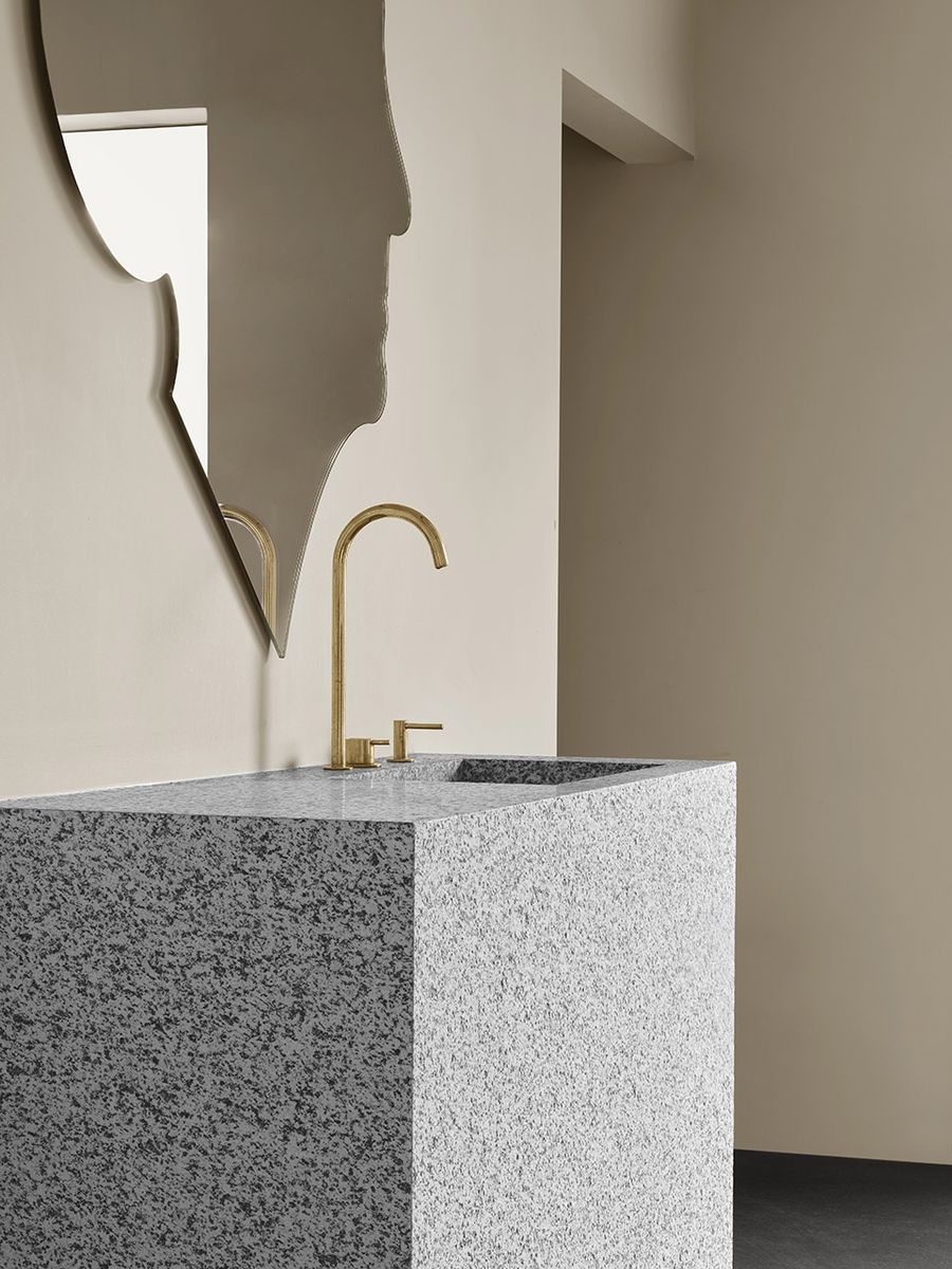
▼洗手池,washing basin © Emil Fagander
设计的核心理念旨在保持材料的真实和简单,例如:包括弯曲的厨师桌和木制隔墙在内的一系列松木家具、绘制了传统蛋彩画的黑色椅子,以及舒适柔软的皮革沙发垫等。大型锥形吊灯则是设计师特意在它们被涂装之前从生产线中购买的,目的是为了保留其原始的金属光面肌理。吧台由不锈钢制成,壁炉和洗手池则是由经过切割的粗糙花岗岩块制成。
The aim has been to keep the materials real and simple:a family of pine furniture including the curved chefs table and the wooden partition wall; the black chairs are coated with a traditional egg oil tempera; sofas are upholstered with leather. The large cone lamps are taken out of the production line before they are coated so that their raw metal finish is preserved. The bar is constructed out of mill finish stainless steel and fireplaces and water station are made from roughly cut granite blocks.
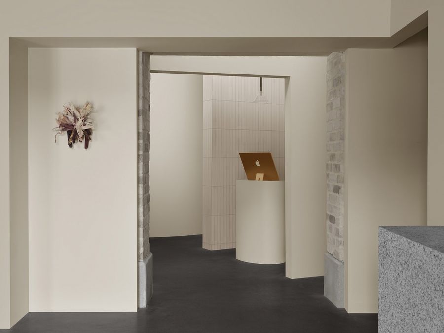
▼新旧建筑元素的结合,combination of the old and new architectural element © Emil Fagander
▼接待台,reception desk © Emil Fagander
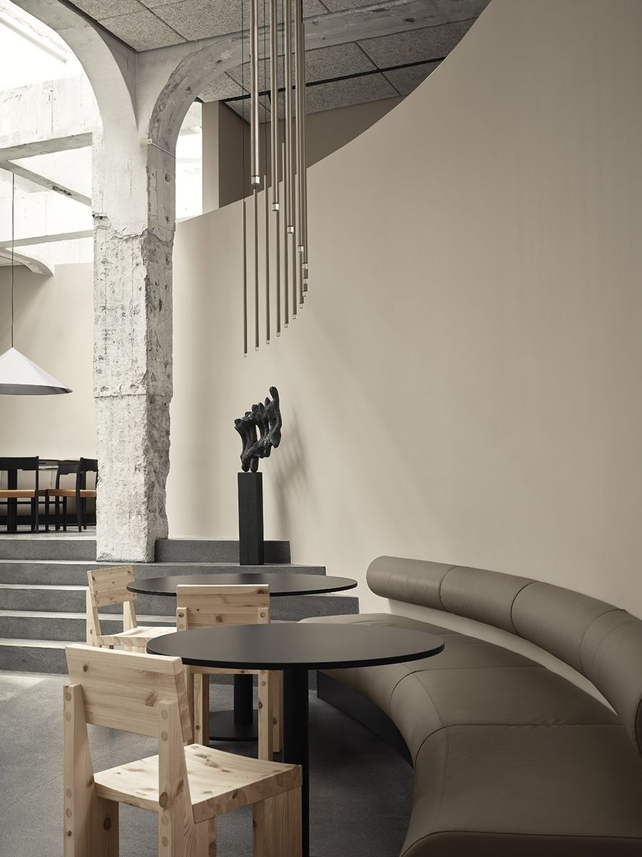
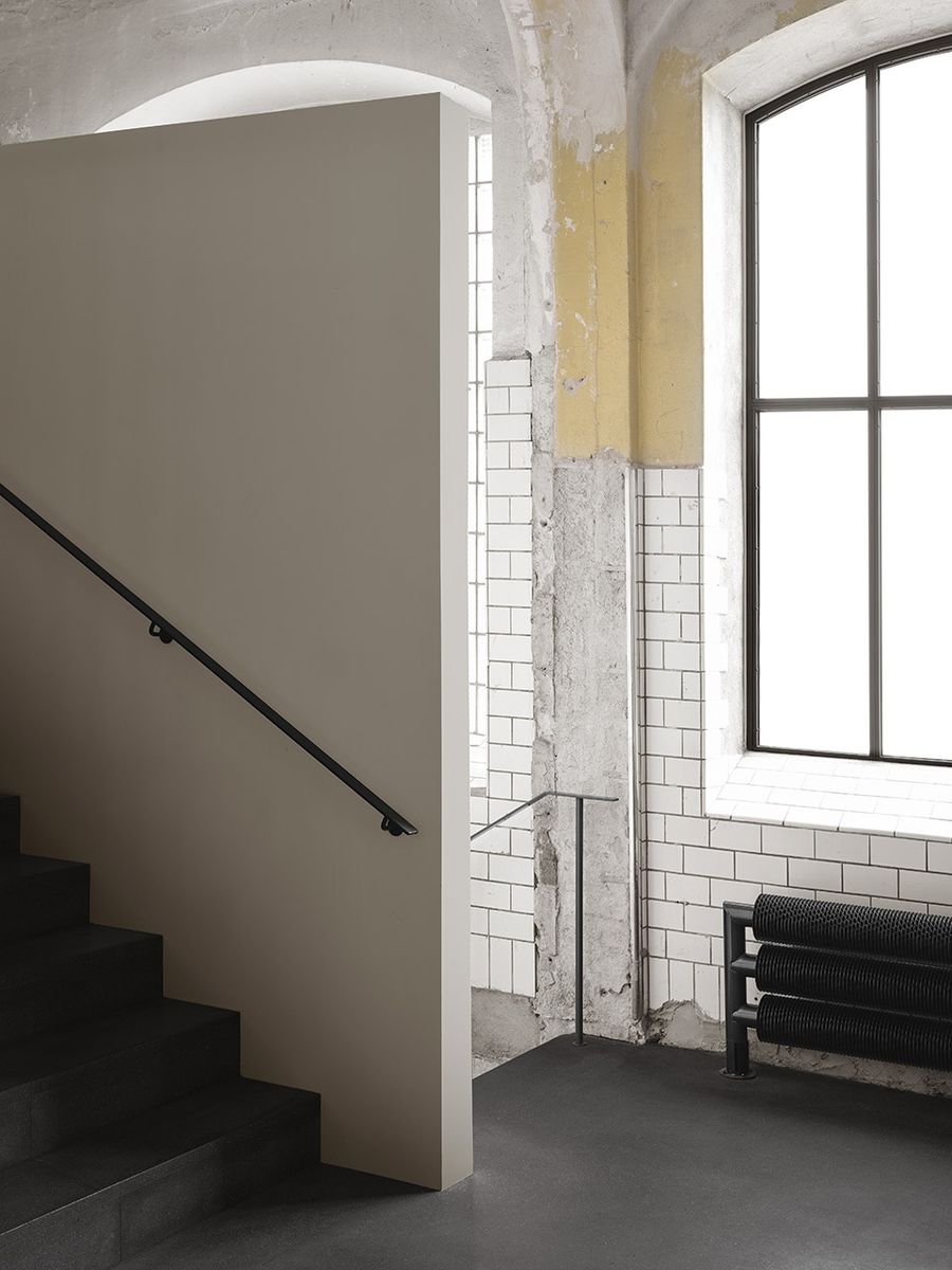
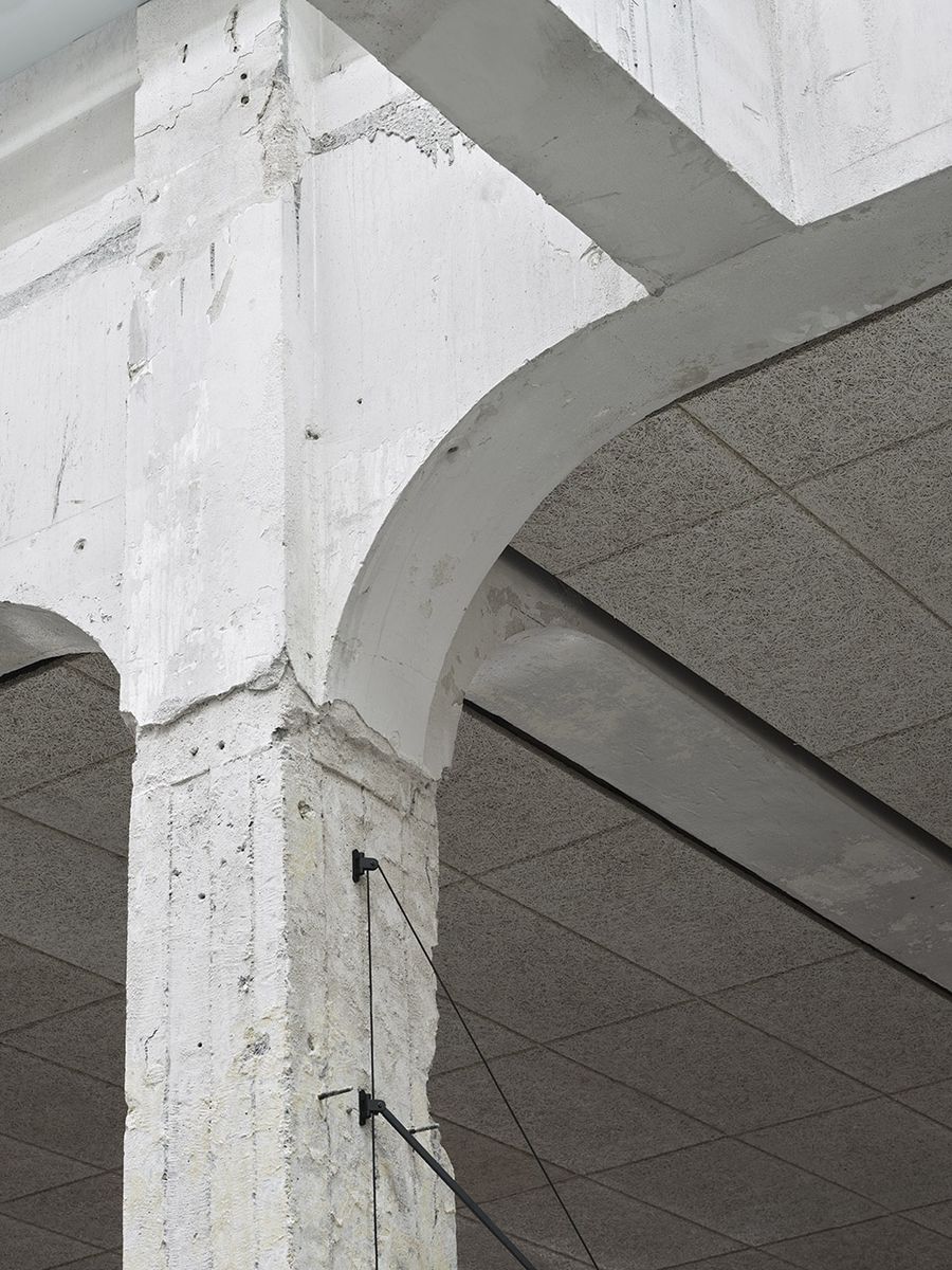
在面对历史建筑时,设计师采用了突出新旧对比的方法。空间中新增的墙体采用了曲面的形式,与正交的原始墙体形成对比。同时,新墙在处理上更加简洁干净,而旧墙则留下了丰富的纹理。这些具有历史意义的石柱,在光滑弯曲的新墙的衬托下,宛如雕塑一般伫立于空间之中。墙面采用了柔和中性的色彩,当温暖的阳光照射在白色的墙壁上时,整个餐厅空间将笼罩在更加柔和的氛围中。
Our approach while working with the historic building has been to celebrate the contrast between the old and new additions. New walls are round, old ortogonal. New walls looks box fresh crisp besides the old that are left with a rich texture. The pillars with all of their historic layering appear almost like chiseled sculptures against the new curved smooth walls.The color that are applied to the walls is the shade you experience when warm sunlight hits a white wall and softens it’s appearance.
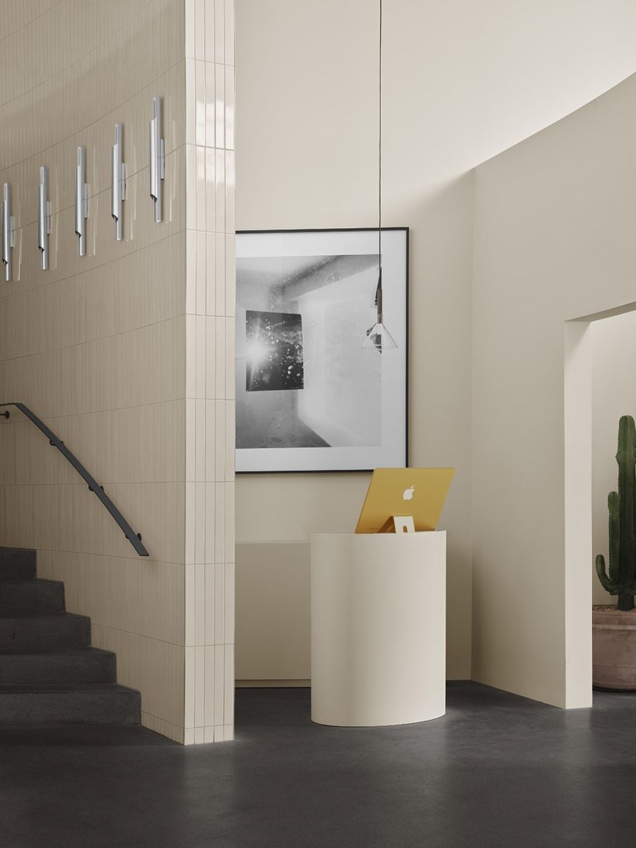
▼楼梯间,staircase © Emil Fagander
▼细部,details © Emil Fagander
▼平面图,plan © Specific Generic


