建筑师的咖啡馆
An Architect’s Café
在自己设计的建筑里开一间咖啡馆,可能是很多建筑师心中都曾有过的小小梦想。
“真希望能有个咖啡馆,一看就是建筑师的。不仅对城市有所回应,兼具展览、工作坊,甚至是办公的功能,更能让大家以咖啡为媒介,更放松的走进和了解建筑师的工作和生活。”
Perhaps many architects have had a small dream in their mind of opening a cafe in a building they designed.
“I hope that there will be a cafe that looks like it is run by an architect. Not only does it respond to the city, but it can also function as an exhibition, workshop, or even an office. Moreover, it allows people to use coffee as a medium to enter and understand the work and life of architects in a more relaxed way.”
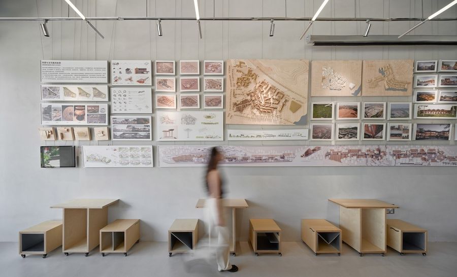
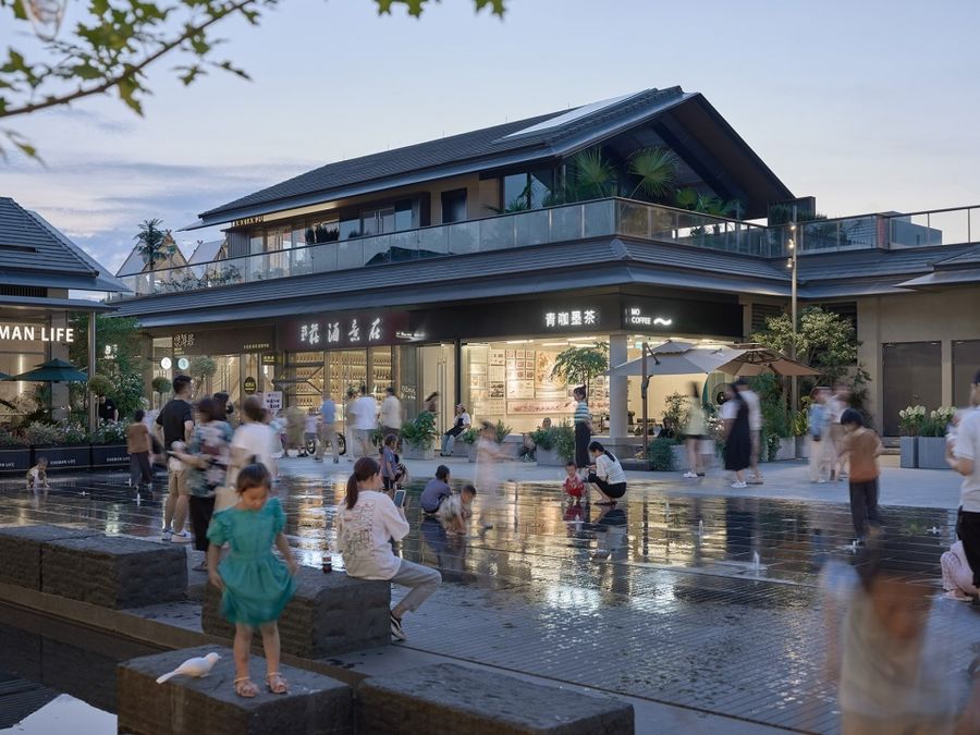
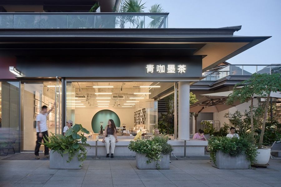
▼项目概览,Preview © 朱清言
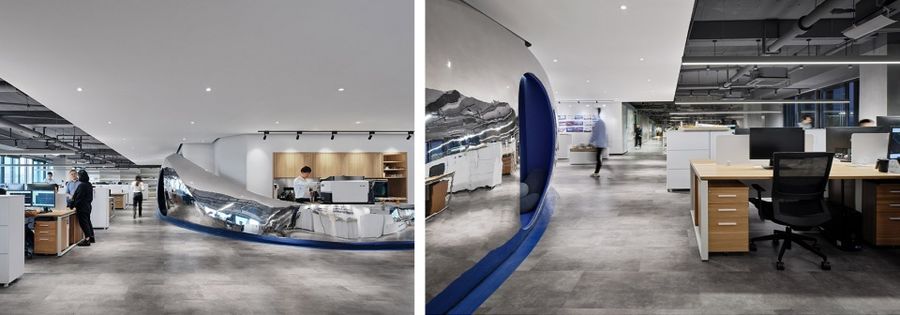
三年前,我们在业主办公室置入迷你咖啡吧,流动的镜面不锈钢激活了核心筒区域。专业咖啡师不仅为同事们制做咖啡,也总是会接到同园区其他公司的“订单”。友邻们纷纷组团来打卡“办公室咖啡”,也带着好奇心围观设计公司的日常。
Three years ago, we installed a mini coffee bar in the owner’s office, and the flowing mirrored stainless steel activates the core area. The professional barista not only makes coffee for colleagues but also receives “orders” from other companies in the same office park. Neighbors come to visit the “Office Coffee” in groups and are curious to see the daily life of the design company.
▼建筑师咖啡店“内测版”,Architect’s Café “beta version” © 朱清言
“办公室咖啡”因此从“福利”变成了“副业”,也让业主看到了建筑对话大众的另一种可能。因此,从办公室到城市的这一步,就这样在建筑圈与咖啡圈双卷的氛围下逆流而上。
The “office coffee” has thus changed from a “welfare” to a “side business”, and has allowed the owner to see another possibility for architecture to talk to the public. Therefore, in the atmosphere of the double-rat race of the architectural and coffee circles, the architect’s café still swims against the current and extends from the office to the city.
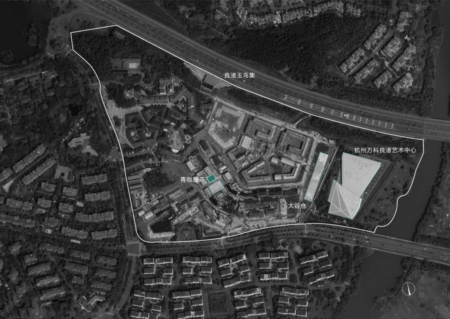
▼咖啡店位置,Café location © 立木
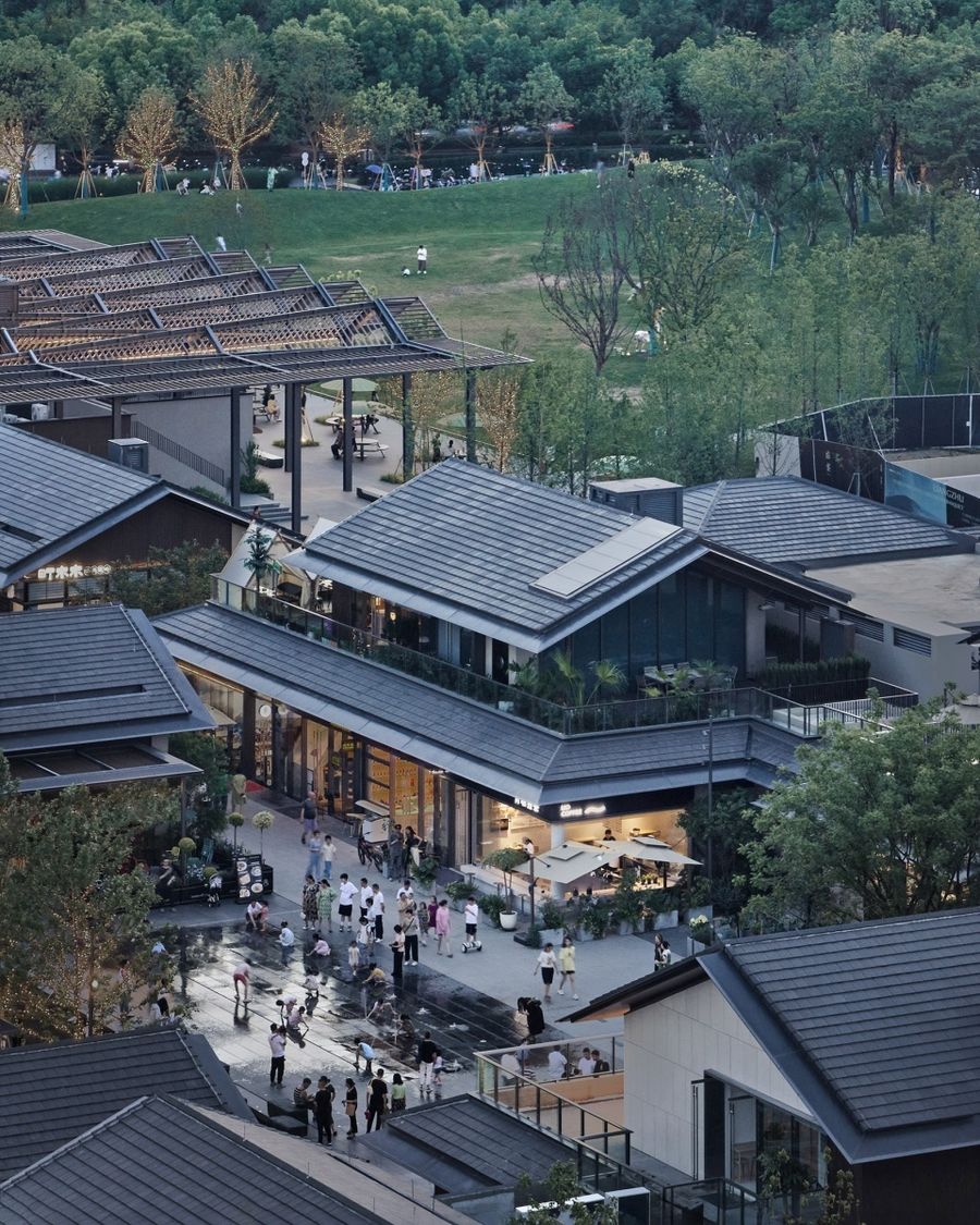
▼俯瞰咖啡店与广场,Overlooking the café and the square © 朱清言
留住初夏的风
Keeping the early summer breeze
咖啡店位于杭州玉鸟集,面向广场与旱喷,是当之无愧的C位。设计时间正处于春夏之交, 户外微风是任何人工设计都无法比拟的舒适体验,让人想起童年在树荫下喝下一碗凉凉 的茶,清爽干净。
The café is located in Hangzhou’s Liangzhu Birland, facing the plaza and the dry spray, a well-deserved center position. The project was designed at the beginning of spring and summer, and the outdoor breeze is a cozy experience unmatched by any man-made design, reminiscent of a cool bowl of tea in the shade of a tree in one’s childhood, refreshing and clean.
▼咖啡店面向广场,Café facing the square © 朱清言
▼设计策略,Design strategy © 立木
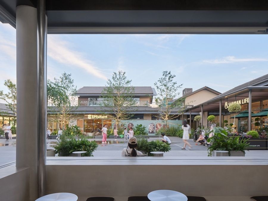
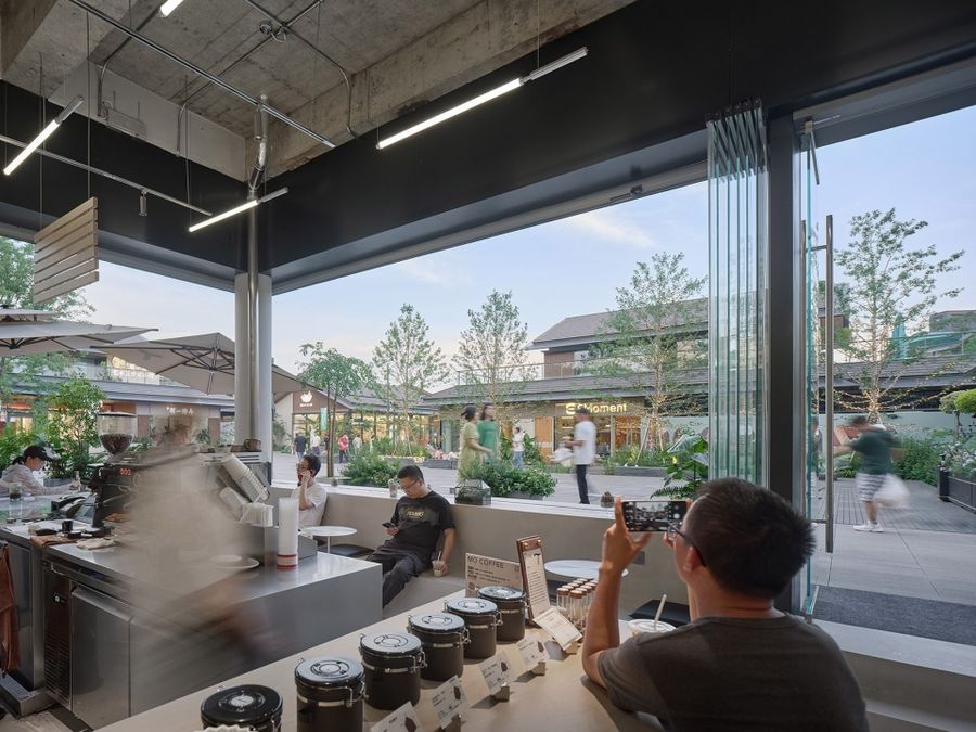
因此设计保留朝向城市广场的270°开放界面,玻璃用来抵御夏季的暴晒与冬季的严寒,而在不冷不热的好天气,折叠玻璃移门可完全打开,为人们留住初夏的风。
Therefore, the design retains the 270° open interface towards the city square, where the glass is used to protect against the summer sun and the winter cold, while the folding glass sliding door can be fully opened on nice days to keep the early summer breeze.
▼留住初夏的风,Keeping the early summer breeze © 朱清言
▼面向广场的视野,Square Facing Vision © 朱清言
▼可完全打开的玻璃,Fully openable glass © 陈子茜
退让的 1/4
The ¼ Setback
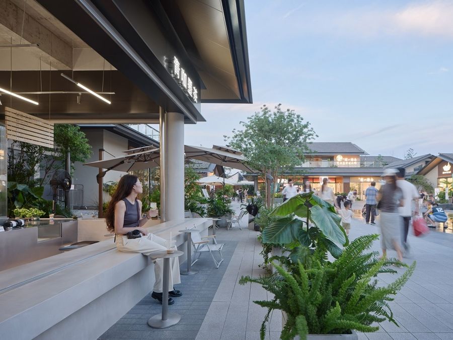
公共性是建筑师不变的情怀,在寸土寸金的广场沿街,设计将咖啡操作和售卖区域向内侧后退了1/4进深,将入口7米长、3米宽的完整区域向街区完全开放。退让压缩了咖啡馆的内部空间,但却将室外广场向建筑内部延伸,使咖啡店变成广场的一部分。
Publicity is a constant sentiment of the architect. Even in the expensive plaza street, the design sets back the coffee operation and sales area by ¼ of its depth to the inside, opening up the full 7-meter-long, 3-meter-wide entrance area to the neighborhood. The setback compresses the interior space of the café, but extends the outdoor plaza into the building, making the café part of the plaza.
▼咖啡店主立面,Cafe Main Elevation © 朱清言
▼退让出1/4的公共区域,Setting aside 1/4 of the public area © 朱清言
▼惬意的日常,Cozy daily © 朱清言
下沉空间的安全感
Sunken Entrance
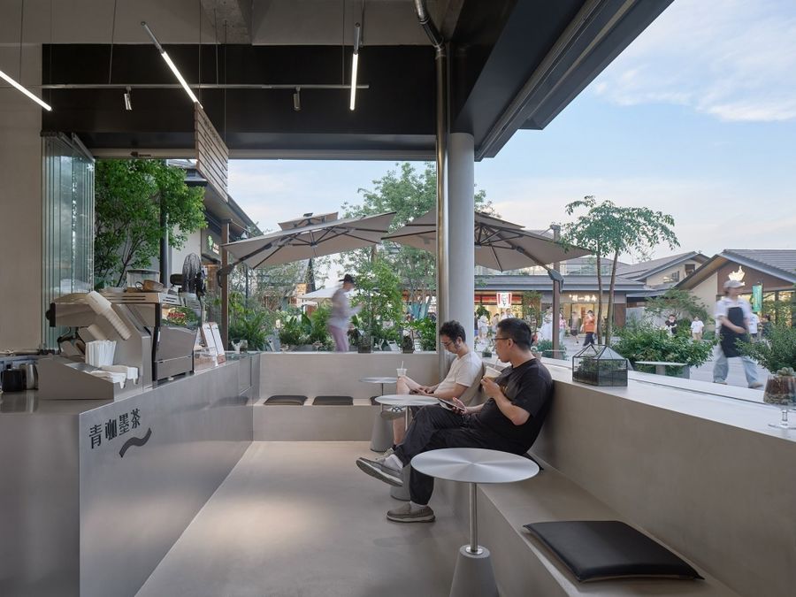
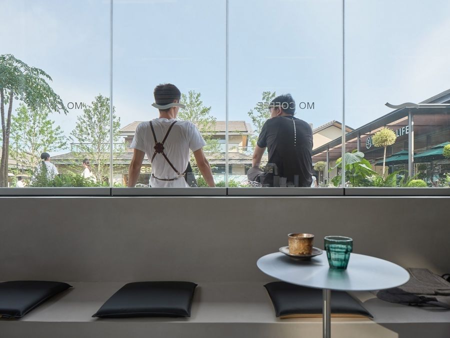
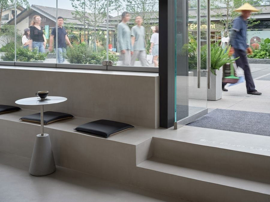
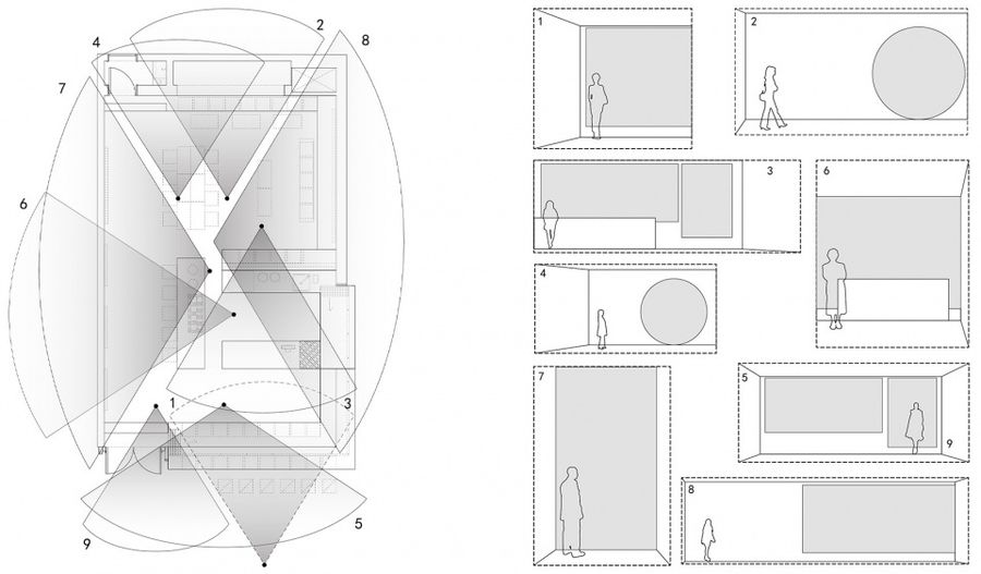
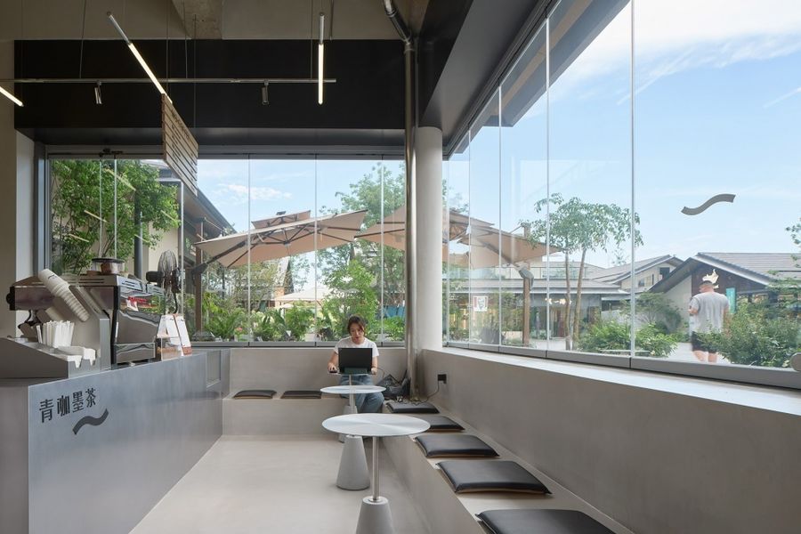
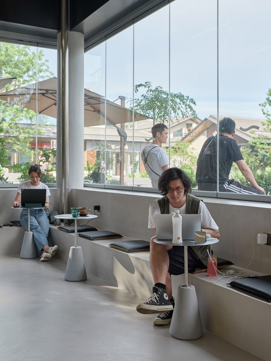
内外界面利用结构0.5米降板的原始条件,人们相背而坐,水平方向的连续和垂直方向的跌落形成自然分离,避免由个人尺寸挤压产生的压迫感。下沉式座位使大家既享受广场的氛围, 又有被包裹的安全感。
The internal and external interfaces utilize the original conditions of the structure’s 0.5-meter drop slab. People sit back to back, creating a natural separation between the horizontal continuity and the vertical drop, avoiding the feeling of compression caused by the crush of individual dimensions. The sunken seating allows everyone to enjoy the atmosphere of the plaza while feeling safe and secure.
▼下沉入口,Sunken Entrance © 朱清言
▼内与外,Inside and outside © 朱清言
▼视线关系,Sightline relationship © 立木
▼下沉式休息区,Sunken Rest Area © 朱清言
▼错位的背靠背,Misplaced Back to Back © 朱清言
在技术条件上,原有的结构降板预留为设备走管使用,且大部分店铺都选择直接回填与室外做平的方式,因此,说服物业保留降板变成一大挑战。我们与业主一同优化管线接口与排水设计,并且预留提升泵和抽水机应对百年一遇的强降雨,最终保留结构降板方向获得了各方支持,得以实现。
In terms of technical conditions, the original structural drop slabs were reserved for equipment piping, and most other stores chose to backfill directly to level with the outdoors. Convincing the property owner to retain the slabs became a major challenge. We worked together with the owner to optimize the piping connections and drainage design and reserved lifting pumps and pumping machines to cope with the once-in-a-century heavy rainfall. In the end, the direction of retaining the structural slab was supported by all parties and realized.
▼模糊的内外边界,Fuzzy Inner and Outer Boundaries © 朱清言
坦诚的咖啡
The Honest Coffee
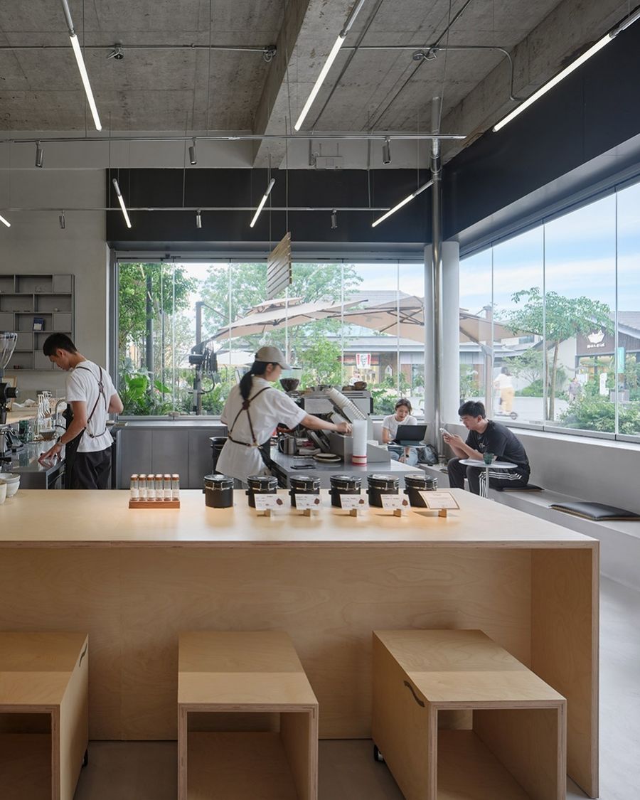
常规的咖啡店操作区一般呈“一字型”或“L 型”,这类布局方便隐藏设备,适合大批量制作咖啡。店铺选择了一种类似公共舞台的布局,将方形的咖啡操作区以360°全开放的形式插入到顾客区域,顾客环绕咖啡师而坐,可以欣赏手冲咖啡与茶的整个过程。站立的咖啡师和落座的顾客在同一视线高度,彼此平等独立,这是空间想要传递的态度。
Conventional coffee shop operation areas are generally “one-line” or “L-shape”, which is convenient for hiding equipment and suitable for large-volume coffee making. The store mainly focuses on hand-brewed coffee, so it chose a layout similar to a public stage, inserting the square coffee operation area into the customer area in the form of a 360° full open, with customers sitting around the barista and enjoying the whole process of hand- brewed coffee and tea.
▼坦诚的咖啡,The honest coffee © 朱清言
▼点单区域,Ordering area © 陈子茜
▼咖啡店的日常,Daily of the Cafe © 立木
变化的可能
Possibilities for change
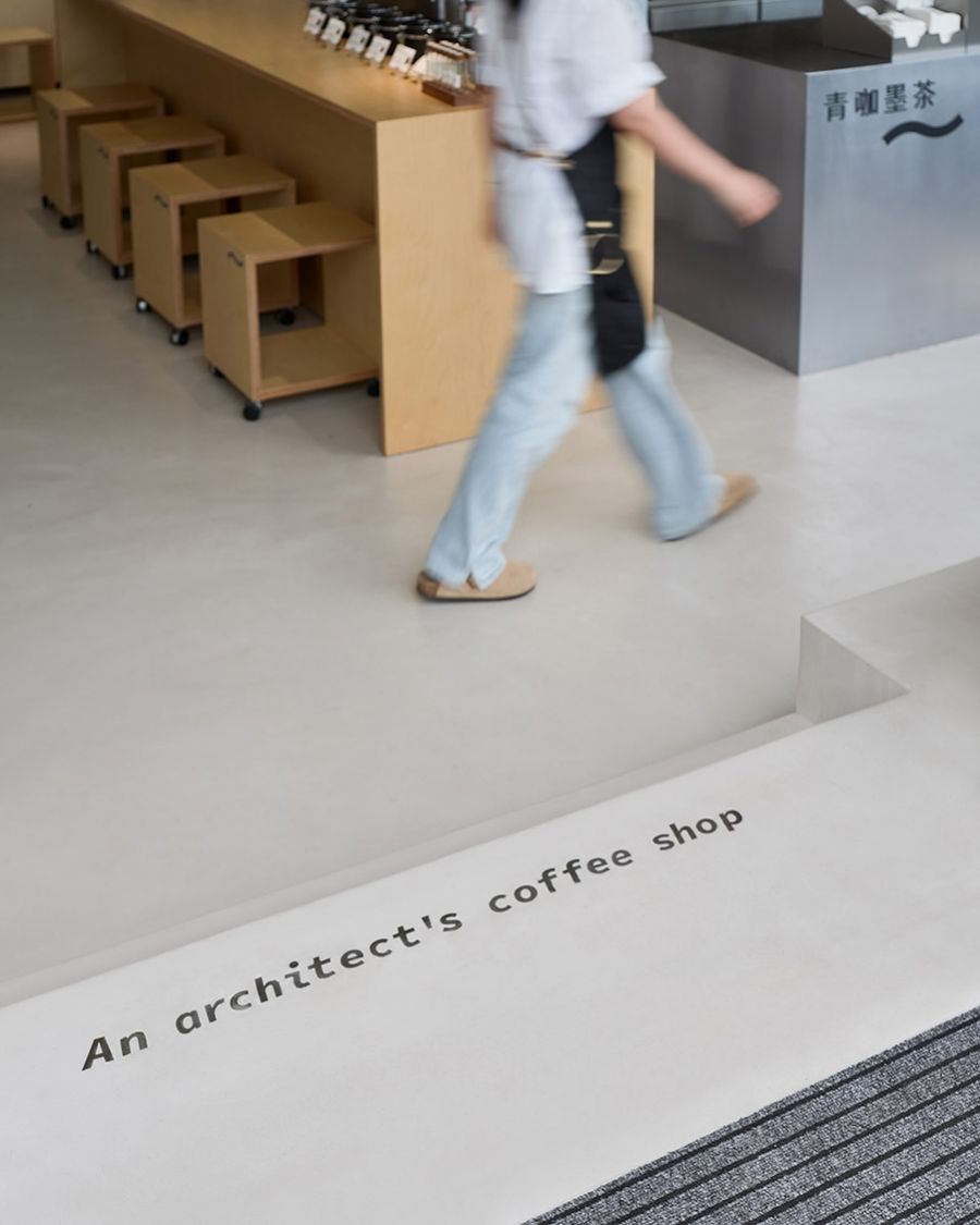
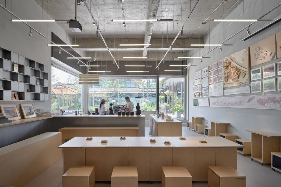
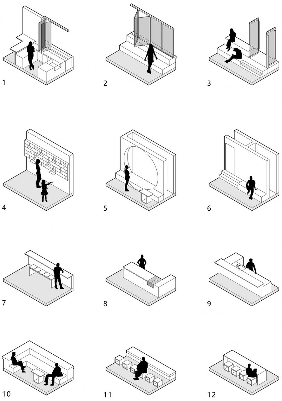
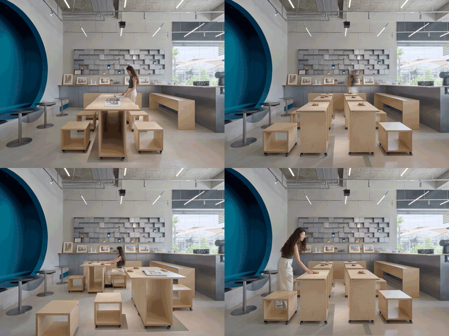
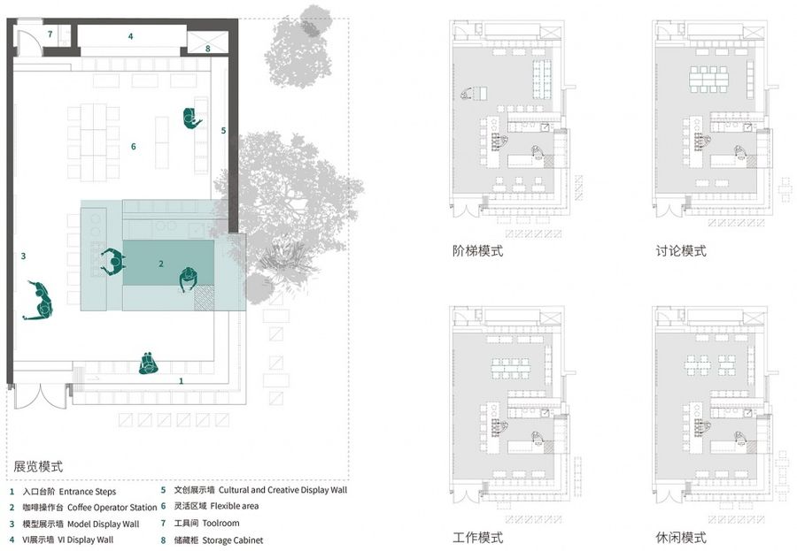
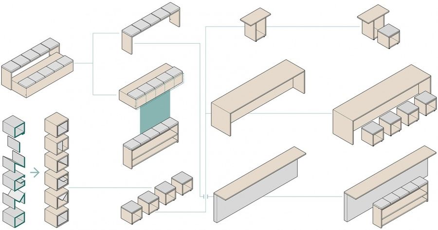
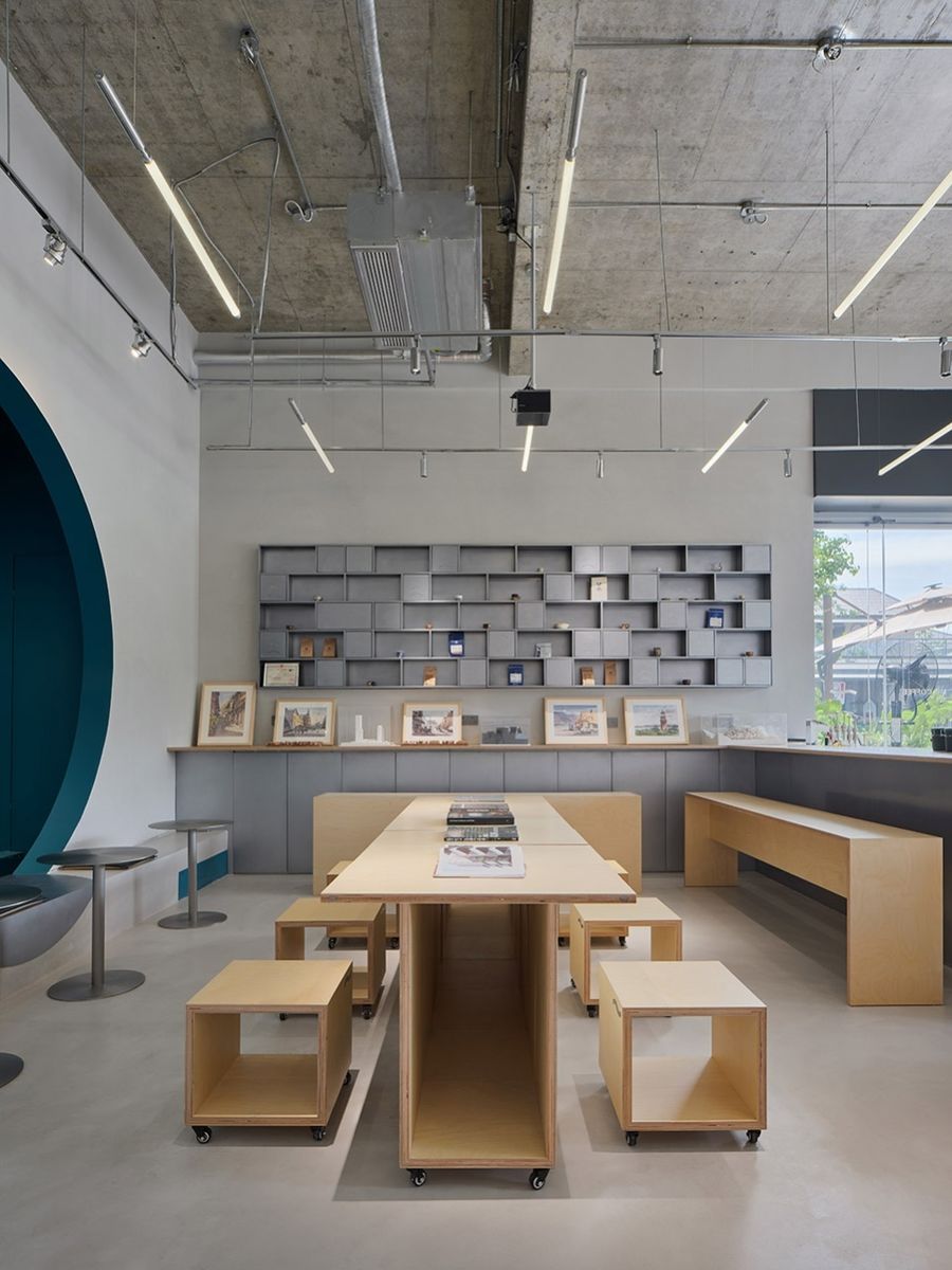
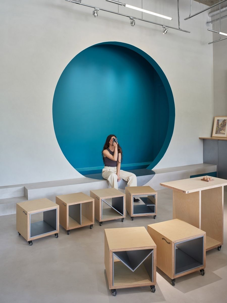
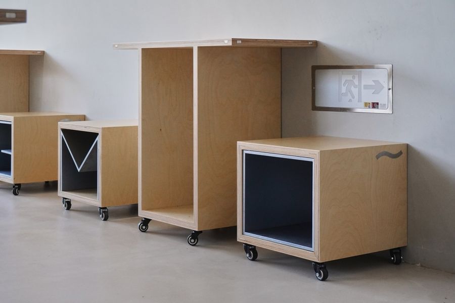
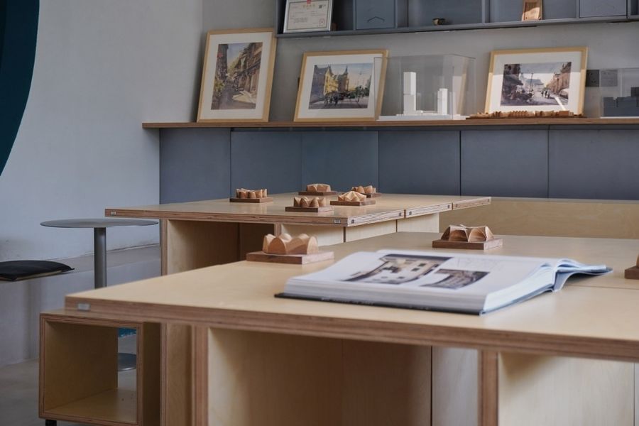
建筑师的咖啡店往往会承担除经营外的其他可能,如对谈、讨论、展览等。因此店内的桌、椅、凳、阶都由统一材料与统一模数制作,不仅朴素简单,也可作为基本单元模块,实现不同使用场景下的灵活切换。
The architects’ coffee shops often take on other possibilities besides business, such as conversations, discussions, and exhibitions. Therefore, the tables, chairs, stools, and steps in the store are all made of uniform materials and uniform modules, which are not only plain and simple but also can be used as basic unit modules to realize flexible switching in different usage scenarios.
▼为不同功能调整家具模式,Adapting furniture patterns for different functions © 朱清言
▼公共舞台式的咖啡操作区,Public stage-style coffee operation area © 朱清言
▼多种空间模式,Multiple space patterns © 立木
▼家具模块,Furniture modules © 立木
▼亦展示亦休闲,Show also leisure © 朱清言
▼对景,Scenery © 朱清言
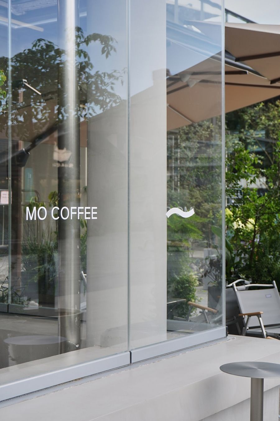
▼坐凳嵌入品牌VI,Sitting Stool Embedded Brand VI © 陈子茜
▼建筑书籍供顾客翻阅,Architecture books for customers to browse © 陈子茜
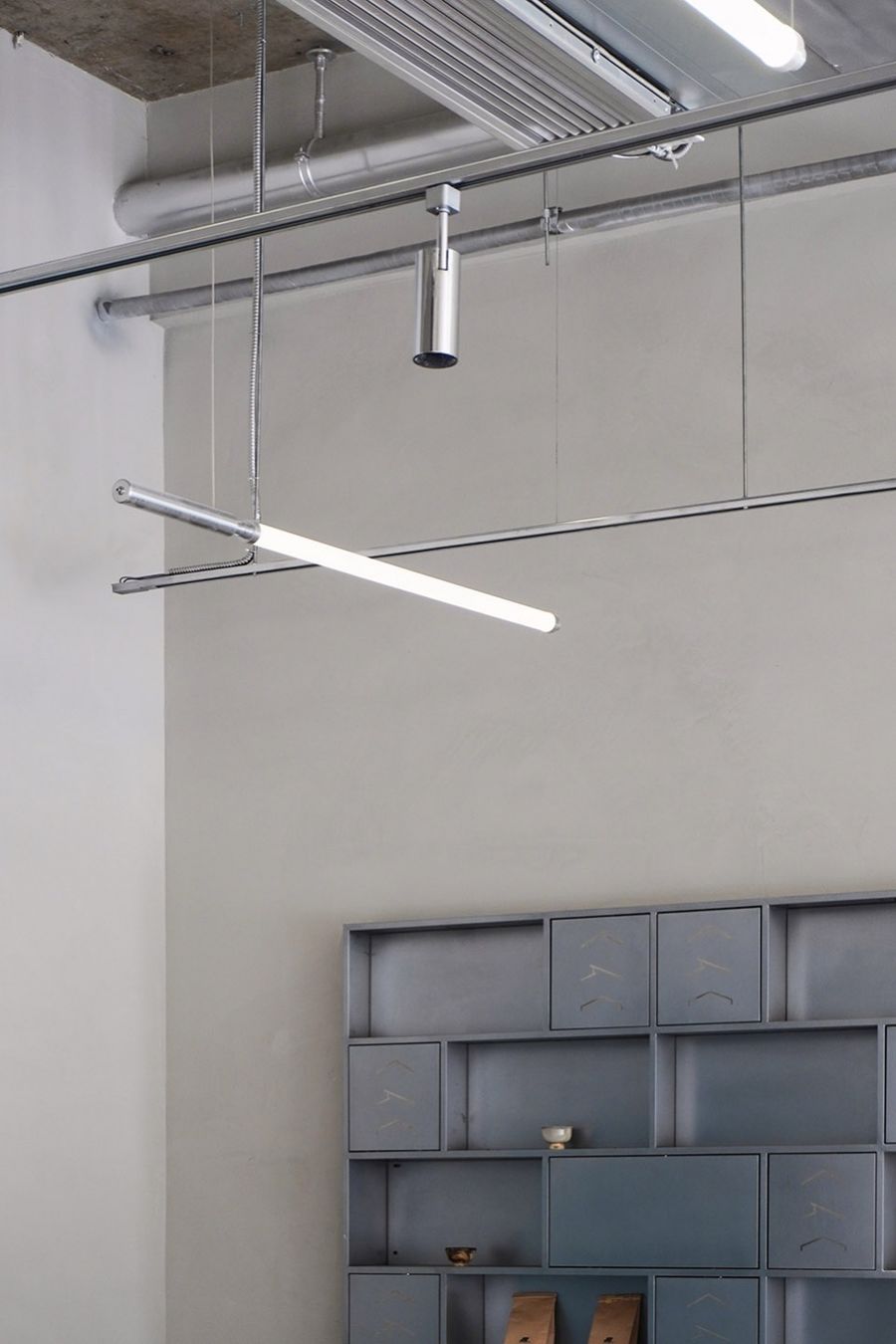
▼灯具与展示架,Lamps & Displays © 陈子茜
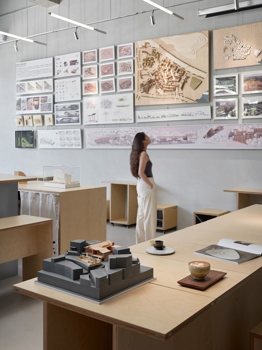
▼模型展墙,Model Exhibition Wall © 朱清言
据说
画图画累了
可以申请来做咖啡
It is said that
When you’re tired of design and drawing,
You can apply to make coffee here.
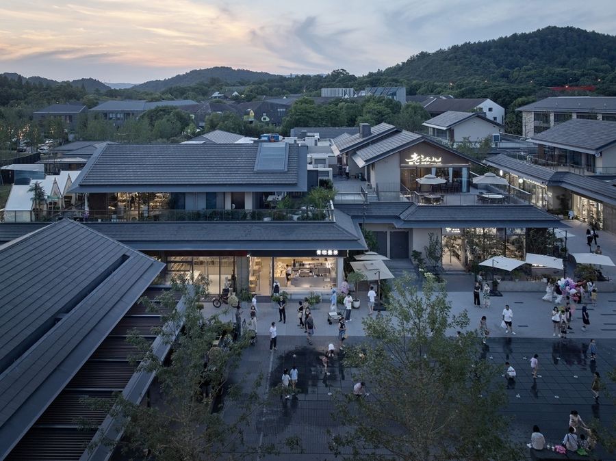
▼俯瞰玉鸟集,Overlooking Liangzhu Birland © 朱清言
项目名称:杭州某建筑师咖啡店
项目地点:杭州玉鸟集
设计:立木 L&M+青墨建筑
项目经理:郭岚
主持设计:刘津瑞、邹明溪
设计团队:李佳妍、谢舜冰、李春瑶、陈子茜、肖罗琴
施工图团队:黄娟,曾帅
设计时间:2022.05
设计顾问:申鹏
项目摄影:朱清言、陈子茜
主要材料:微水泥、木板
Project Name: An architect’s cafe in Hangzhou
Location: Hangzhou Liangzhu Birland
Design: L&M + Qingmo Architecture
Project Manager: Guo Lan
Lead Designer: Liu Jinrui, Zou Mingxi
Design Team: Li Jiayan, Xie Shunbing, Li Chunyao, Chen Zixi, Xiao Luoqin Construction Drawing Team: Juan Huang, Shuai Zeng
Design Time: 2022.05
Design Consultant: Shen Peng
Project Photography: Zhu Qingyan, Chen Zixi
Main Material: Micro Cement, Wooden Board


