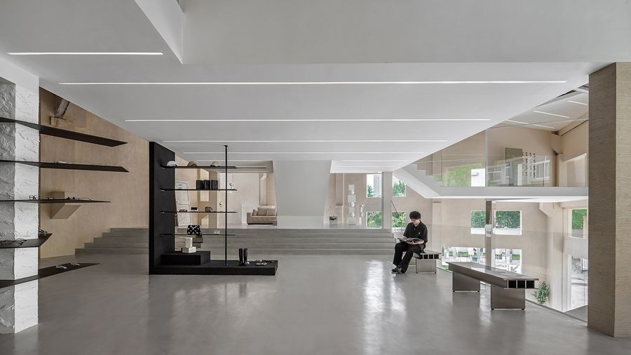
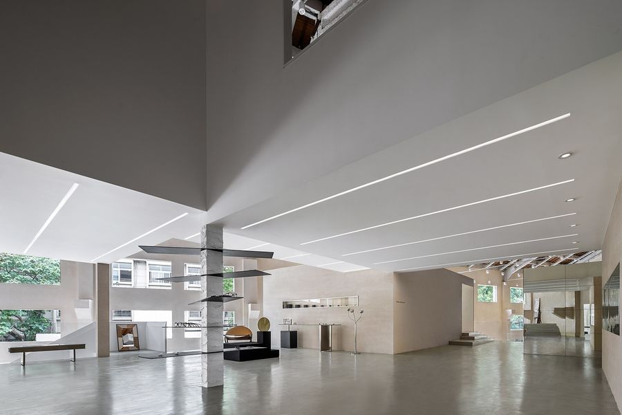
项目难点在于有效的在合适的成本内满足其艺术展陈空间的多方位需求,同时强调人与空间的情感交流。建筑空间以内外一体化方式进行空间的重新规划,并对内部空间的建筑结构进行重新设计。
The difficulty of the project is to effectively satisfy the multidimensional needs of artistic display space within proper cost, while highlighting the emotion interaction between human and space. The architectural space is re-planned by internal and external integration, and redesigning the inner architectural structure.
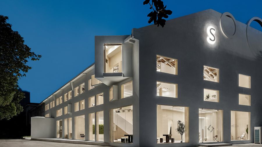
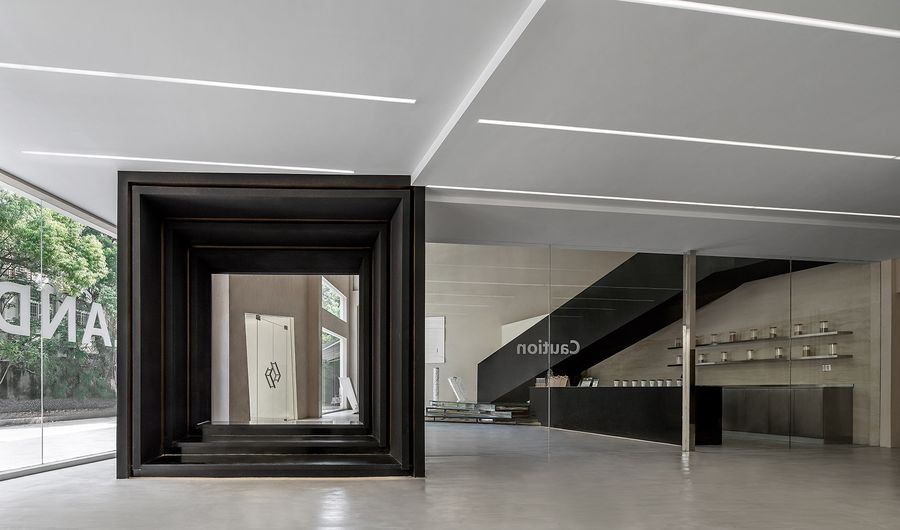
▼项目外观,appearance of the project ©Cao Yin
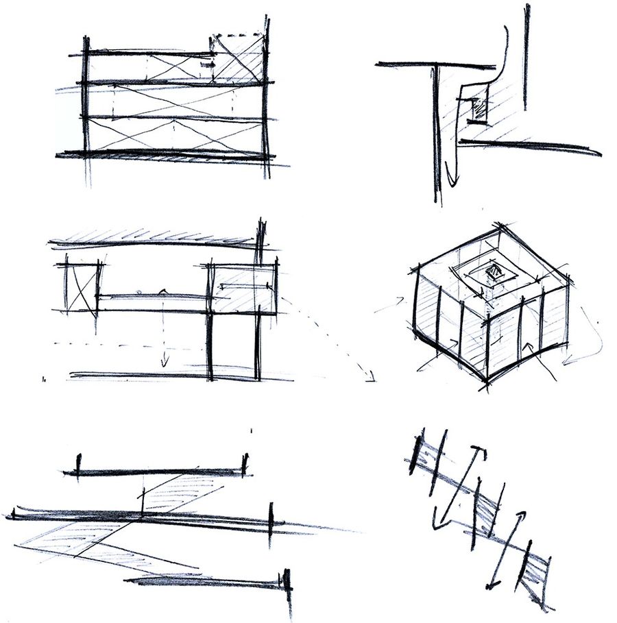
设计以建筑环境受光面分析为起点,对建筑空间组织关系进行推敲,并适当加强内部空间的层次结合功能区域作探究。在某种程度设计希望去除传统的室内外界限,对内部空间从零开始的结构体量设计意在加深消费者对内部空间的探索欲。整个建筑空间分为三层且错落有致,在观感上突出建筑空间感。
▼设计构思草图,design and conception draft ©QUANHONG
The design start with the analysis of light-receiving side of the architectural environment, deliberating the organization relationship of architectural space, and properly enhance the inner space layers combined with functional area as study. To some extent, the design hopes to remove traditional internal and external bounds. We intend to encourage the customers’ desire to explore of inner space with inner space structural quantity design from scratch. The whole building has three well-proportioned floors, visually highlighting the sense the architectural space.
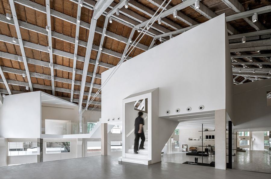
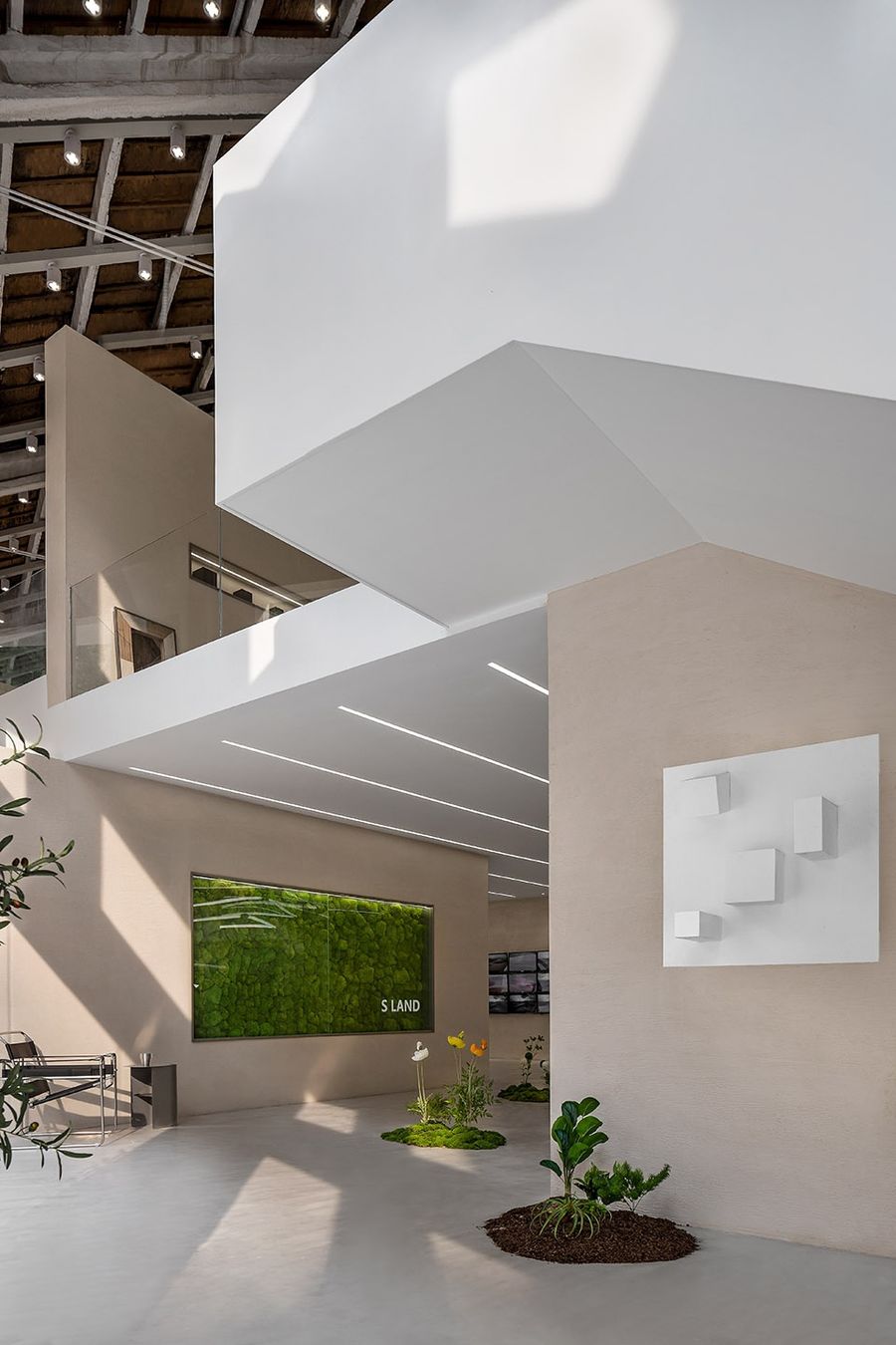
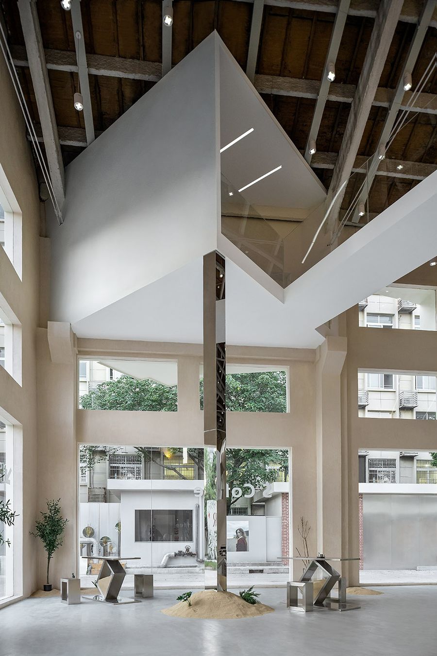
▼错落的建筑体量转换空间,scattered architectural quantity transfer space ©Cao Yin
▼空间中适度穿插一定的大区平台,properly interspersed some large platform within space ©Cao Yin
▼对内部空间结构柱体的雕塑化处理,sculpturize the construction pillar of inner space ©Cao Yin
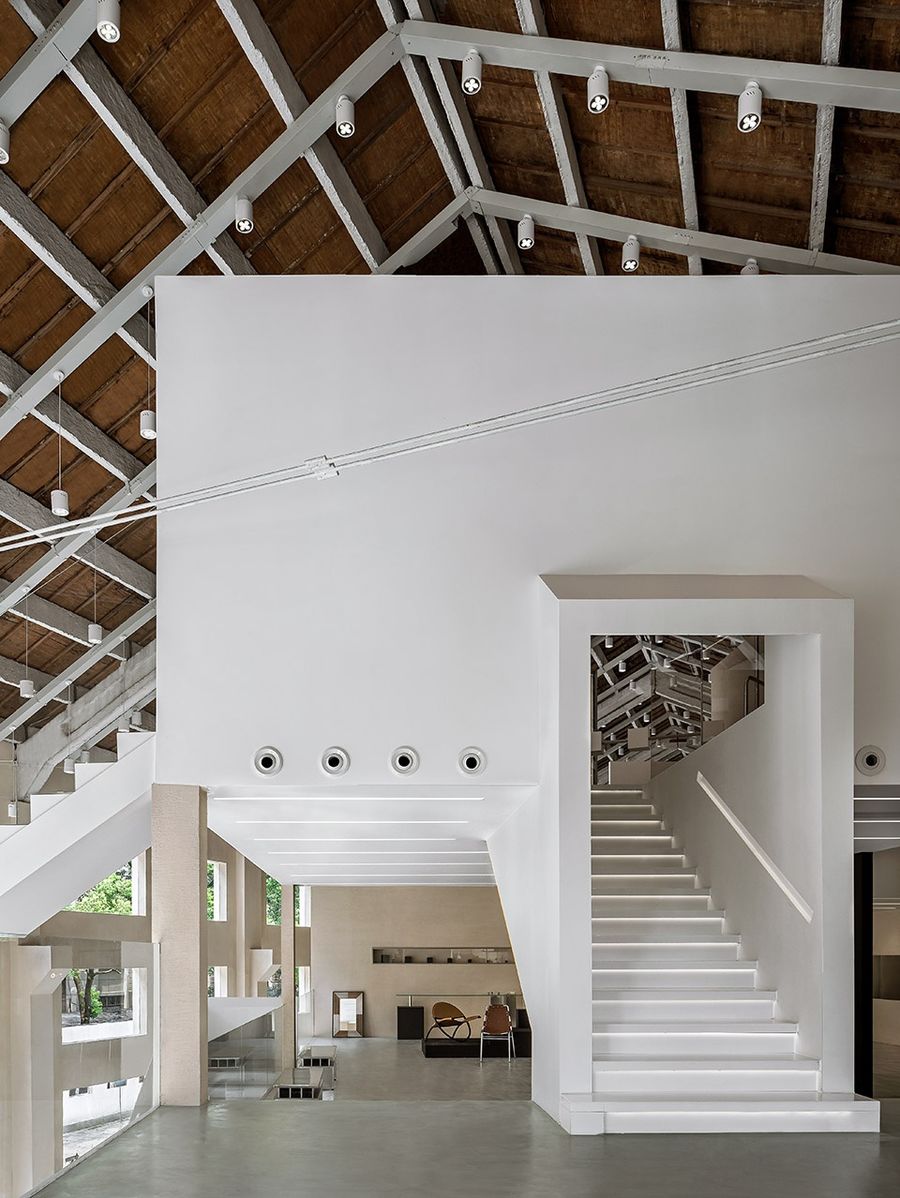
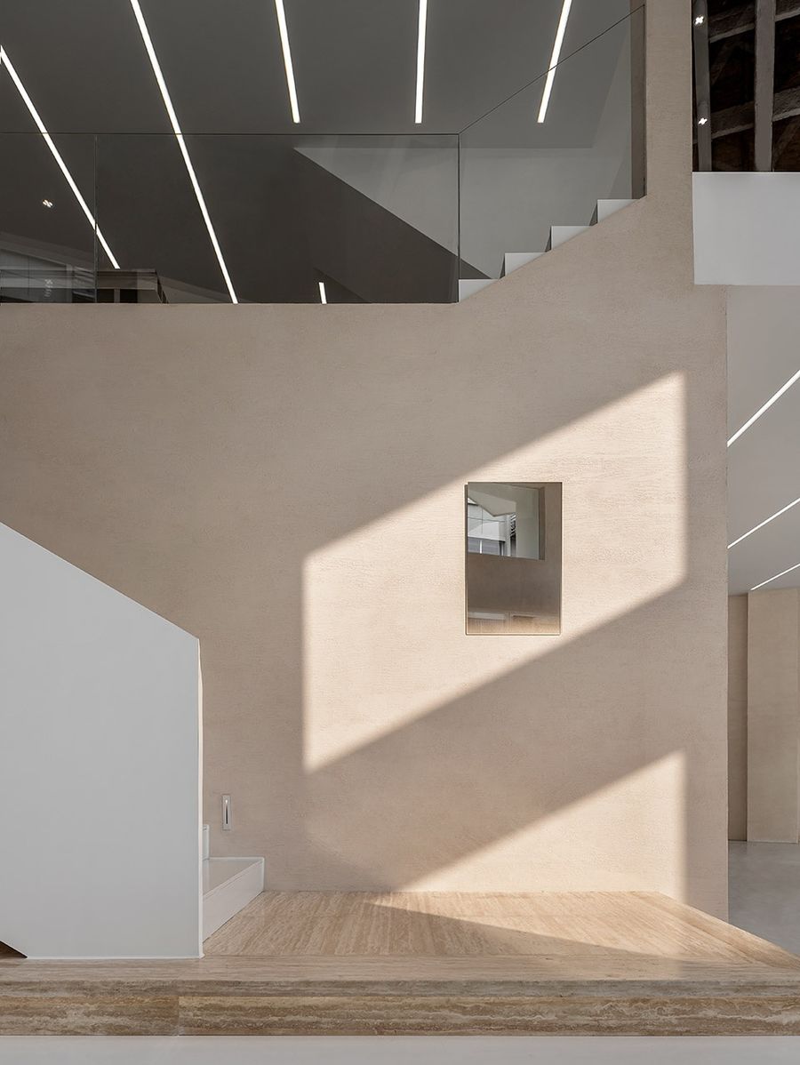
▼溶为一体的交通楼梯,traffic stairs syncretize with each other ©Cao Yin
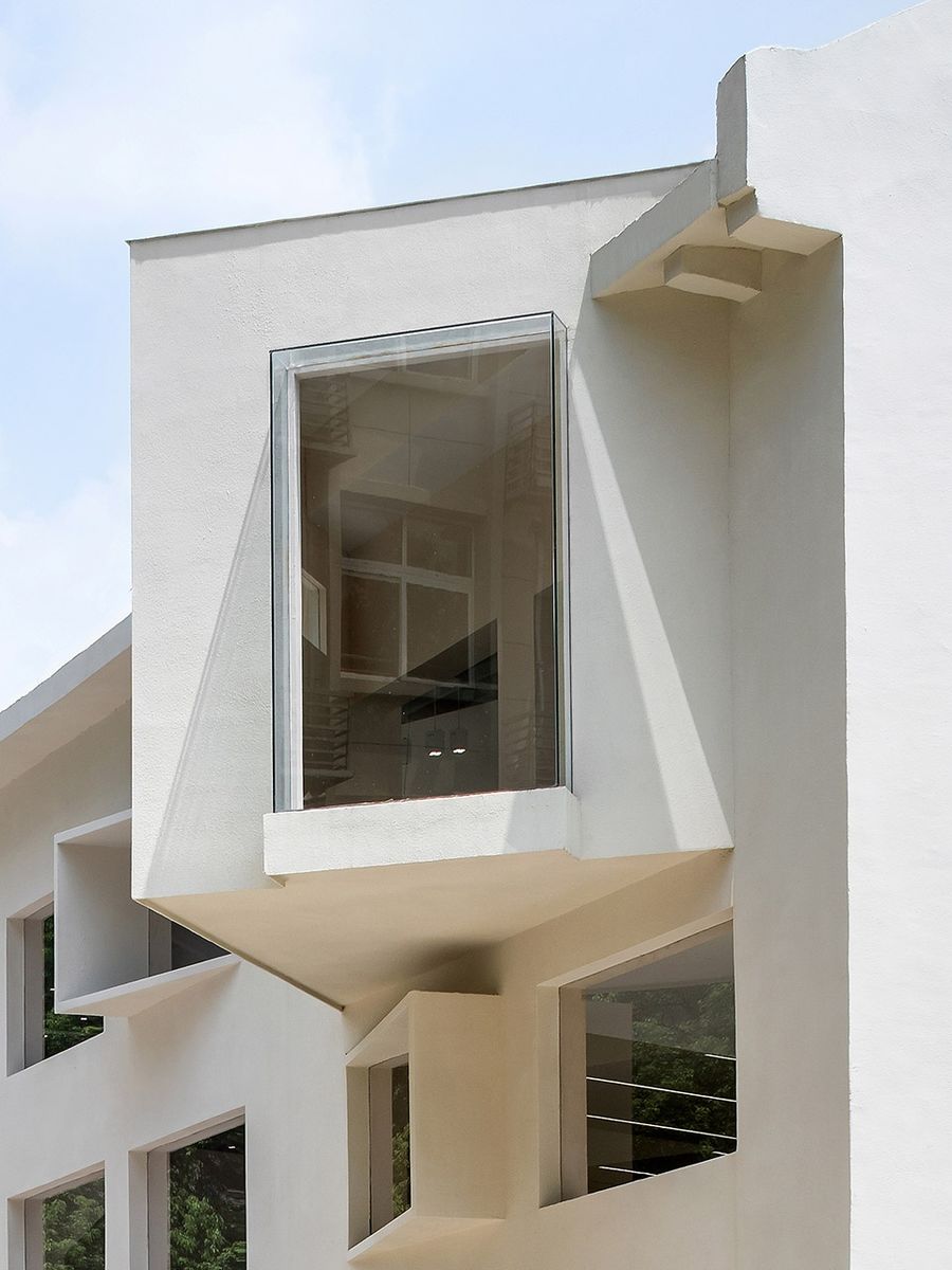
建筑本身并无正长面主体的视觉方向,相反人车动线视觉集中在侧面,建筑外立面并没有采取过多的立面语言,在依托原有建筑框架结构上采取了减法策略,一方面考虑到成本,而在入口与顶部新增的两个体量意在解决建筑空间侧面视觉的立体感,另一方面加强建筑刻板的印象。
The building itself has not the visual direction of the front long main structure, but the moving line of people and vehicle focus on the side of the building. Outside elevations ,façade language is not overused. Considering the cost issue, subtraction strategy is applied based on original frame structure. And the two added quantity is to solve the stereo feeling of the architectural space side vision, as well as strengthening the architectural stereotype.
▼侧面局部视角,side partly vision ©Cao Yin
空间以人视觉变化为思考起点,在内部空间的视觉递进上设立了许多的大小开间,视线在组织内的节奏是非死板固定的,同时融合一定的空间艺术装置做表现。
Considering the change of vision at the very beginning, there are a lot of big or small bays in inner space to create visual progression, and coordinate with some art installation to present. The vision is not fixed in a rigid rhythm.
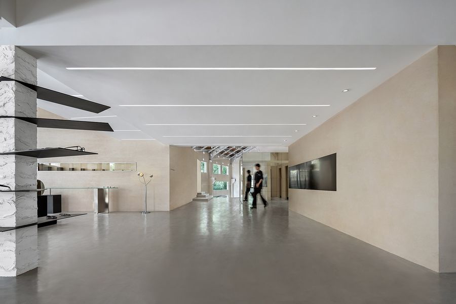
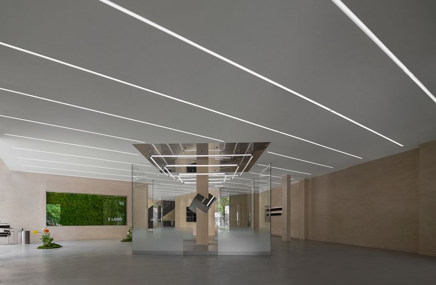
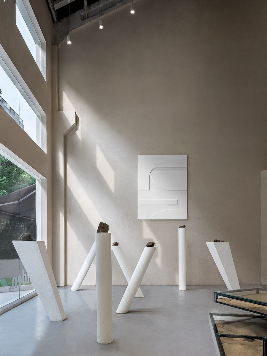
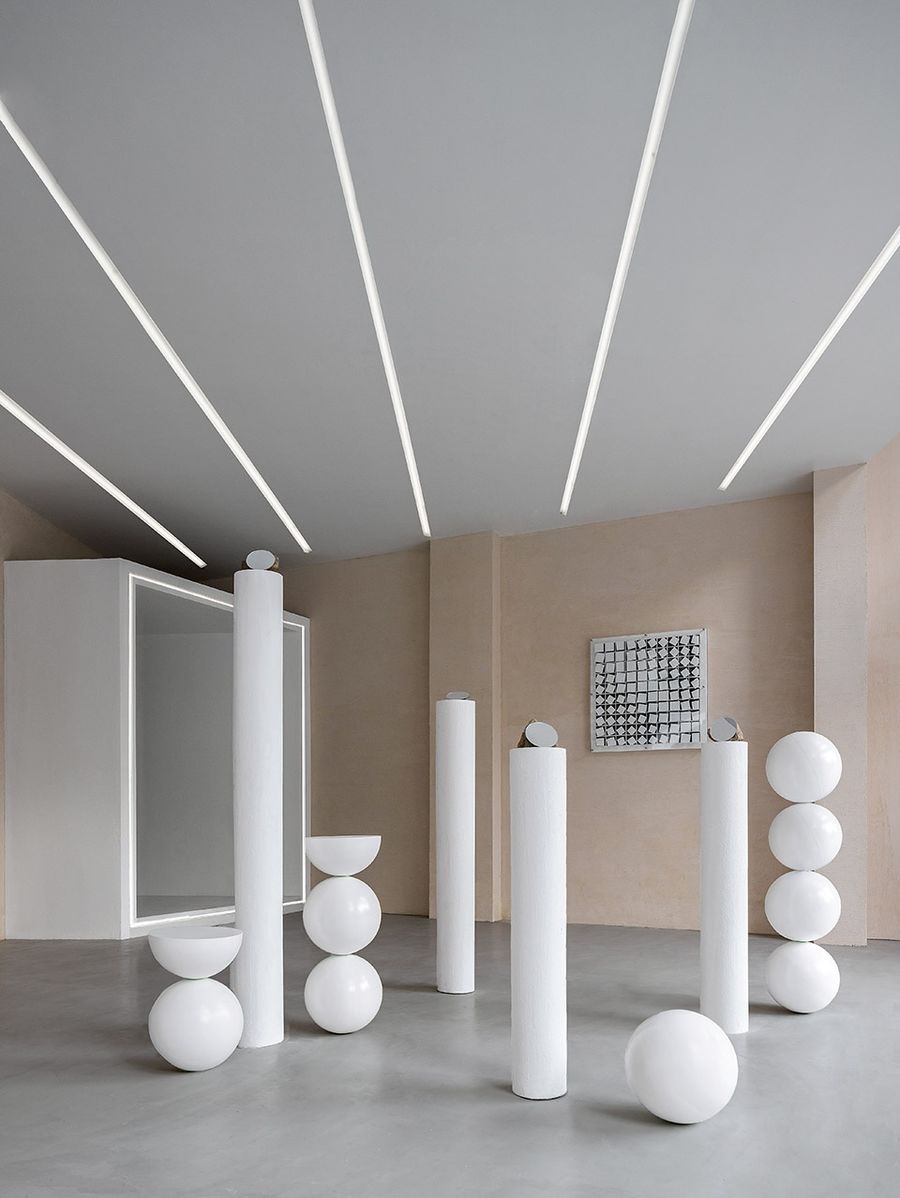
▼开放的公共区域穿插具有雕塑仪式感的空间装置艺术,space art installation with sculpture sense of ritual interspersed in open public area ©Cao Yin
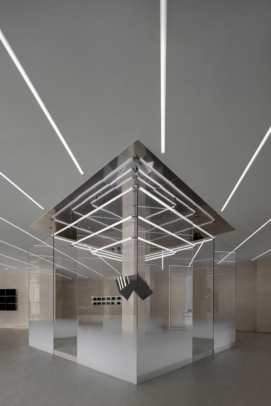
▼具有雕塑仪式感的空间装置艺术,sculpture sense of ritual interspersed in open public area ©Cao Yin
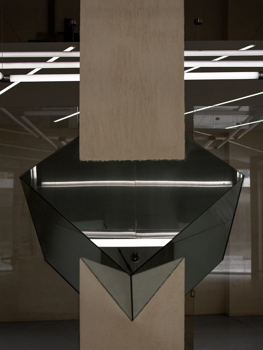
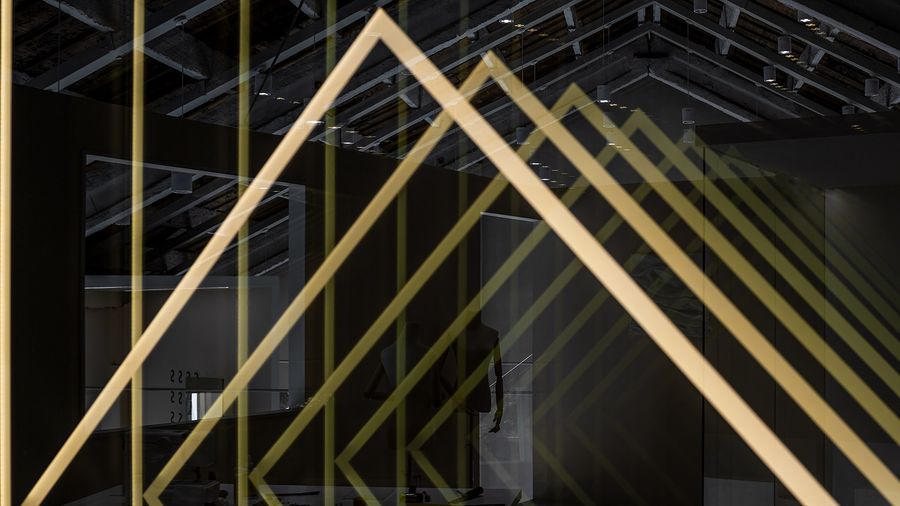
▼棱切穿插配合灯光的近部特写,close-up of edge cutting through the light ©Cao Yin
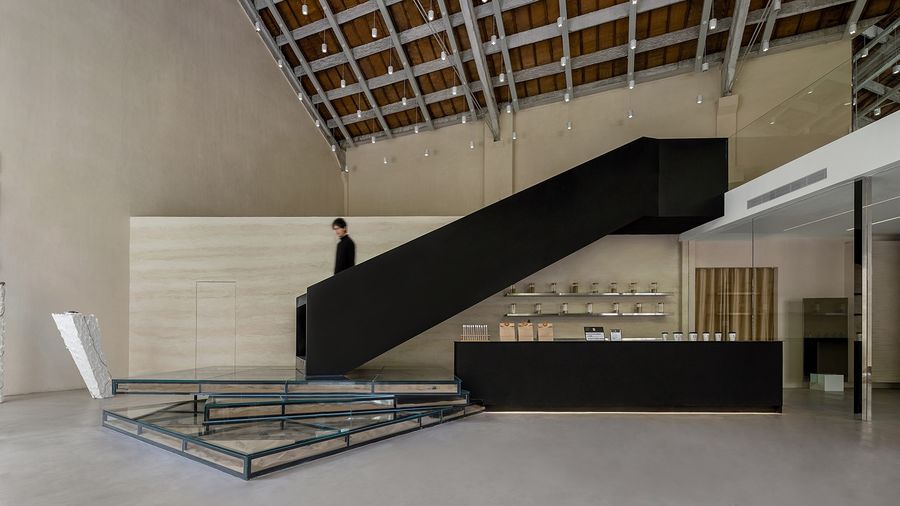
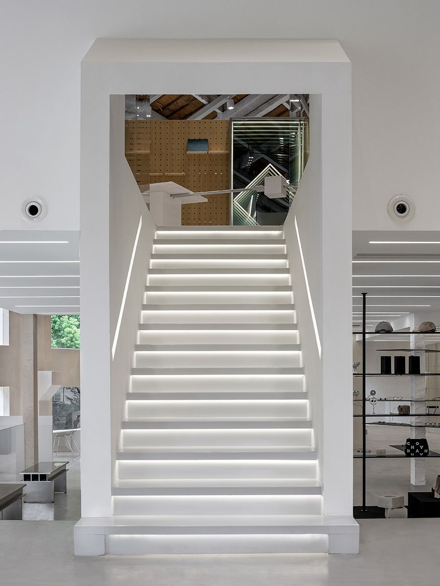
上下关系的楼梯体量做为连接不仅作为空间上升下降的交通体量同时也对空间加强了雕塑刻画的作用。设计希望体验人群在非固定的流线中随着自己的感受不断进行空间探索,同时享受艺术空间带来的感染力。
Using up-down stairs quantity as link can not only act as traffic quantity of space upward and downward, but also strengthening the sculptural affect for the space. The design hopes people can experience constant space explore with their feelings in an unfixed line, meanwhile enjoy the charm of art space.
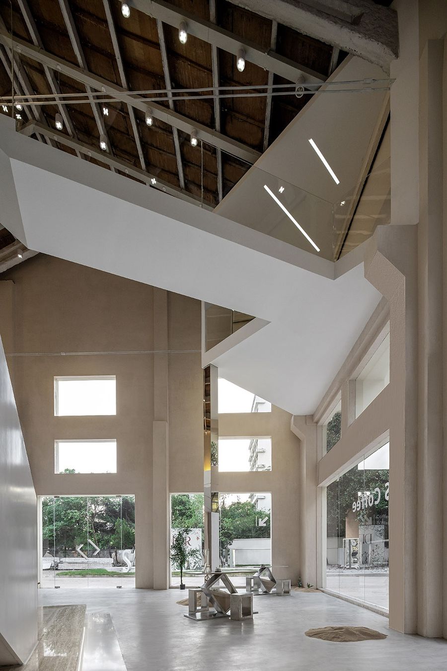
▼空间大厅一侧的交通楼梯,traffic stairs in one side of the hall ©Cao Yin
▼平行空间的转换,transfer of parallel space ©Cao Yin
▼以楼梯斜面作空间挑空的切割划线,the cutting line using the space hallow created by he stairs angular surface ©Cao Yin
▼三楼楼梯正面,front side of stairs on the third floor ©Cao Yin
设计一直围绕突出人与空间的关系为核心在考虑,空间好似安排也无安排的旅程,在三层的突出体量设置了一条选悬空长廊,在空间探索上处于空间流线末端,廊桥的关系不仅突出了内部空间的层次同时作为了内部空间的视觉牵引终点。
The core consideration of this design is to highlight the relationship between human and space, arranging an ambiguous trip through the space. The outstanding quantity of the third floor is a suspended corridor, at the end of the space line in terms of space explore. The relationship of the corridors is not only highlighting the layers of inner space, but also working as the visual-based navigation terminal of inner space.
▼挑空的廊桥过道与三层的独立体量,hollow corridor and independent quantity on the third floor ©Cao Yin
设计主张好的艺术展陈空间并非刻意去贴合当下某种特定的装饰风格语言,重在研究空间的组织关系与未来的可塑变化性上。在内部空间上加强光影与建筑本身的互动,加强装置艺术与人的互动,目的都在加强人对于场所空间的深刻印象。
QUANHONG ARCHITECT & ASSOCIATES believes good art showroom is not to deliberately fit the current certain decoration style or language, but to study the organization relationship of space and plasticity and change of future. Highlighting interaction of light shadow and building itself in inner space, interaction of installation art and people, is to enhance people’s image of space.
▼空间光影随时间不断演绎,space light shadow keep going ©Cao Yin
▼光线装置的互动关系,interaction of light installation ©Cao Yin
▼柱体上方的镜面随着时间光线变化不断发生错位反射,the light of the mirror above the pillar keep interlaced reflecting with time ©Cao Yin
▼局部无限延伸的立面,partly unlimited extension elevations ©Cao Yin
这是一个对于建筑空间重塑的实验性艺术项目,融合了实用功能及艺术空间特质的综合性展陈空间。在一定的理性设计逻辑下设计过程同时又显得尤为不确定性,这是设计对于展陈空间去死板化的探索过程,一步一景,享受其中的每个空间音乐章节。
This is an experimental art project based on the reconstruction of architectural space, a comprehensive showroom mixing with practical function and the character of art space. Under the rational design logic, the design process is extremely uncertain. This is an exploring process of showroom primness-removing for design, one step, one view, enjoying every music chapter of the space.
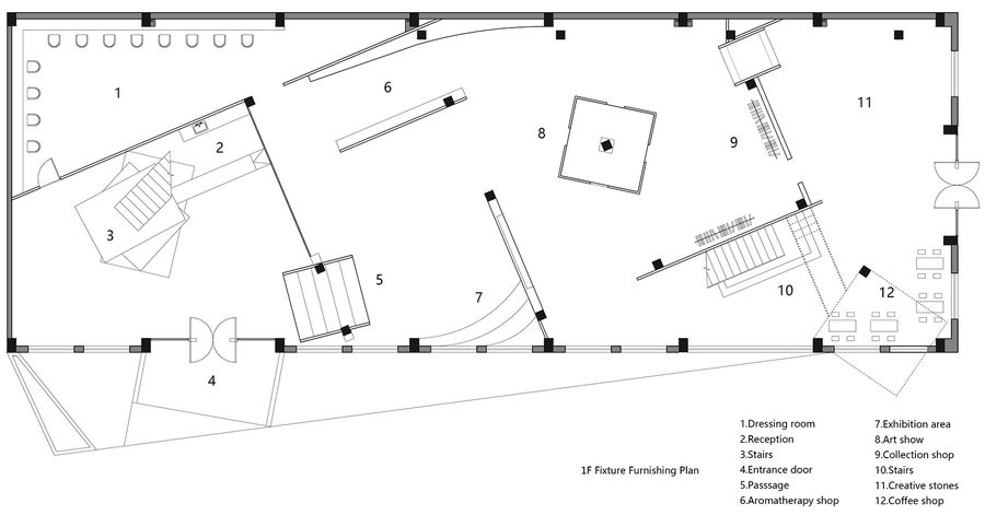
▼首层平面图,ground floor plan ©QUANHONG ARCHITECT & ASSOCIATES
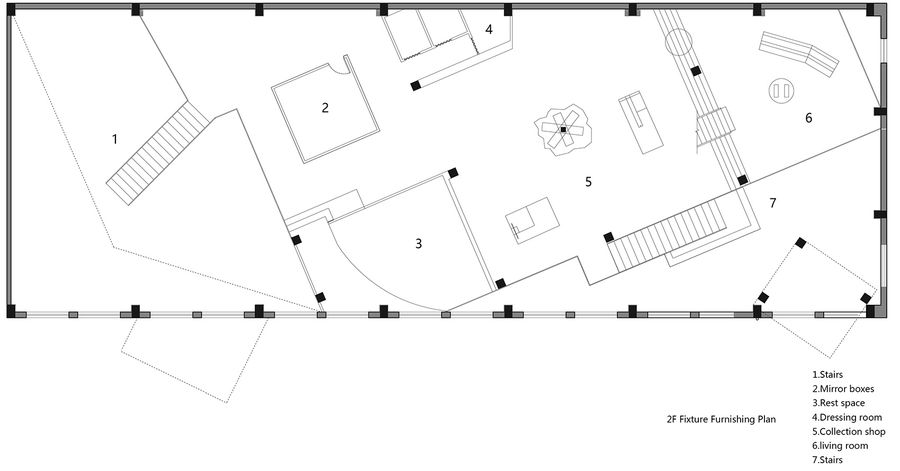
▼二层平面图, second floor plan ©QUANHONG ARCHITECT & ASSOCIATES
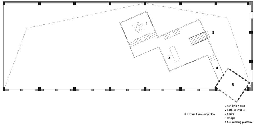
▼三层平面图,third floor plan ©QUANHONG ARCHITECT & ASSOCIATES
▼立面图,elevations ©QUANHONG ARCHITECT & ASSOCIATES
▼剖面图,sections ©QUANHONG ARCHITECT & ASSOCIATES
项目名称:S 生活艺术展厅
项目类型:展陈空间
项目地址:杭州
设计面积:2800m2
设计公司:权洪建筑研究所 QUANHONG ARCHITECT & ASSOCIATES
主持建筑师/艺术总监:施权洪
项目主材:钢材 镜面 玻璃 艺术漆
影像:曹寅
Project name: S Life and Art Space
Project type: Showroom space
Project address: Hangzhou
Design area: 2800m2
Design company: QUANHONG ARCHITECT & ASSOCIATES
Cheif architect: art directior| Shi quanhong
Main material of the project: steel mirror glass art lacquer
Project photographer: Cao Yin


