光线打在墙体上,建筑就此形成。在投射墙体之前,太阳光并不知道自己是什么。——路易斯·康
When the light hits the wall, the building is formed. Before projecting onto the wall, the sun does not know what it is.——Louis Kang
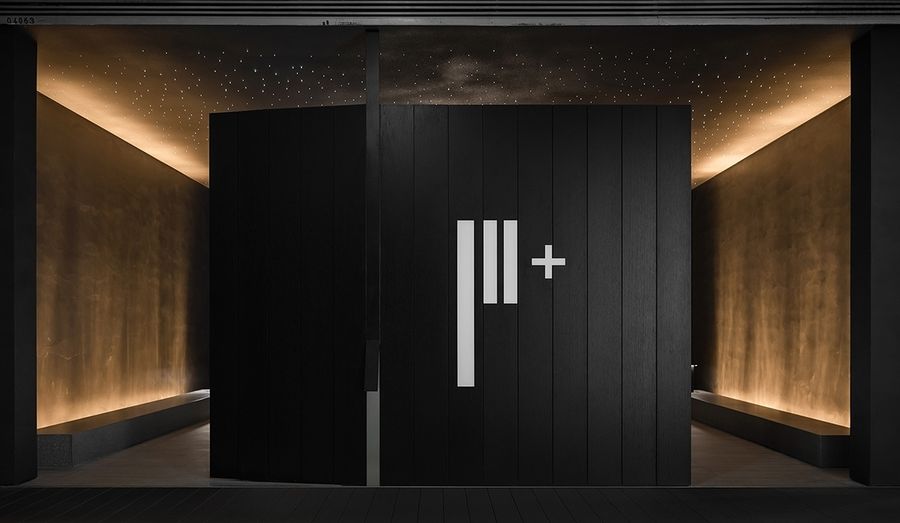
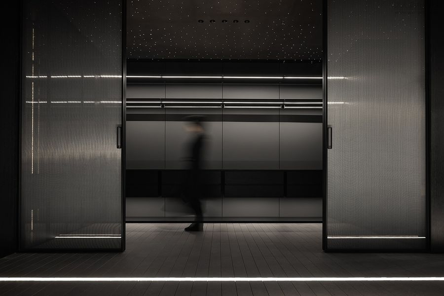
F+生活研究所,位于上海宜山路家饰佳商场内,周边聚集着众多同类家装设计品牌。品牌方希望通过空间设计策略跳脱消费者对行业的固有认知,形成一处个性与艺术风格相融的艺术展厅。
F+Life Research Institute is located in Shanghai Yishan Road Home Decoration Mall, surrounded by many similar home decoration design brands. The brand hopes to break away from consumers' inherent perception of the industry through space design strategy and form an art exhibition hall with personality and artistic style.
F+生活研究所是一家成立于2018年的主打极简风格的全屋定制品牌。遵循品牌的极简理念,我们从路易斯·康的萨尔克生物研究所汲取设计灵感,用克制的手法塑造空间的形体,以光为媒介建构场所精神。
F+Life Research Institute is a whole-house customized brand focusing on minimalist style, established in 2018. Following the minimalist concept of the brand, we draw design inspiration from the Salk Institute of Biology of Louis Kang, use restraint to shape the shape of space, and use light as the medium to construct the spirit of the place.
互联网的发展和疫情的经历,很大程度改变了人们的购物方式和生活方式,于此也对品牌空间提出了新的时代命题。不同于过去简单铺陈产品,当下的品牌展厅更注重通过空间设计展示品牌气质,从而为到访的客人带来沉浸式品牌体验。
The development of the Internet and the experience of the epidemic have changed people's shopping and lifestyle to a large extent, which also put forward a new era proposition for brand space. Unlike the simple display of products in the past, the current brand exhibition hall pays more attention to displaying the brand temperament through space design, so as to bring the guests an immersive brand experience.
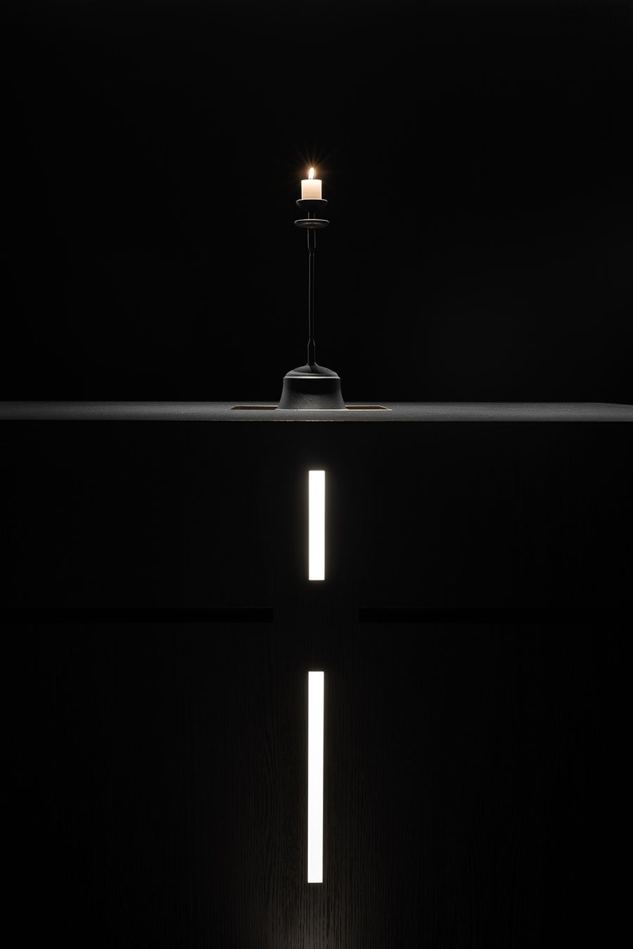
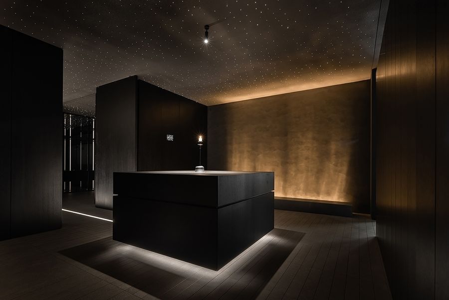
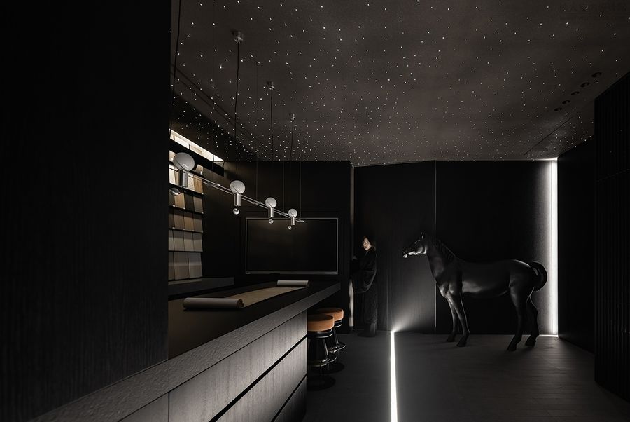
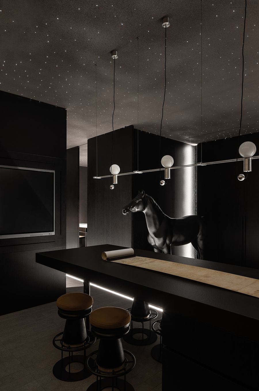
中央的吧台下端嵌入线性灯带,勾勒出硬朗的体块,带来了灵动的漂浮感。
The lower end of the central bar is embedded with a linear light band, which outlines a strong body and brings a flexible floating feeling.
中央的吧台下端嵌入线性灯带,勾勒出硬朗的体块,带来了灵动的漂浮感。
The lower end of the central bar is embedded with a linear light band, which outlines a strong body and brings a flexible floating feeling.
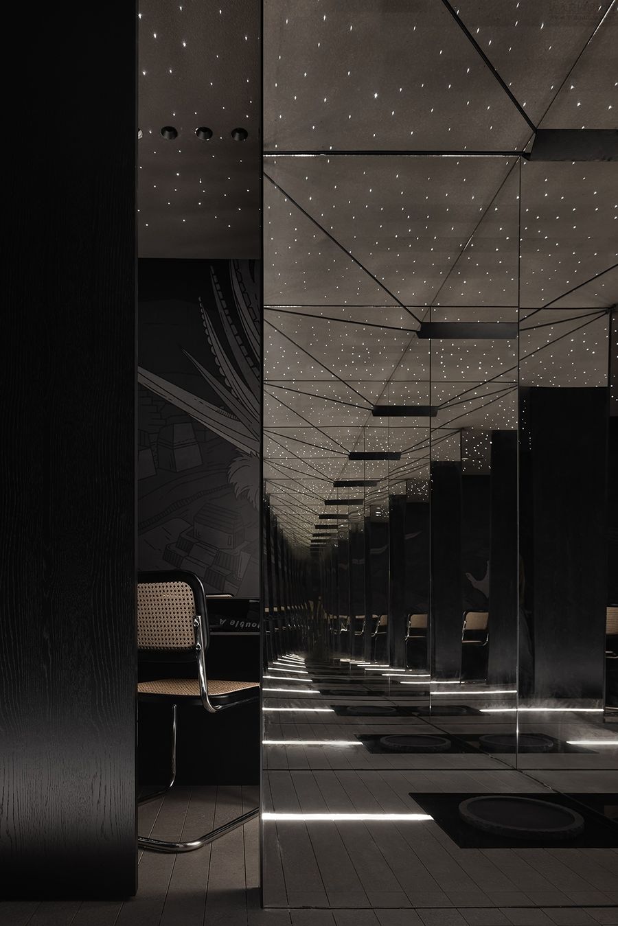
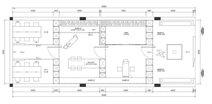
片墙之后的纵向空间被一分为二,中央走廊串联起六个区域。
The longitudinal space behind the wall is divided into two parts, and the central corridor connects six areas.
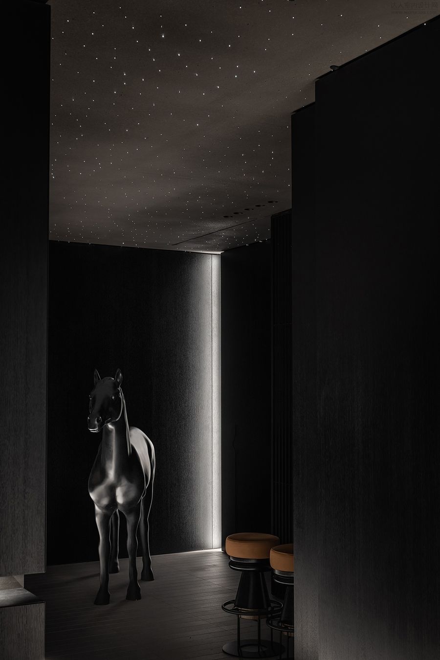
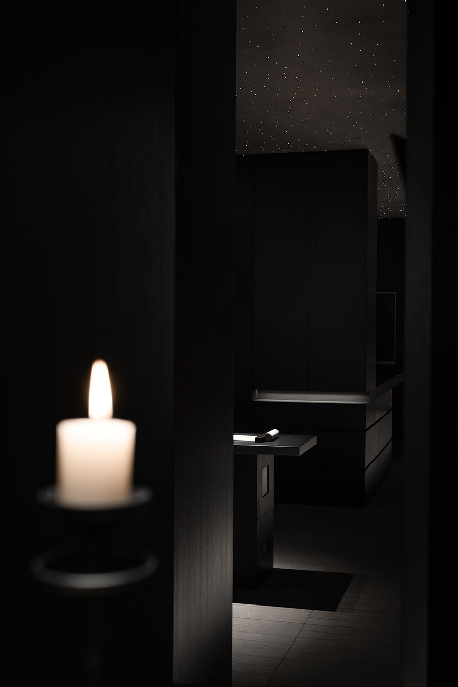
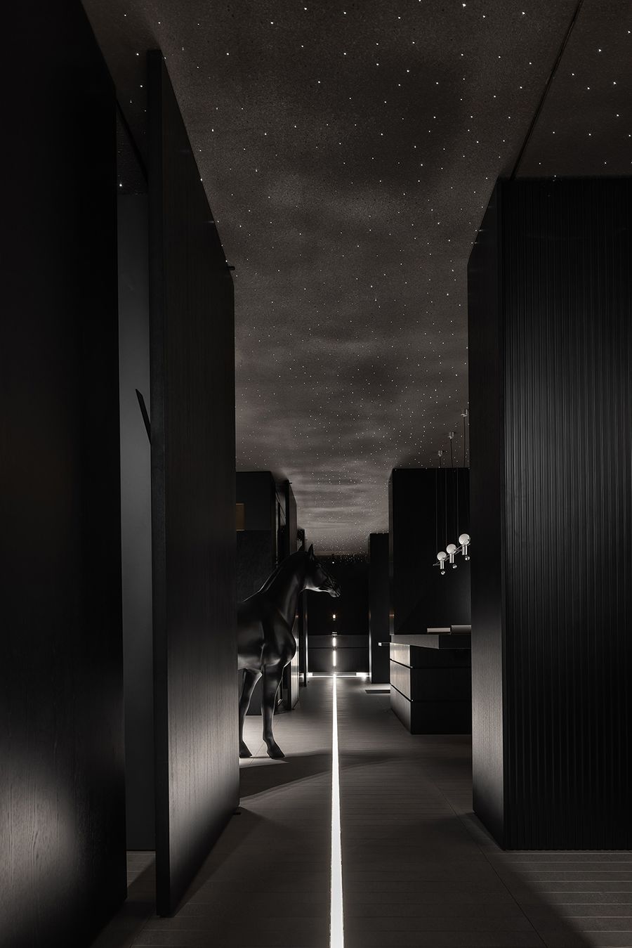
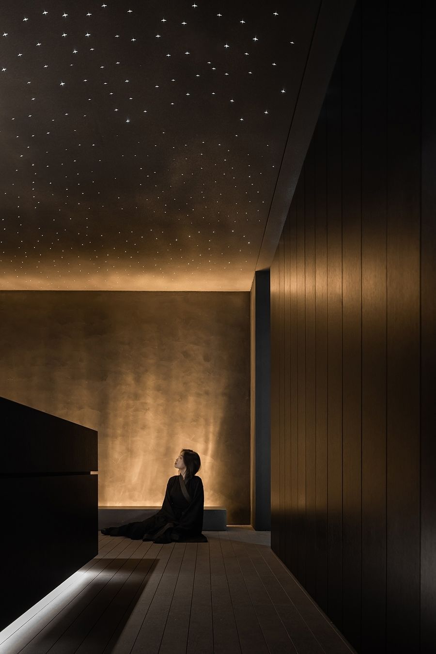
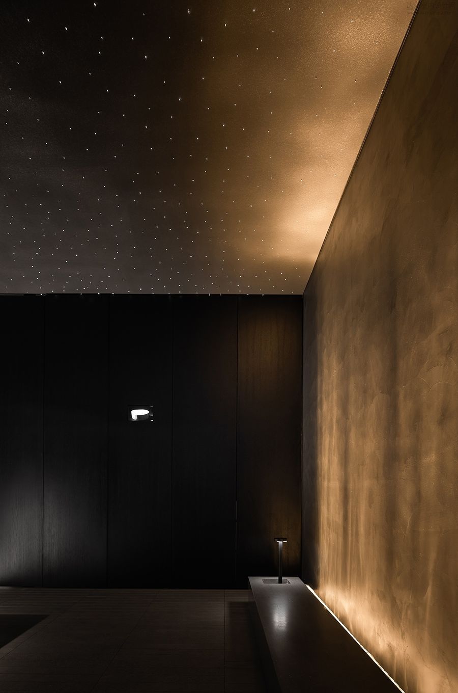
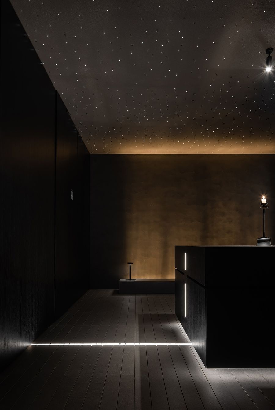
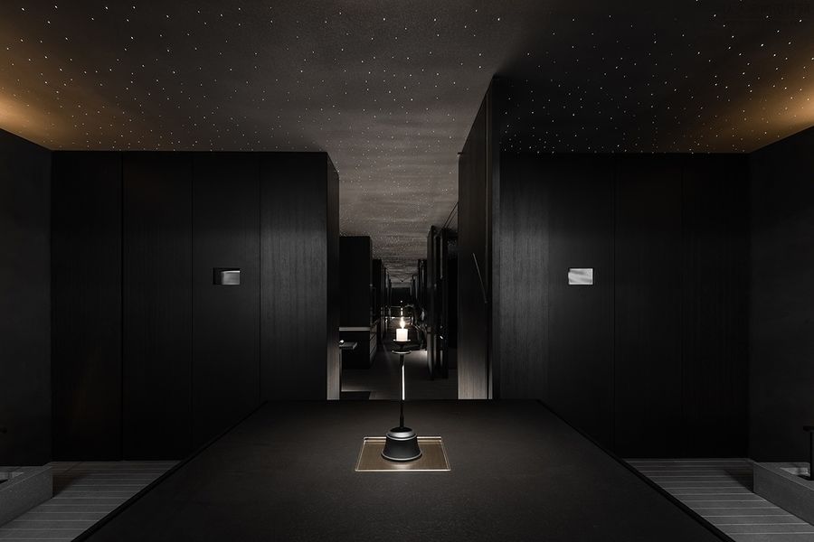
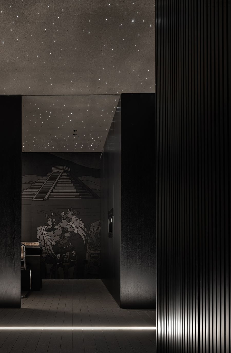
黑色的走廊墙面更加突显了顶面的冲孔铝板带来的星光点点,萨尔克生物研究所广场中的水道在空间中以线性地灯再现,暖色调的灯光在暗色系空间中延展开来,打破整个空间的沉默,增加空间的纵深感,吸引人们探寻空间深处。
The black corridor wall more highlights the starlight spots brought by the perforated aluminum plate on the top surface. The watercourse in the Salk Institute of Biology square is reproduced in the space with linear lights, and the warm color lights are extended in the dark space, breaking the silence of the whole space, increasing the depth of the space, and attracting people to explore the depth of the space.
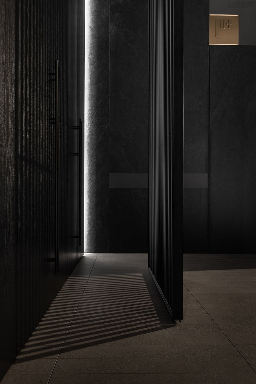
除此之外,走廊的三处隐形门,可根据不同的空间需求进行开合,对空间进行横向切割。
In addition, there are three invisible doors in the corridor, which can be opened and closed according to different space requirements, and the space can be cut horizontally.
一层为空间整体序幕,二、三层空间为产品展示及客户洽谈区,四层为办公区域。在产品展示区域,我们打破了展厅设计的场景化设计,更多的是呈现与产品相符的空间气韵。
In addition, there are three invisible doors in the corridor, which can be opened and closed according to different space requirements, and the space can be cut horizontally. The first floor is the overall prologue of the space, the second and third floors are the product display and customer negotiation area, and the fourth floor is the office area. In the product display area, we have broken the scenario-based design of the exhibition hall design, and more importantly, we have presented the space charm consistent with the product.
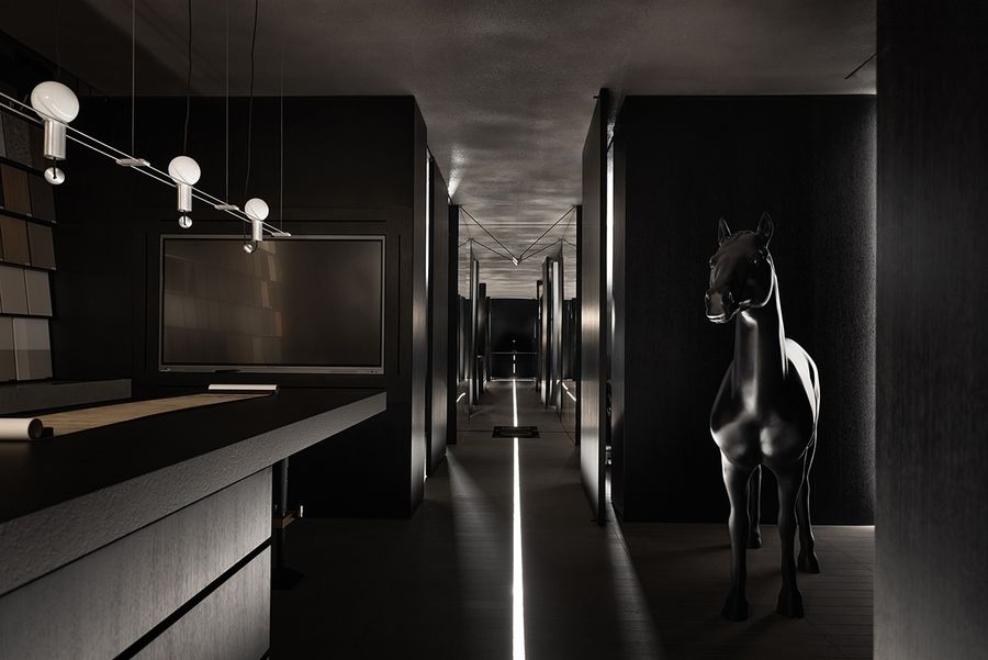
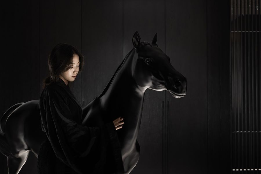
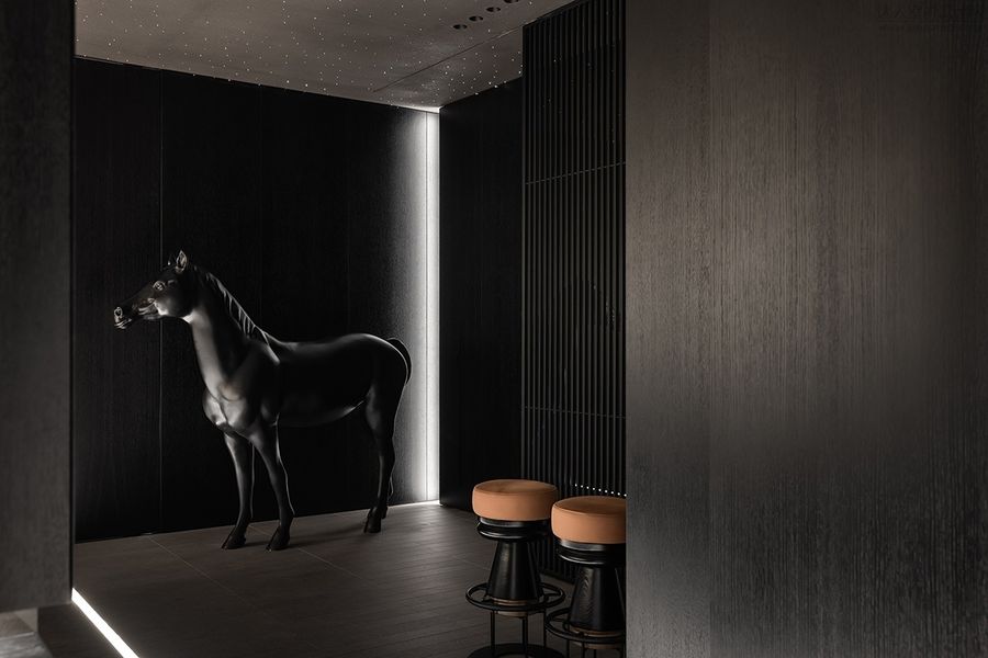
空间一角的黑马装置,如全屋定制行业的黑马F+生活研究所一般闯入我们的视野。
The dark horse device in the corner of the space, such as the dark horse F+Life Research Institute in the whole-house customization industry, has entered our vision.
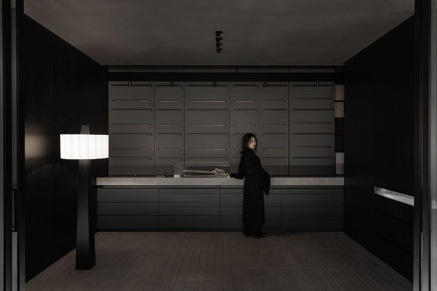
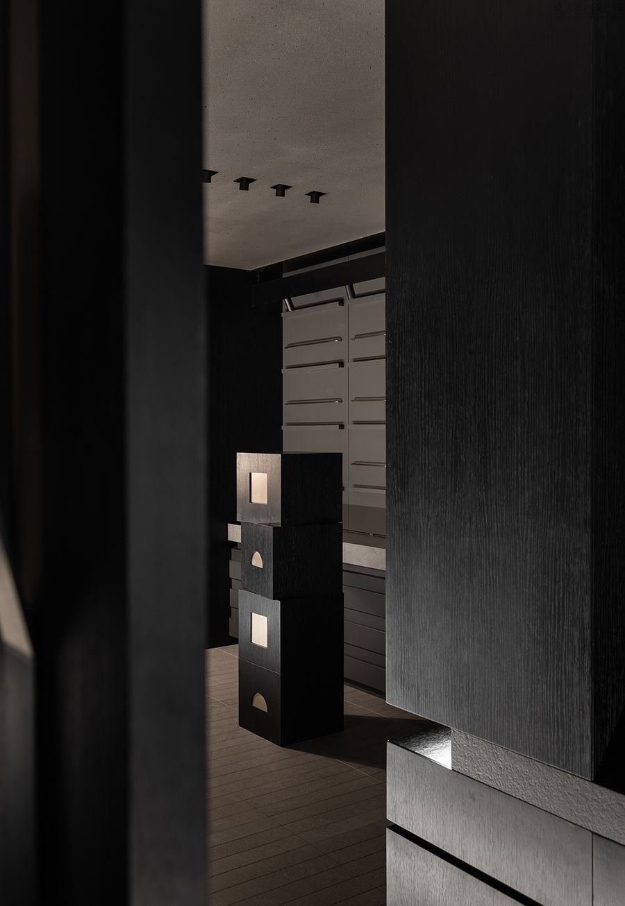
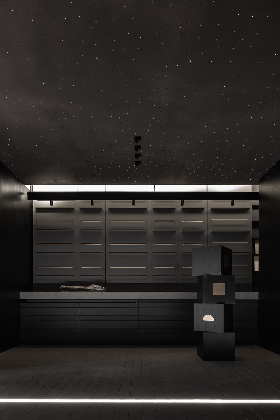
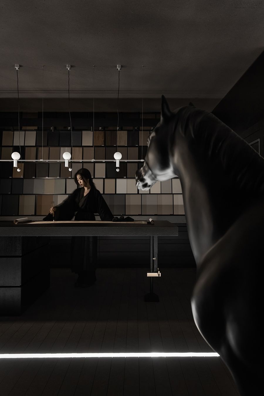
黑马对面是极简的岛台洽谈区,符合站立高度的长桌岛台可容纳多人在此处进行交流洽谈。岛台背后的墙面整齐罗列着百款产品样板,方便客人随手取阅了解。
Opposite the dark horse is the minimalist island and platform negotiation area. The long table island and platform that meets the standing height can accommodate many people to exchange and negotiate here. The wall behind the island platform is neatly listed with hundreds of product models, which is convenient for customers to read and understand.
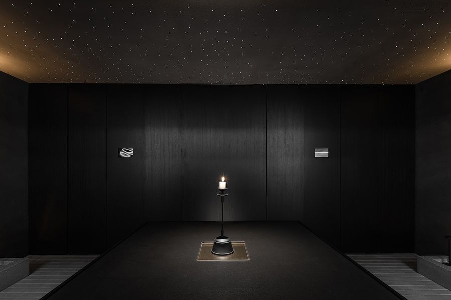
在F+生活研究所,我们尝试用极简的手法在有限的物理空间中,用光和墙的对话来营造空间氛围,赋予空间无限的想象力,呈现极简克制的品牌概念。
At F+Life Research Institute, we try to create a space atmosphere by using the dialogue between light and wall in a limited physical space in a minimalist way, endow the space with infinite imagination, and present the brand concept of minimalism and restraint.
正如F+生活研究所对家的理解”从家的本质出发,以定制打造家居生活方式。”我们相信从品牌的本质出发,将产品和空间氛围更柔软地糅合,是更对品牌理念更契合的呈现。
As F+Life Research Institute understands home, "starting from the essence of home, we can customize our home lifestyle." We believe that starting from the essence of the brand, combining the product and space atmosphere more softly is a more consistent presentation of the brand concept.


