麦间甜屿是一家主打法式风味的甜品品牌,在重庆已开了三家分店,并以不同的装修风格出圈,如何在这几家分店中脱颖而出并重新定义当代都市人对法式年轻化、潮流空间的理解和在有限的空间下怎么创造法式浪漫。
Ble Patisserie & Brunch is a dessert brand focusing on French flavor. There are three branches in Chongqing so far, and has become widely know by different decoration styles. How to make it stand out from these stores, redefine the understanding of French youth and trendy space by contemporary urbanites, and create French romance in limited space?
▼项目概览,overview of the project © 杨帆
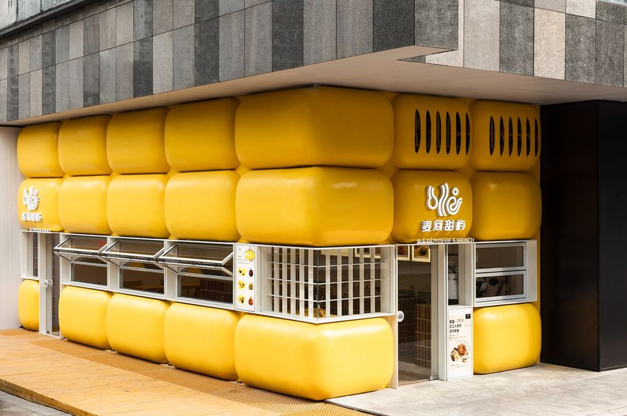
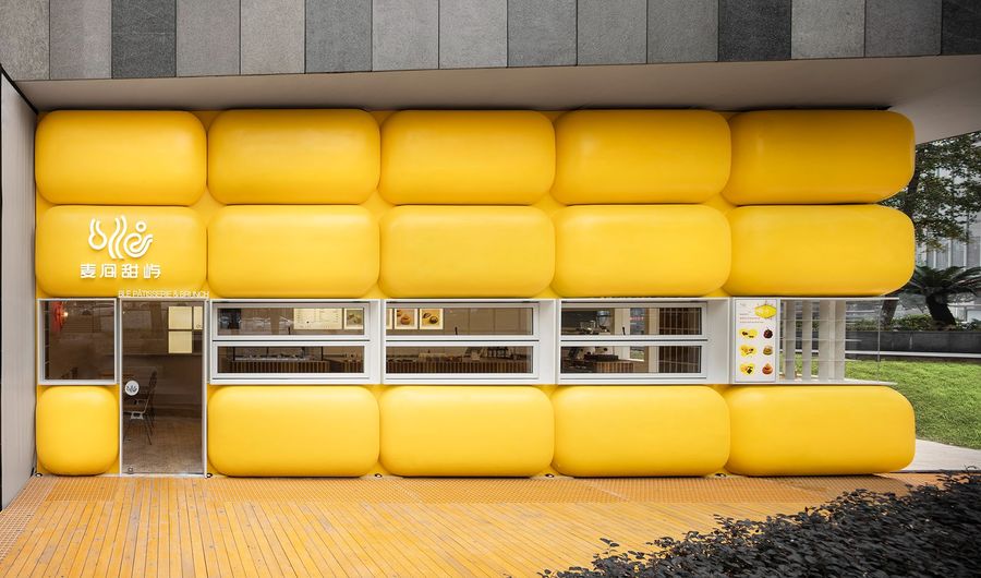
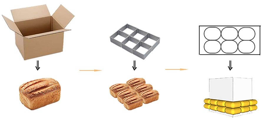
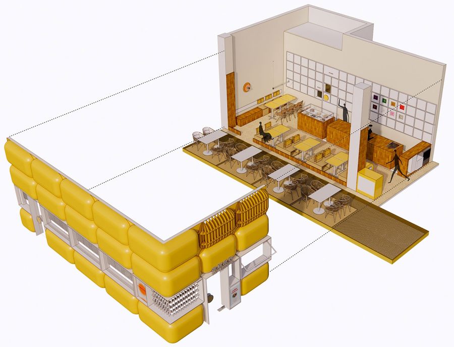
项目位于重庆渝北区的龙湖MOCO的B馆,由于该位置处在建筑外面的夹角,设计师因此联想到了黄色的蛋糕体块,并由此介入空间概念来设计。外立面的造型是由一个蛋糕体块被挤压切割成20块的柠檬黄蛋糕体,以此形成挤压的互动感,突显甜品店的独特造型。建筑本身的色调与新空间外立面的色调形成鲜明的对比,整体扩大了视觉上的冲击性引发联想,像是缝隙里塞了一块蛋糕,勾起了人们内心的探索欲。
The project is located in Hall B of Longhu MOCO in Yubei District, Chongqing. For the reason that it is located at the angle outside the building, the designer associates with the block of yellow cake, which arouses the space concept of the designer. The shape of the facade is made up of 20 pieces of lemon yellow cake which are cut from one cake block by extrusion, so as to form an interactive feeling of extrusion and frame the unique shape of the dessert shop. The color of the building itself forms a sharp contrast with the color of the new space façade, expanding the visual impact from the whole to trigger association, like a cake stuffed in the gap, arousing people’s desire for exploration.
▼项目街景,street view © 杨帆
▼项目外观,exterior view © 杨帆
▼外立面概念图,conceptual diagrams of the facade © 发喜空间设计
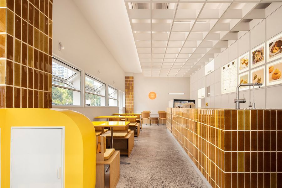
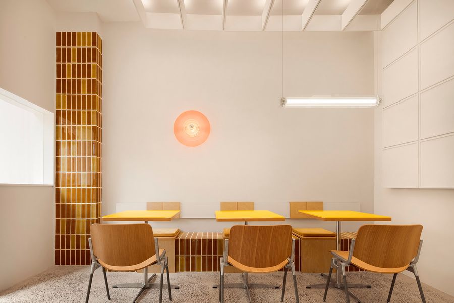
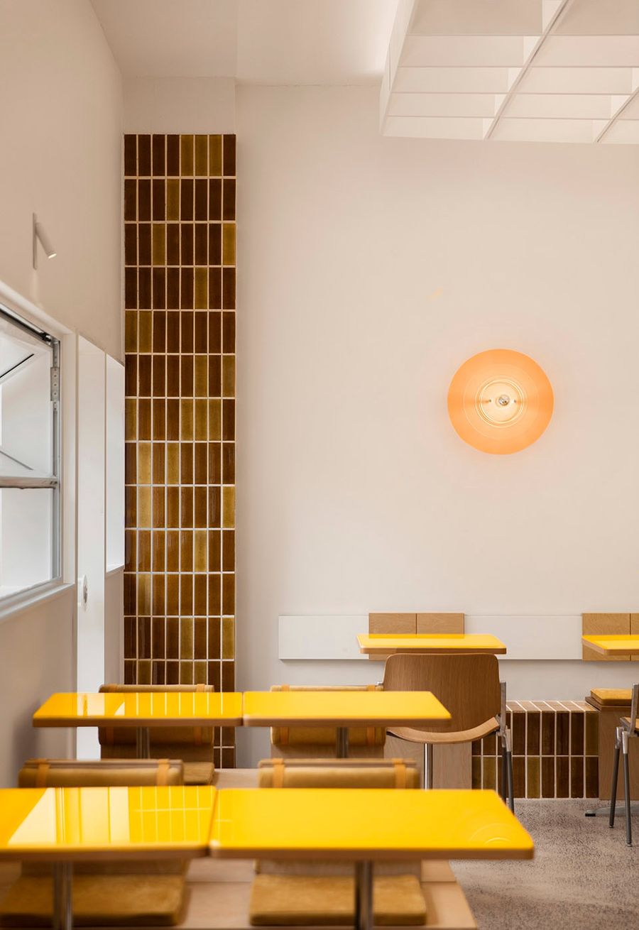
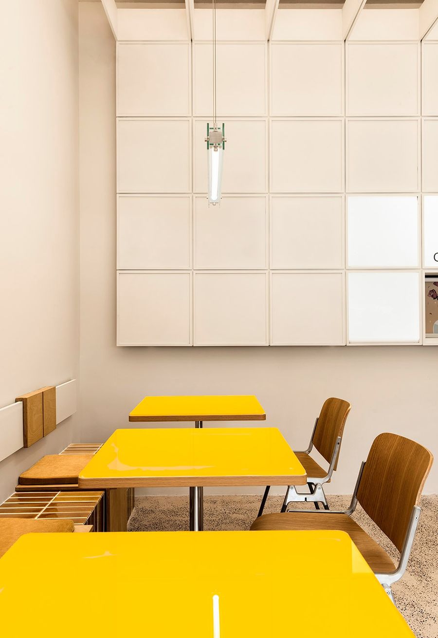
法式风格的塑造重在细节的思考,在桌椅、柱子装饰面、餐吧台立面等上均采用同一色调但不同材质,给空间提高了层次感,时尚又高级。
The shaping of French style focuses on the consideration of details. The same color but different materials are used for tables and chairs, decorative surfaces of columns, and elevations of the dining bar, bringing the space a sense of hierarchy, fashionable and advanced.
▼轴测图,axon © 发喜空间设计
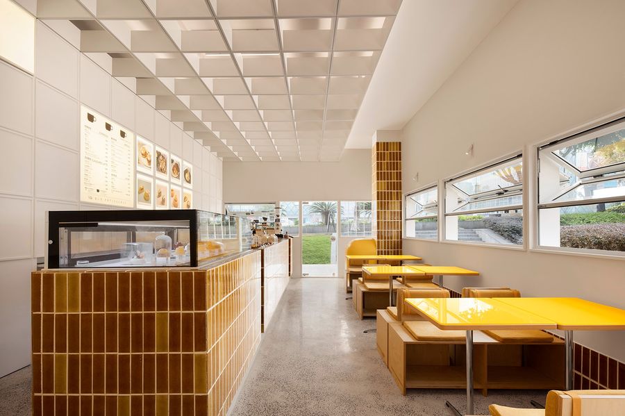
▼室内概览,overview of the interior space © 杨帆
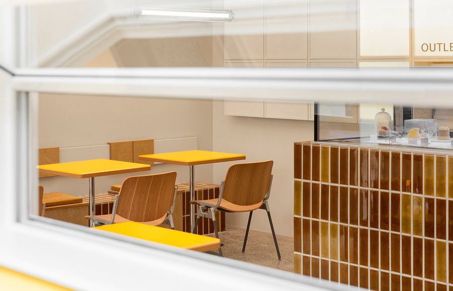
▼从室外看室内,view from the outside to the inside © 杨帆
▼用餐区,dining area © 杨帆
▼桌椅近景,close view of dining tables and chairs © 杨帆
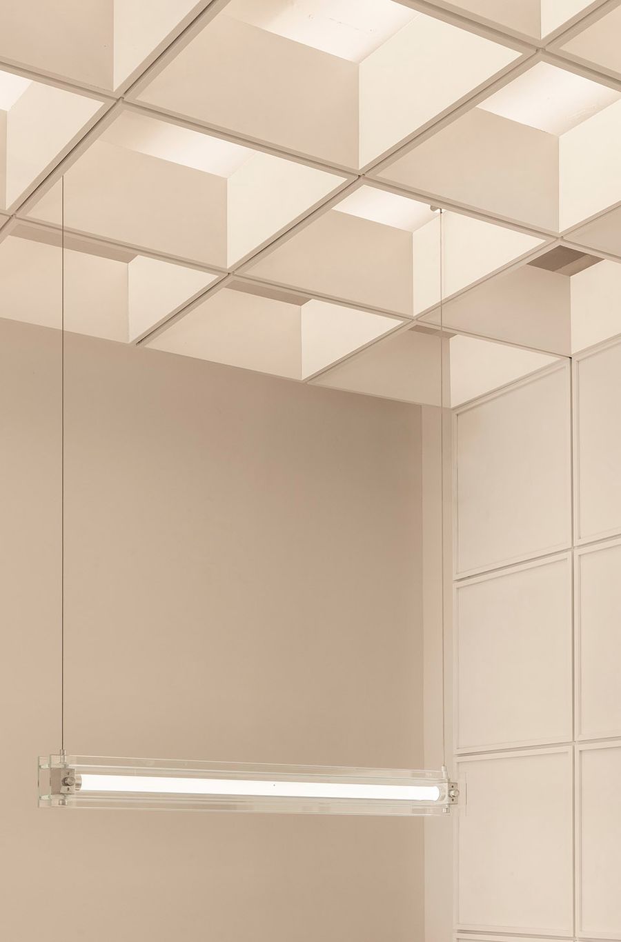
顶面的设计提取了蛋糕磨具的结构,构成方格框架顶棚,让整个空间更加贴合,加入灯带后从里透光出来显得尤其干净整洁,给人带来视觉享受。工业水泥的硬装与灯光的营造,让整个空间变得高级且极简明亮,创造出了通透有呼吸感,自然轻松的氛围,简易灵活的桌椅,环保又舒适。
The design of the top surface extracts the structure of the cake grinding tool to form a grid frame ceiling, which makes the whole space fit more closely. After adding the light belt, it looks particularly clean and tidy, creating visual enjoyment. The hard decoration of industrial cement and the construction of lighting make the whole space advanced and very concise. It creates a natural and relaxed atmosphere with a sense of breath, simple and flexible tables and chairs, which are environmentally friendly and comfortable.
▼顶面设计,design of the top surface © 杨帆
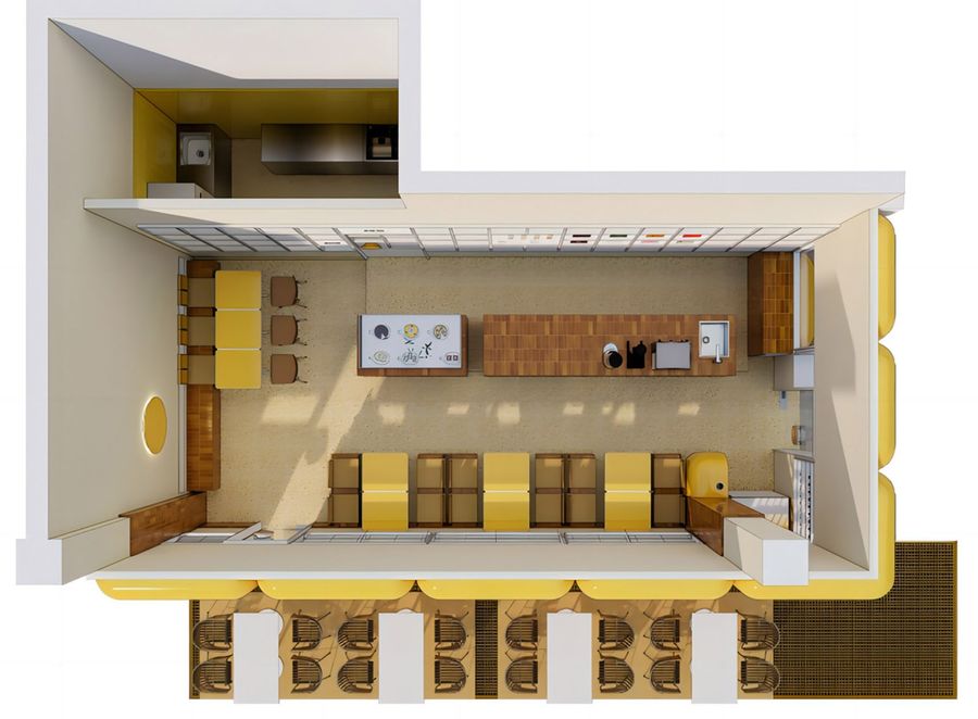
▼平面透视,plan perspective © 发喜空间设计
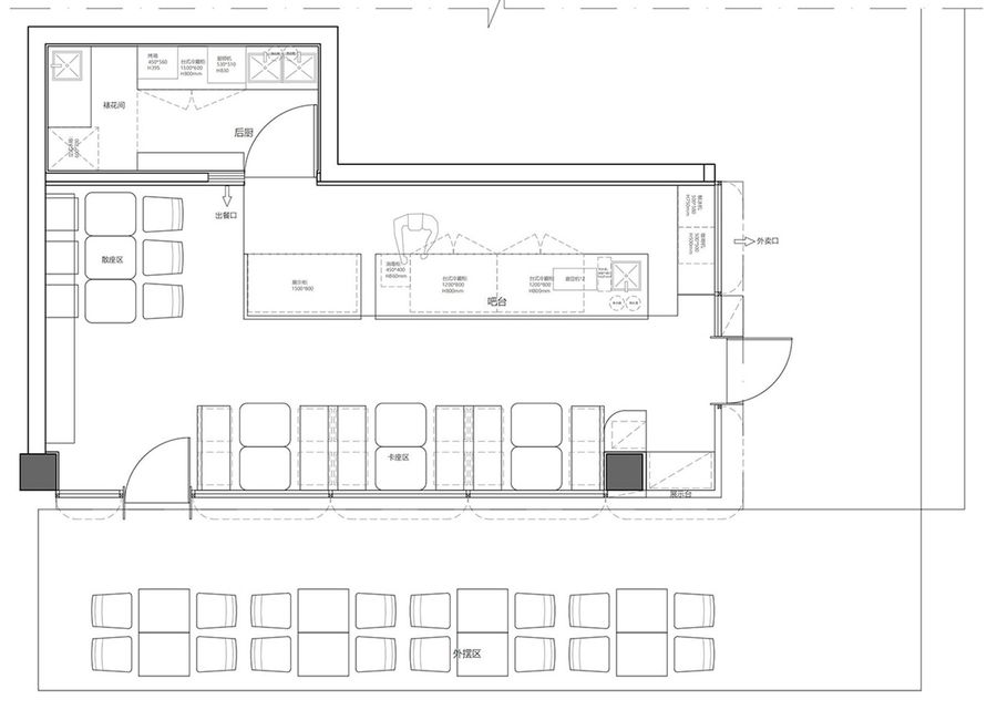
▼平面图,plan © 发喜空间设计
项目名称:麦间甜屿
项目类型:零售空间设计 商业空间
设计方:FX.D发喜空间设计
项目设计:FX.D发喜空间设计
完成年份:2022年
设计团队:杨科 唐爽
项目地址:重庆渝北区龙湖MOCO
建筑面积:20㎡
摄影版权:杨帆
合作方:麦间甜屿
客户:龙永亭
材料:玻璃钢、木板、格栅


